
Also available in: Français
I use the name “CSS3″ only for its “commercial” aspect. Actually, we will use my two favorite pseudo-elements :after and :before which are available since CSS2.1. I mean they are available since a long time ago… Demos you see in the demo page are composed with only one unique <div> and some CSS properties.
For me, the best rendering is made with Firefox browser, but you should see those advanced shadows on all modern browsers, so use the one ou prefer.
In this demonstration I will use some advanced CSS properties (transform, box-shadow) directly on :before and :after pseudo-elements. Those pseudo-elements allow to build a kind of “shadow-dow” inside the existing DOM (Document Object Model). It’s an element built with CSS, or a sort of… Lets do it!
:after and :before pseudo-elements
Imagine: in your website, just after a link, you want to add the language of the resource you linked to. (reminder: this information is given by the hreflang attribute in a <a> element). You can do it using those some lines of CSS:
a[hreflang]:after {
	content : " ("attr(hreflang)")";
}
With that code, all the links with the hreflang attribute will be ended by “(en)”, in the case of an english reference:
My link (en)
The working basis
Under the same principle, we will use two pseudo-element to built several styles of dropped shadows, the same you can analyze in the demo page.
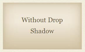
As base of HTML, we have a single div element:
<div class="block">Without drop shadow</div>This div element has a block, class value which will visually create the block (some basic styles for the demo). The without class in the first block is just here to define the block without any shadow. No big deal.
You will find the corresponding CSS below. The main properties are those about positioning and dimensions. It’s not mandatory to fix dimension of the block, here is for the demo. So, the styles:
.block {
	position: relative;
	display: inline-block;
	vertical-align: top;
	margin: 35px 26px;
	padding: 25px;
	width: 220px;
	height: 110px;
	background: #f0e8d8;
	font-size: 1.6em;
	line-height: 5em;
	font-family: sans-serif;
	text-align: center;
	background-image: linear-gradient(to bottom, #dacdb1 11%, #f0e8d8 56%);
	box-shadow: 0 0 65px #cdbe9f inset, 0 0 20px #beae8c inset;
}
Then, we build our pseudo-elements for all the cases. It’s important not forget the empty content property.
.block:after,
.block:before {
	content: "";
	position: absolute;
	width: 50%;
	height: 100px;
	z-index: -10;
}

.block:before { background: green;}
.block:after { background: red; }
Pseudo-blocks have an absolute position and a negative z-index, the goal is to place those elements under their parent. (the <div> they depend)
Colors of pseudo-elements are added to understand how it works, how those elements are positioned, rotated, etc. I had planned to invite you to use Firebug to play with the .block background, but thanks to a suggestion by Philippe, I developed a plaything to watch those pseudo-elements without effort. :p
But let us come back to the topic.
Pseudo-blocks are ready, we just have to add them a drop shadow and a precise positioning. With some cases, we will need other properties, we will see later together.
The following codes will be applied to all elements that have the block class combined to the other class associated. In other words: one class by type of shadow.
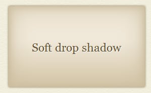
For example, for the next effect, the HTML element need those classes:
<div class="block simple">Soft Drop Shadow</div>Simple shadow
It’s never too early to remind basis about box-shadow usage.
.simple {
	box-shadow: 0 0 65px #cdbe9f inset, 0 0 20px #beae8c inset, 0 0 5px #816f47;
}
/* we don't need pseudo-elements this time */
.simple:after,
.simple:before {
	display: none;
}
Here, we don’t need pseudo-elements, so we hide them.
We have the same box-shadow code than the base, but we added another shadow to the list. As you can see, we can combine inset shadow and drop shadow.
The basic syntax:
box-shadow: 1px 2px 9px 0 #000;allow to create a box shadow, with those parameters, in the order:
1px of horizontal move (to the right), 2px of vertical move (to the bottom), 9px of blur, 0 of spread (optional), #000 for the shadow color.
An optional parameter, the keyword inset, put at the end of the shadow value, makes the shadow inner instead of generating a drop shadow. Without this parameter, the shadow is a classical drop shadow.
This set of parameters can be duplicated and comma separated to create multiple shadow.
Lateral shadows
This is how we will really use our pseudo-element to create advanced effects.
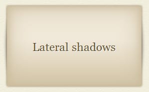
We will put our pseudo-blocks in a certain position, and give them dimensions and “personal” shadow. Let’s see!
.laterals:before {
	top: 15px;
	left: 0;
	width: 100%;
	height: 130px;

	border-radius: 12px / 65px;
	box-shadow: 0 0 10px #555;
}
.laterals:after { display: none; }
The border-radius property add a curled effect in our shadows. It’s more realist.
Don’t forget to use the X-Ray feature to watch pseudo-element in action.
Curved lateral shadow
Simple but not too simple. I mean, it’s simple if you get in mind that there is only one shadow in one side.
So! This time, again, we will use only one of both pseudo-elements.
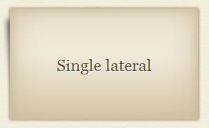
We have to use a rotation to give the shadow its effect.
.lateral:before {
	top: 10px;
	left: 8px;
	width: 50%;
	height: 130px;

	box-shadow: -7px 0 10px #555;
	transform: rotate(-5deg);
}
.lateral:after { display: none; }
You may see the negative value of box-shadow property. This value moves the shadow to the left to make it more visible below the block.
Hozizontal shadows
It’s the same principle than lateral shadows, but this time I use the both of pseudo-elements. In fact, it’s rare to know in advance the height of an item. Using :before and :after to make this effect allows me to have a dynamic-height item.
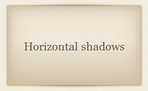
The first pseudo-element is positionned regarding to the top of the block, the second one regarding to the bottom.
.horizontal:before {
	top: 0px;
	left: 5%;
	width: 90%;
	height: 50px;

	border-radius: 125px / 12px;
	box-shadow: 0 0 8px #555;
}
.horizontal:after {
	bottom: 0px;
	left: 5%;
	width: 90%;
	height: 50px;

	border-radius: 125px / 12px;
	box-shadow: 0 0 8px #555;
}
I volontarily duplicated styles to the both declarations, but you can merge those duplicated properties in a single declaration to be more maintainable. It’s up to you.
Simple horizontal shadow
It’s the more complex part of that article, I think.
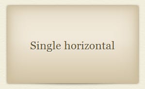
By adding single class to our element:
<div class="block horizontal single">Single horizontal</div>and applying this CSS code (in addition of our previous effect):
.single:before { display: none; }It’s not a big deal, indeed 😉
Of course, instead of creating styles for :before and hide it, we can also just create styles for :after and hide :before directly.
Curved shadows
It was (and it is, maybe?) a trendy effect to add a touch of depth in some web designs.
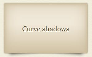
To make this effect, we will use our both pseudo-elements, and add a rotation to them, like the Curved Lateral Shadow seen previously.
.curve:before {
	top: 52px;
	left: 5px;

	transform: rotate(-5deg);
	box-shadow: 7px 6px 15px #333;
}
.curve:after {
	top: 52px;
	right: 5px;

	transform: rotate(5deg);
	box-shadow: -7px 6px 15px #333;
}
Too easy!
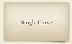
With the same principle, you can hide one of both shadows to create this more simple effect. Use the single class, seen previously, or just don’t style one or the other pseudo-elements.
More experimental shadow
So! This one, the X-Ray feature will not help you, not this time.
I use entirely the both pseudo-elements, not only their box-shadow property.
The corresponding CSS code is bigger than the previous we made, but this experimentation is good to help you during your front-end work 🙂
.drop:before {
	left: -5px;
	top: 167px;
	width: 280px;
	height: 4px;
	background: #aaa;

	border-radius: 140px / 2px;
	box-shadow: 0 0 5px #aaa, 0 0 10px #888, 0 0 15px #666;
}

.drop:after {
	left: 8px;
	top: 168px;
	width: 255px;
	height: 2px;
	background: #666;

	border-radius: 125px / 1px;
	box-shadow: 0 0 5px #444, 0 0 8px #333, 0 0 10px #666;
}
To be more efficient, you could (or should) use rgba() instead of hexadecimal colors.
The :before pseudo-element is used for the large shadow.
The :after pseudo-element is used for the fine shadow, at the center of this complex large shadow.
In both cases, we need to transform them into ellipses (fr) (french article, but understandable code).
Bugs
If it happens shadow not showing up, you may be in the following case: the elements affected by the shadows are in another parent element. In other words, you have a container that containing the elements you tried to make shadowy.
If that container has a background (color or image), the shadows become non-visible.
It’s a z-index issue, you have to reorder it.
In our example, you just have to put the position property to relative (or other value like fixed or absolute, depending on your layout) and a z-index with 0 as value:
.container {
   position: relative;
   z-index: 0;
}
The ending word
I hope this tutorial was easy to follow for you. Some explainations are short, but if you have question, the comment form is there for you.
The X-Ray feature should help you to find some answers, just click it!
This topic about advanced drop shadows is also available here Nimbupani and there NicolasGallagher.
Thank you for your reading!


Post a comment for this article?
Follow comments and trackbacks