
Also available in:
Last week, I worked on a new short web project: the WP Media Company website. It’s a single web page with some typical sections and subtle animations. I was ready to code it with a Mobile First method, and I finally thought about a more natural one. I named it: (Natural) Flow First.
I did some research, especially on Google, to find information about this kind of method, but no expert had talked about that before. Perhaps I was using the wrong keywords. I read some things about content first which is the nearest method if you want to compare mine with an existing one.
So I will explain my approach about this Natural Flow First, by showing you some case studies.
Before we start, you need to know that I’m writing about the front-end part of the work, which is only a (big visible) part of a web project.
Mobile First VS Flow First
Let’s talk about theory (I like theory), when you think Mobile First, you are thinking about the device(s) you are targeting. In other words even if an HTML element has a natural behavior, you will place and create it regarding the mobile layout proposed by the graphic designer, and regardless of it’s natural “flow”. Only the device matters, and you begin to code for that device first.
When you begin to think about natural HTML element flow, you really begin to think Adaptative Web Design. You create styles only when the element really needs a change in its natural behavior. Your CSS code become lighter and really efficient: each viewport gets the styles that suit him. No more! No need to overwrite “Mobile” styles for desktop or tablet, for example.
Back to the natural flow
The natural flow is this weird thing that makes an HTML element block or inline, table or list. This flow is defined by the W3C under the more global name of Visual formatting model which includes box-model, display property, containing block, block-level, inline-level, etc. So, the natural flow is the sequence of the natural behaviors of the elements that composes your web document.

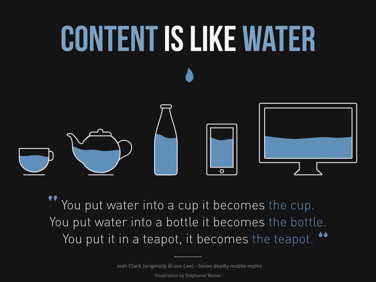
When you use the concept of Flow First, you respect the fact that each HTML element has its own behavior, its own visual format. Your content becomes respectful of the container, like water takes the form of its container. If you change the property of the content for only one container, it’s like making ice cubes: some cube sizes are not compatible with the neck of the bottle! (and you will be forced to create other ice cubes with other properties.)
Be like water making its way through cracks. Do not be assertive, but adjust to the object, and you shall find a way around or through it. If nothing within you stays rigid, outward things will disclose themselves.
— Bruce Lee
Analyze every situations
When you use the Mobile First concept, you strictly apply “mobile styles” first, then you create specific styles for bigger devices using CSS media queries. Often, it works because we have less width space across the device, so we design items one on top of another. (I said “often” ;p)
When you use the “old way” of retro-fitting and use CSS media queries to overwrite styles for more and more smaller devices, you create too much unecessary CSS rules, sometimes.
But sometimes, in both cases, you overwrite code you wrote yourself. This adds some heaviness in your CSS and makes it less maintainable and less readable.
Flow First is a constant analysis based on a better understanding of both styles to apply and natural ones already (naturally) applied to an element.
Natural Flow First examples
To be more consistent, I will give you some examples used during the WP Media website developement, the first project I really tried to apply that Flow First concept.
The team member
In this part of the website, the graphic designer made something like that:

The .team-member-photo is a single division containing an image with some visual effects. Here I just care about this <div>, not the image inside.
If I was in a Mobile First way of coding I would write:
.team-member-photo {
	float: left;
	width: 100px;
	margin-right: 15px;
}
@media (min-width: 640px) {
	.team-member-photo {
		float: none;
		margin: 0;
		width: auto;
	}
}
Being in a Flow First way, I code something like that:
@media (max-width: 639px) {
	.team-member-photo {
		float: left;
		margin: 0 15px 0 0;
		width: 100px;
	}
}
Indeed, in my first block of code, the second part with media query only resets the defaults “natural” values of my <div> element.
Also, the value of the media query in term of width is totally depending on the readability and design of the component, not a random device size .
The columns
That example will seem more natural for you, perhaps. It respects the same Flow First logical, even if it corresponds exactly to the same result of a Mobile First reasoning.
On WP Media website, we make the choice to not have columns before 640 pixels width. We get a code near that one.
@media (min-width:640px){
	[class^="cols-"] {
		margin: 0 -25px;
	}
	[class^="col-"] {
		float: left;
		padding: 0 25px;
	}
	.col-1-2 {
		width: 50%;
	}
	.col-1-3 {
		width: 33.33%;
	}
}
There is here nothing else for mobile devices, because elements are naturally one on top of another.
Flow First, in short
If I had to wrap up that idea of Flow First, I told that you have to keep in mind the natural behaviors of each HTML element and you have to constrain them to do things differently only if you really need it, using an adapted media query. (max- or min- depending on your needs, or a combination of both)
And you, how do you write your code?
Post a comment for this article?
Follow comments and trackbacks