
Also available in:
The Vintage Washed effect is actually fashionable. The “users” of this effect are looking for an old aspect, they want to give to their photographies a kind of history by giving them an aged appearance, some people talks about an “authentic” appearance. Let see how to reproduce that effect with CSS.
The expected outcome
We are looking for a diminution of colors contrasts by reducing darkest ones. Each photography will need its own treatment depending on its colors exposure.
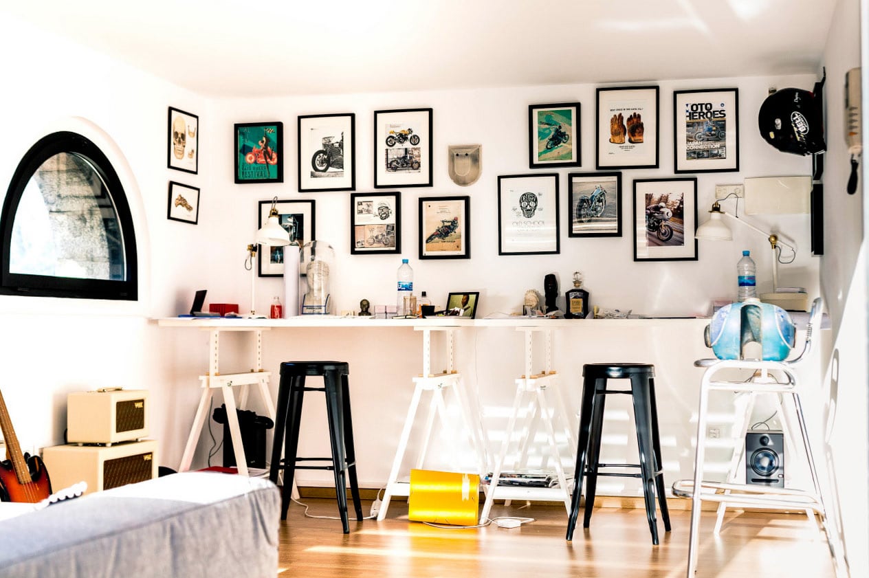
See this example:
To make this effect revelant, we will use the lighten blend mode in CSS.
This blend mode multiply two channel (of colors) preserving in each channel the lightest colors.
How to?
I will use this HTML code. You can use the same one in order to have the same bases.
<div class="image"></div>The image I used will be applied as background image. We will use the background-blend-mode property to merge the background color to background image.
Just copy/paste the following code CSS :
.image {
	width: 800px;
	height:  600px;
	background: url(https://www.creativejuiz.fr/blog/wp-content/uploads/2015/11/photo-atelier.jpg), #000;
	background-blend-mode: lighten;
	background-size: contain;
}
You can use multiple background, like here, or simple background-color plus background-image properties. Actually, you see any differences with the original photo because we use the #000 color (black). The actual blend mode is a “keep the lightest colors between image and (black) color”-mode, so “keep the photography’s colors” 🙂
Now, replace black color by a medium gray, for example #777.
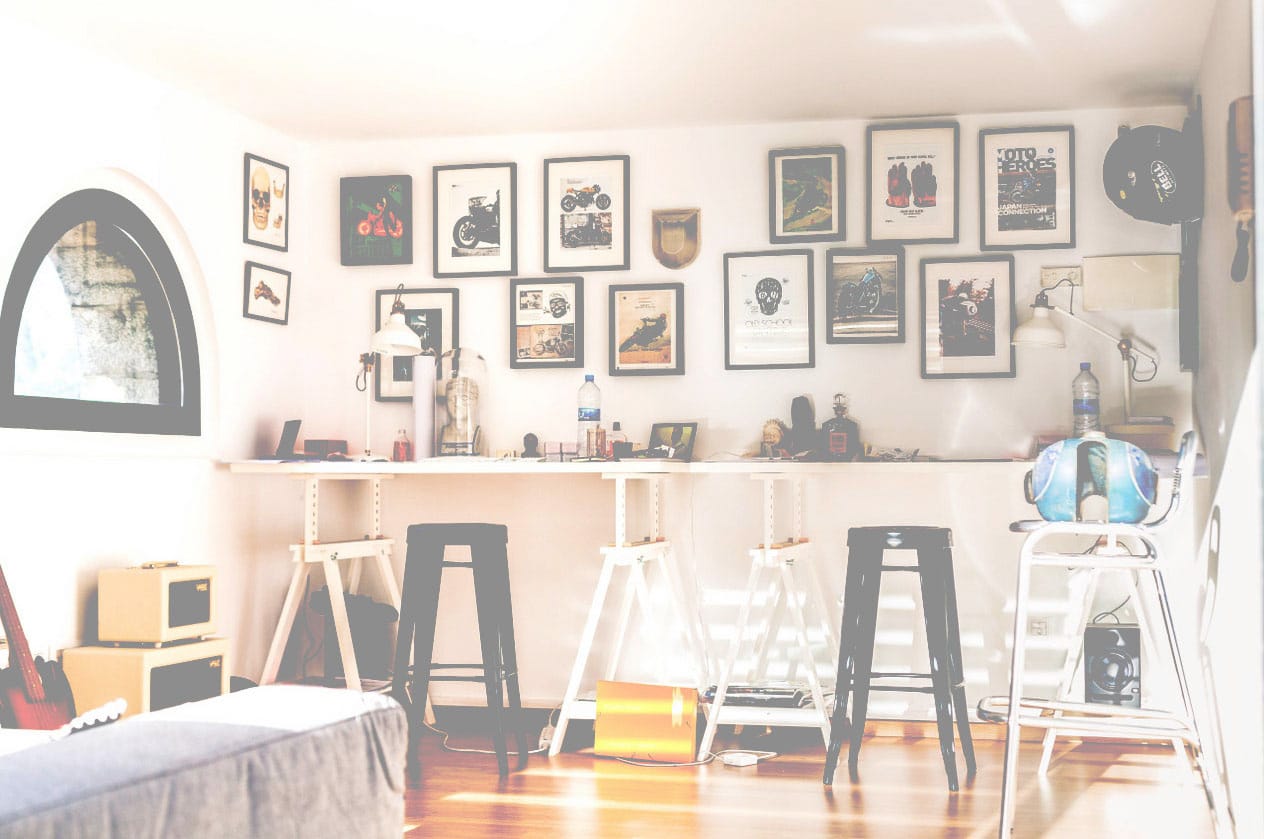
Here, we lost to much colors, we have to be darker with the blended color.
I let you test #222 or #333 colors. We get something good with those values.
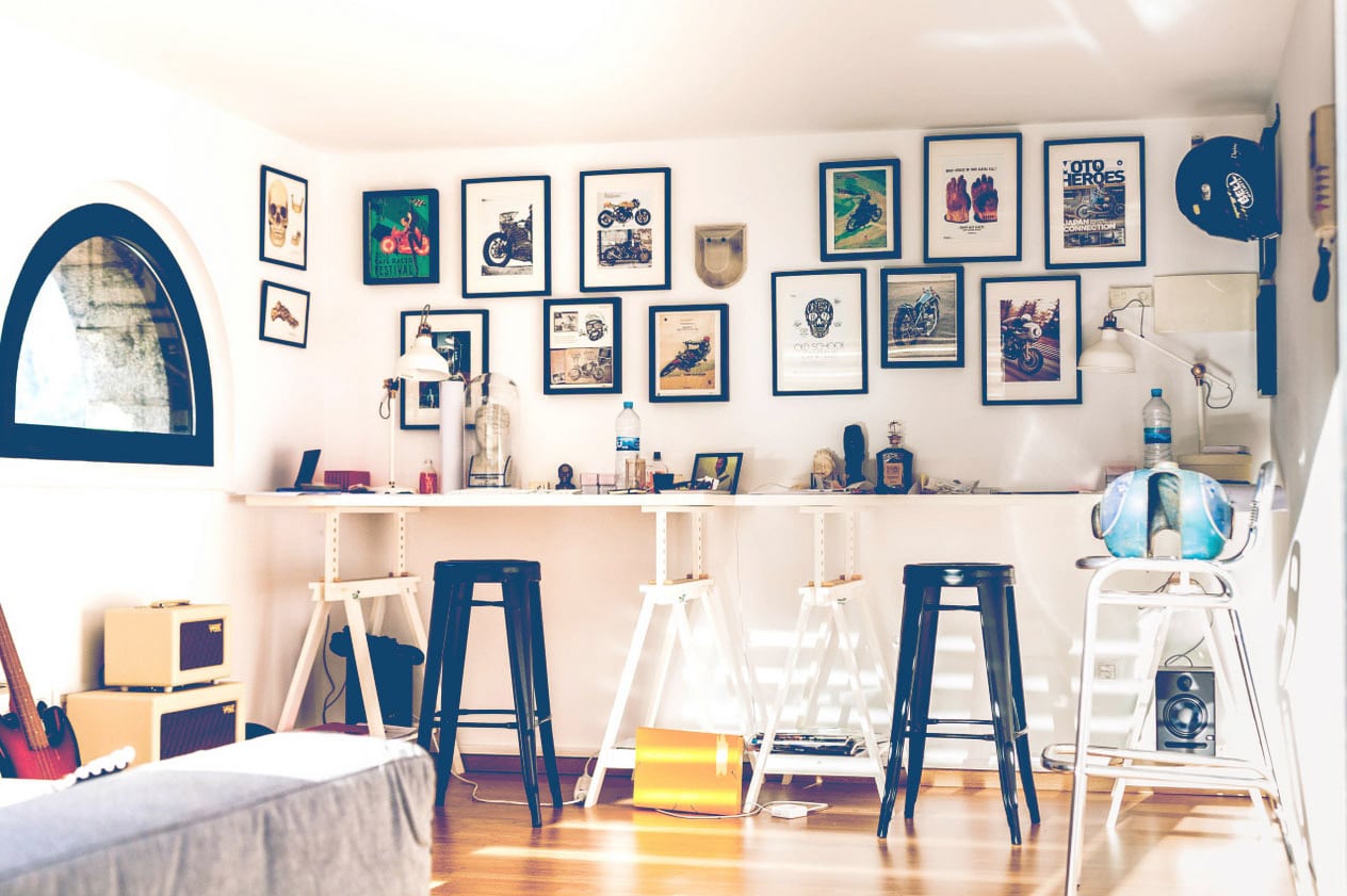
Let try to don’t use a gray shade for that merged color, but a cold or hot dark color. I tried first with a cold one, the one I prefer is #123456 because it’s easy to remember and its a good dark blue. We get the exactly desired effect.
Ok, now test with the dark hot color #654321, and compare.
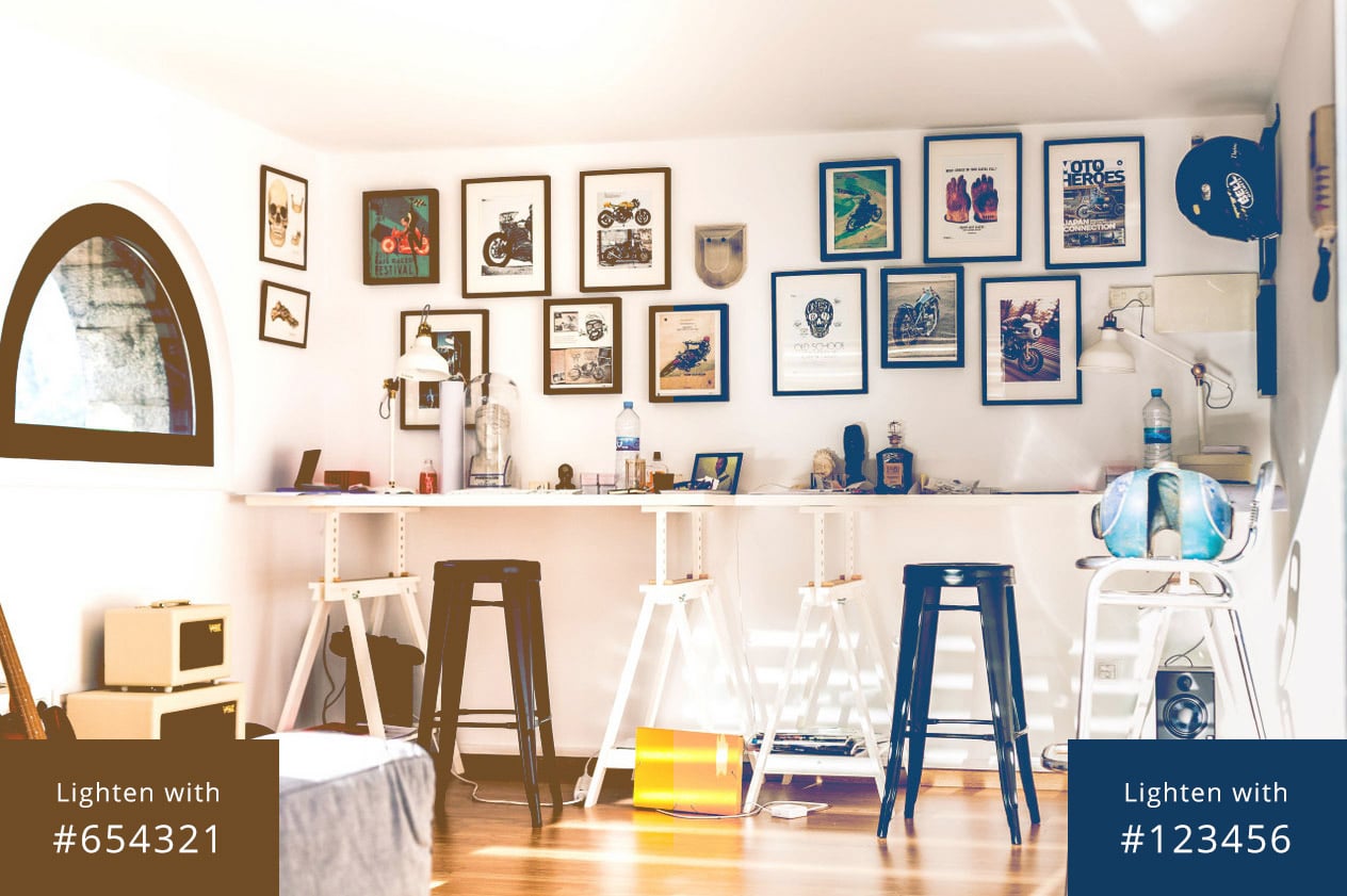
I actually prefer the left (cold) one, for this photography anyway.
With a hot or cold dark color, you will be able to upset a bad white balance in a photography.
“Et voilà”, you know how to do a washed effect. Easy? Isn’t it?
Don’t hesitate to play with the CodePen I made for your.
Same effect with a “content” image
You know the principles of that effect. You can now use one of those methods I will give you to make it on images declared on you HTML code.
HTML code
Place an image inside a container.
<div class="thumbnail">
	<img src="https://www.creativejuiz.fr/blog/wp-content/uploads/2015/11/photo-atelier.jpg" alt="">
</div>
This container and this code is the same for both methods I will present to you, one by one…
CSS basics
Here, the commun CSS code for both methods 🙂
.thumbnail {
	position: relative;
	margin: 0 auto;
	width: 600px;
	max-width: 100%;
	border: 3px solid #123456;
	line-height: 0;
}
.thumbnail img {
	max-width: 100%;
	height: auto;
}
Our two methods will be the followings :
- Apply a background color to the container, and apply the blend mode to the image.
- Create a pseudo-element with
:beforeor:after, give a background color to this pseudo-element and apply to it the blend mode.
1 – Container’s background color
It’s my favorite method, because is blend mode is not supported by the web browser, we get a simple image without specific effect on it.
.thumbnail {
	background: #123456;
}
.thumbnail img {
	mix-blend-mode: lighten;
}
It’s pretty easy, as you can see. The image is blended with the background color of its container.
2 – Pseudo-element as blend layer
This method adds a specific element to create a blend layer. It can be useful if the container background is already used for another effect. However, it creates a layer above the image: imagine if blend mode is not understanding by the web browser…
.thumbnail:after {
	content: "";
	position: absolute;
	top: 0; right: 0; left: 0; bottom: 0;
	background: #123456;
	mix-blend-mode: lighten;
}
But, you have an alternative.
We will attribute a new value of z-index to our elements to make the image above the pseudo-element, and apply blend mode to the image.
.thumbnail:after {
	content: "";
	position: absolute;
	top: 0; right: 0; left: 0; bottom: 0;
	background: #123456;
	z-index: 1;
}
.thumbnail img {
	position: relative;
	z-index: 2;
	mix-blend-mode: lighten;
}
Ok, you have now more lines of code, but this alternative offer us a more secure way to do the same effect with a pseudo-element.
You can play with another CodePen demo.
Have fun!
Post a comment for this article?
Follow comments and trackbacks