
Also available in:
Recently, I have been working on two website projects within the company I work with. Both need a complete rework in there visual aspect, but also in there content hierarchy and complete architecture. That is where Octopus.do and its visual sitemap builder came as a really good discovery.
When you work on this kind of website refresh, the more difficult part in my opinion is to share your vision of what will be the website with all the stakeholders on this project. That’s why (but not only) we build, as designers, tools like sitemap, user journey maps, or other kind of methods and deliverable: to help people understand what we have in mind before jumping into production. It help us validate the path we are taking for this website refresh.
Octopus.do is “a lightning-fast visual sitemap builder” as they say. You can build your website structure in using a system of Content Brick Method and rapidly share it to collaborate with your team or clients.
Visual Sitemap Builder: some features
I won’t go into all the features of this tool, I’ll let you browser the Octopus features page if you are interested. I want to share some of the features I used, or I would use in the future.
From XML Sitemap to Visual Sitemap
With Octopus.do you can generate beautiful and clean website diagrams fast and easy by
importing the XML sitemap from any website. In fact, on the tool you can simply put an URL in a field, and the tool will detect the declared sitemap on your website.
I talk about this tool first because it’s kind of hidden on the UI of the tool, but it’s a great way to:
- double check if you existing sitemap isn’t a mess,
- pre-build a visual sitemap that can be really big
- pre-link every item on Octopus to the actual online page, which can be helpful.
I tried it for this article, I used Suggest.design website, a site project of mine, to see how Webflow generate a sitemap of a “CMS” website. Not bad.
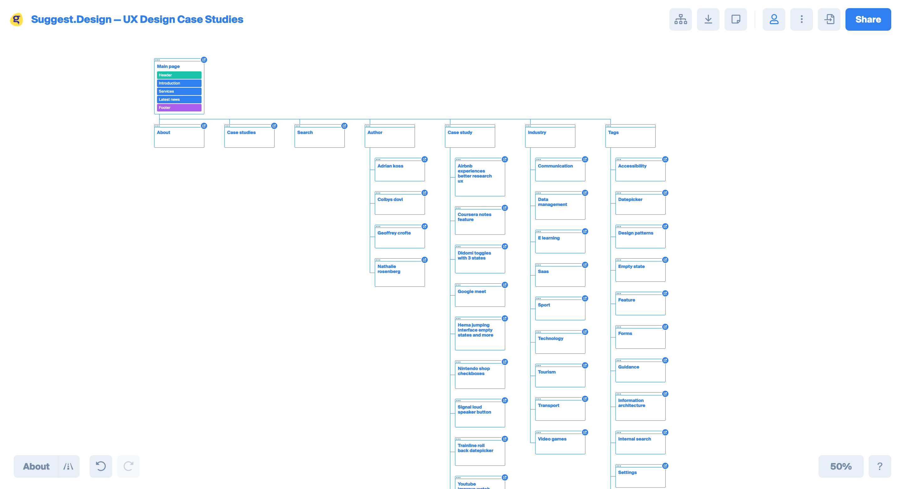
This is the kind of start you need for complex websites, because you really don’t want to do all of this by hand.
Create Sitemaps that are beautiful
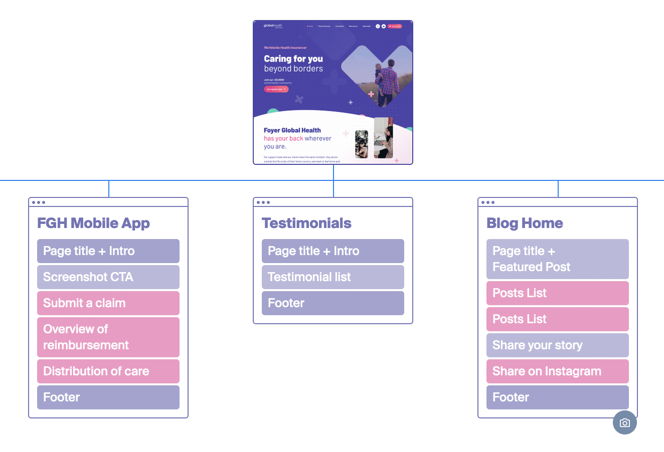
The other interesting part of this tool is that the design of the sitemap is well made and easy on the eyes. The visual sitemap is colorful and pleasant to look at. It’s easier to share this kind of templates with your team and clients.
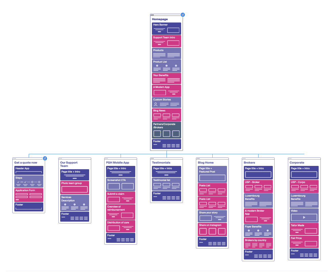
The good part is that you can use a collection of premade-blocks that will help you imagine what kind of content you are expecting at a more or less precise position in the page. This is what Octopus.do call the low fidelity wireframe kit.
It’s a good way to help people understand the structure of the page, the layout you would like to use, but also the type of content you would build. Here is the list of the blocks available (not all available in the free version though)
 This list of blocks comes with 38 typical contents and was, for me, way enough to build my low fidelity wireframes directly within the visual sitemap.
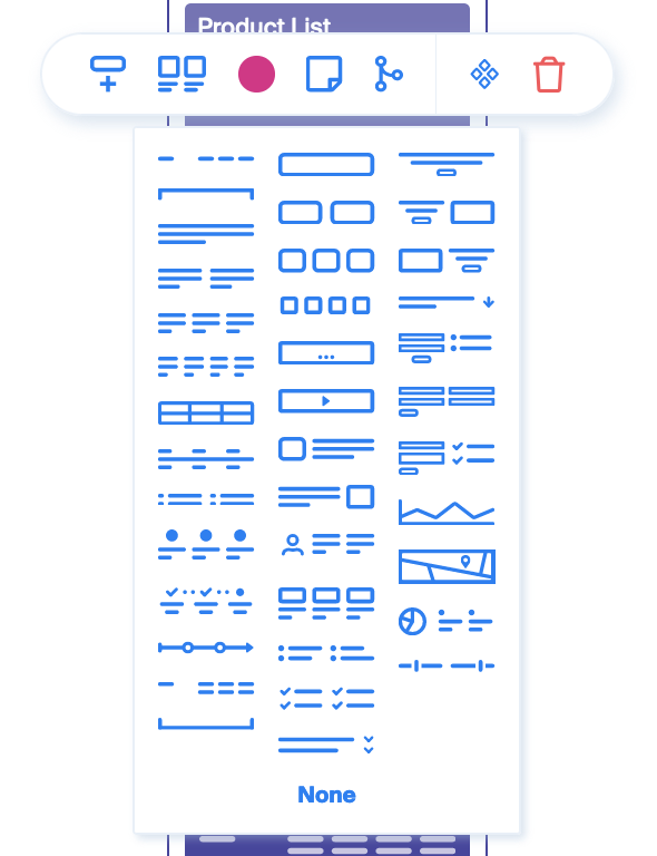
As you can see, each block of content you add to the page comes with several options next to this content-template option:
- You can pick a color of you choice and even give it a meaning with a legend.
- You can add a note, like the future textual content of this block, or a note at destination of your teammate, etc.
- You can also make a component a global symbol. If you are familiar with Figma or Sketch, it’s a synchronized master element that you can duplicate and modify at 1 place. Really handy, even if I had a hard time making it work.
I don’t know for you, but already here I was surprised by the tool, in a good way. Small but powerful, I thought at this moment. But wait for it, it’s not the end yet.
Add and image and estimation of costs to you visual sitemap
Sincerely, I didn’t use these features for the two projects I’m working on at the moment. I tried it out of curiosity, but I didn’t use it in a real situation.
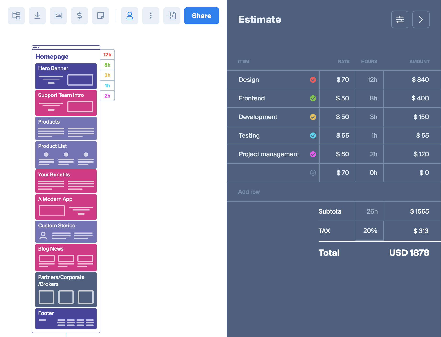
The costs estimation feature is pretty simple. You can activate a sidebar that allows you to add post of expenses on each page of the website, including everything you want as it is customizable. For example below on the image, you see for the homepage next to the template 5 lines of estimated time of work. On the right, you have a table with the items, rates, hours and total amount estimated.
Again, simple, but really handy and powerful I think. It reminds me of these years in web agency where estimations were real pain in the ass, and oftentimes not accurate at all!
The second feature I didn’t use was the image mode. It’s a mode where you can replace one “page” by an image. I don’t know why you would do that, I guess it’s to get from a low fidelity to a higher fidelity by keeping the sitemap very visual.
I talked earlier in this post about a direct link feature. When you click on a specific page, you have several other options like: add a note, add SEO-related informations, or also add a link to a webpage. Personally, I used this last option to put a direct link to Figma. But I suppose this would be great if we could combine a “link to design”, and a “link to current website page”.
That’s all for me on this tool. I’ll keep using it for my project and see if I can complete this article at the same time.
Don’t hesitate to share a comment if you are using it and found handy ways to use it I didn’t think about 😊
Post a comment for this article?
Follow comments and trackbacks