
Also available in:
I recently worked on several websites, and the request for a sticky menu was almost systematic. Sometimes it was justified, sometimes I approached the stereotypical ergonomic counter-example. But still! Let’s see together how we can do that.
The sticky menu concept
I like to start from an idea and lay down some elements on the paper so that I don’t go with my head down in the code. First of all, we all agree on the definition of the sticky menu? This is the thing that sticks to the top (often) of the page when scrolling down.
I want to split the content (HTML), the form (CSS) and the interactions (JS), and in that order precisely. So I’m going to forbid myself any form of animation or positioning in JS, I’m going to use CSS to do so.
The expected behavior is this: I have a header with a logo and a menu that are “classically” positioned. Beyond a certain scroll threshold in the page, I want to display the menu again to the user to allow faster access to it. First, the scroll value will be arbitrary (defined manually by us), then we will make sure that the menu only appears when the scroll has passed a certain element in the page. Finally, we will also see a variant where the menu only reappears if the user returns to the top of the page.
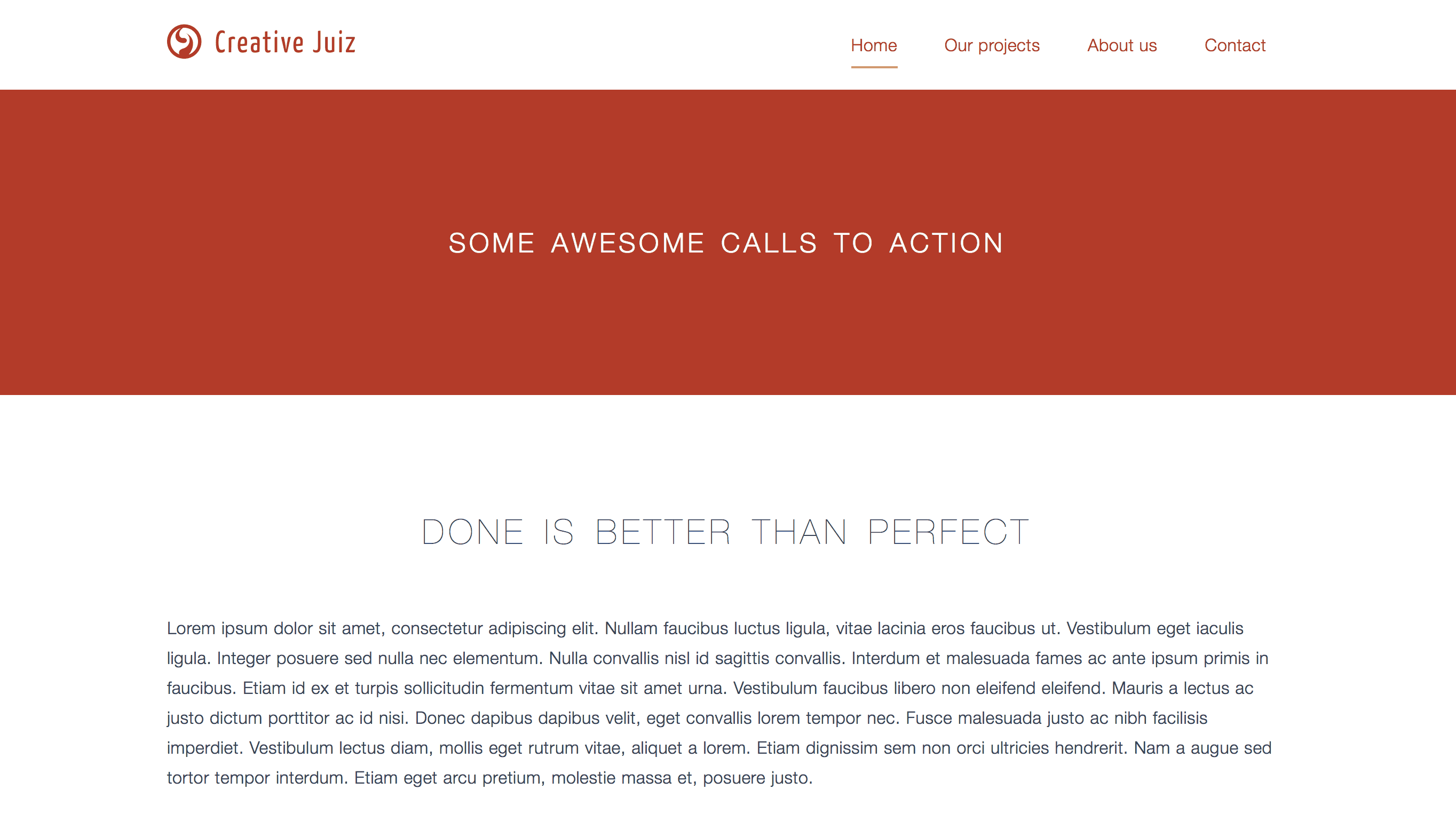
In the end we will have something like that:
Sticky menu structure
I invite you to use this menu structure, and possibly copy/paste the Lorem Ipsum from my demo page to get content and be able to scroll into your page.
<header id="header" role="banner" class="main-header">
	<div class="header-inner">

		<div class="header-logo">
			<img src="logo.png" alt="Creative Juiz" width="150" height="45">
		</div>

		<nav class="header-nav">
			<ul>
				<li><a href="#">Home</a></li>
				<li><a href="#">Our projects</a></li>
				<li><a href="#">About us</a></li>
				<li><a href="#">Contact</a></li>
			</ul>
		</nav>

	</div>
</header>
I use the <header> element with a banner role attribute to define the main header of my page. It is important to note that the id attribute of the header will be used in JS in order to quickly access the element. The rest of the markup is quite classical.
Styles of the sticky menu
Those styles will be rather brief and do not deal with the case of small screens. Ideally, the sticky aspect should only be “activated” on large enough screens and high enough to avoid obstructing the visibility of the content.
Let’s start by making a mini reset of some styles:
/* micro reset */
* {
	box-sizing: border-box;
}
html, body, ul {
	padding: 0; margin: 0;
}
Then define our basic styles. I will use the colors of my blog, do as you wish, of course.
/* Some basic styles */
body {
	font-family: Helvetica Neue, Helvetica, Arial, sans-serif;
	line-height: 1.75;
	color: #F1EEDD;
	background: #B13C2E;
}
.main-header {
	color: #B13C2E;
	background: #FFF;
}
You can refresh your page in your browser if you follow the tutorial as you go, so you will see exactly what changes we are making.
We will now place our elements on the same line. Instead of using floating positioning I decided to use table layout this time. It would also be possible to use flexbox, but you have to make a choice 🙂
/* Elements are placed one next to another */
.header-inner {
	display: table;
	width: 100%;
	max-width: 1100px;
	margin: 0 auto; /* centering the element */
	padding: 20px 25px; /* adding some space */
}
.header-inner > * {
	display: table-cell;
	vertical-align: middle;
}
By using this table positioning without using table-layout: fixed; on the parent, the cells will be sized according to the content of each one. Let’s take advantage of it!
We will now have to put our list of links on one line and space the items a little bit apart. We also need to align the menu on the right. I’ll show you a trick to avoid using the float property.
/* Align the menu */
.header-nav {
	text-align: right;
}
/*
   Put the menu in inline (inline-block, inline-table or inline-flex) to make it responsive to the text-align property
*/
.header-nav ul,
.header-nav li {
	display: inline;
	list-style: none;
}
.header-nav a {
	position: relative;
	display: inline-block;
	padding: 8px 20px;
	vertical-align: middle;
	font-weight: 300; /* between regular and light */
	letter-spacing: 0.025em;
	color: inherit;
	text-decoration: none;
}
On the links, I decided to do a little animation on the flyover (and focus): a line the size of the word will be added as it fades up to the word. For that I will use a pseudo-element ::after to generate a line.
/* Animating the link */
.header-nav a::after {
	content: "";
	position: absolute;
	bottom: 0; right: 20px; left: 20px;
	height: 2px;
	background-color: #B13C2E;

	/* Preparing the transition */
	opacity: 0;
	transform: translateY(5px);
	transition: all .4s;
}
.header-nav a:hover::after,
.header-nav a:focus::after {
	opacity: .6;
	transform: translateY(0);
}
/* I remove the outline effect because I already handle it */
.header-nav a:focus {
	outline: none;
}
Here we are, we have a minimalist header overall and the sticky aspect of our menu will be able to work thanks to JS. But before that, just a few parentheses.
Sticky menu: the position: sticky; CSS property
The CSS position property and its sticky value were introduced in CSS Level 3 but had a lot of trouble being implemented in our browsers, and even today (at the time of writing) only Firefox 32+ (and 41+ for Android), Safari 6.1+ (prefix -webkit-, and Safari iOS 6.1+) support it.
Chrome made an attempt between versions 23 and 36 as an experimental option to activate (flag), but has removed this flag in version 37.
This property value is kind of a mixture of the fixed value and the relative value.
Indeed, when you use the fixed value, you take the element out of the flow, i.e. the element you position will see its “box” output from the general positioning calculation of the elements in relation to each other. In other words, you pass this element on a new plane, it is then no longer counted on its original plane where the other elements live their little life without it.
If you want to try it in your browser, here is a short explanation (5 min) in video. It’s in french sorry (the original blog post is in my mother tongue) but the manipulation in the browser should be understandable.
Here is the code used:
/* If only… */
.main-header {
	position: sticky;
	top: 0;
}
But we will not use it for the rest of this tutorial.
A little bit of JavaScript
The JavaScript presented here is called “Vanilla”, i. e. the code is natively functional in your browsers and does not need jQuery or other framework to work. But it can still work if you use a JS library.
This code is normally functional from IE8 (not tested), but I would hope that none of my readers support this browser anymore. (I say this for your own good and the good of your customers)
To start your JS document, write this polyfill of requestAnimationFrame().
/*
	RequestAnimationFrame Polyfill

	http://paulirish.com/2011/requestanimationframe-for-smart-animating/
	http://my.opera.com/emoller/blog/2011/12/20/requestanimationframe-for-smart-er-animating
	by Erik Möller, fixes from Paul Irish and Tino Zijdel

	MIT license
 */

(function() {
	var lastTime = 0;
	var vendors = ['ms', 'moz', 'webkit', 'o'];
	for(var x = 0; x < vendors.length && !window.requestAnimationFrame; ++x) {
		window.requestAnimationFrame = window[vendors[x]+'RequestAnimationFrame'];
		window.cancelAnimationFrame = window[vendors[x]+'CancelAnimationFrame'] || window[vendors[x]+'CancelRequestAnimationFrame'];
	}

	if ( ! window.requestAnimationFrame ) {
		window.requestAnimationFrame = function(callback, element) {
			var currTime = new Date().getTime();
			var timeToCall = Math.max(0, 16 - (currTime - lastTime));
			var id = window.setTimeout(function() { callback(currTime + timeToCall); },
			timeToCall);
			lastTime = currTime + timeToCall;
			return id;
		};
	}

	if ( ! window.cancelAnimationFrame ) {
		window.cancelAnimationFrame = function(id) {
			clearTimeout(id);
		};
	}
}());
I’m not going to detail this code, but to make it short if your browser doesn’t recognize the native functions requestAnimationFrame() and cancelAnimationFrame(), we create them based on a setTimeout(). We had already seen a similar method on the article: A more efficient onresize or onscroll in JS.
Let’s start by writing our code while protecting it. Below, w and d correspond to window and document:
(function(w,d,undefined){

	// Here our incoming JS code

}(window, document));
The code that we will execute in this way will be protected from other scripts to avoid conflicts.
Therefore, place the following code instead of the commentary on the previous code.
var el_html = d.documentElement,
	el_body = d.getElementsByTagName('body')[0],
	header = d.getElementById('header'),
	menuIsStuck = function() {
		// We are going to complete here
	},
	onScrolling = function() {
		// we execute our menuIsStuck()
		// inside the onScrolling() function
		menuIsStuck();
		// we could do lot more here
	};

// When we scroll.
w.addEventListener('scroll', function(){
	// We also execute onScrolling()
	w.requestAnimationFrame( onScrolling );
});
Let’s detail this code together.
The first 11 lines (the first large block) are used to declare four variables, two of which are actually functions.
el_html corresponds to the node html and header is the node of our header that we will position in sticky later.
The menuIsStuck function will allow us to do the positioning calculations in the page to paste/take off our header at the right time. It is in this function that we will place the next piece of JS code.
The onScrolling function will be triggered at the moment of scrolling in the page, and will execute the menuIsStuck function. I am used to encapsulating some functions in a more global one, especially when I need to execute several functions during the same event or when some variables are shared between functions.
The following block is used to declare the event listener, here for the scroll event. As soon as a scroll is performed, the requestAnimationFrame() function will execute the onScrolling function. This first function allows you to perform an action as often as possible according to the browser’s capabilities.
Let’s complete our menuIsStuck function by replacing the comment with this code:
var wScrollTop	= w.pageYOffset || el_body.scrollTop,
	regexp		= /(nav\-is\-stuck)/i,
	classFound	= el_html.className.match( regexp ),
	navHeight	= header.offsetHeight,
	bodyRect	= el_body.getBoundingClientRect(),
	scrollValue	= 600;

// if scroll less than 600 AND
// the class nav-is-stuck doesn't exist on HTML
if ( wScrollTop > scrollValue && !classFound ) {
	el_html.className = el_html.className + ' nav-is-stuck';
	el_body.style.paddingTop = navHeight + 'px';
}

// if the scroll less thant 2 AND
// the class nav-is-stuck exists
if ( wScrollTop < 2 && classFound ) {
	el_html.className = el_html.className.replace( regexp, '' );
	el_body.style.paddingTop = '0';
}
Here we have three main blocks of code: a declaration of various and varied variables, and two controls.
The declaration brings together all our needs in calculations and variables.
wScrollTopis the position of our scroll in the page.regexpallows us to record the regular expression that will be used to detect thenav-is-stuckCSS class we will use.classFoundrecords whether or not the HTML element carries our CSS class.navHeightrecords the height of our header (yes it can vary).bodyRectreturns several values related to our body element (such as width, height, position in the page, etc.).scrollValueis the distance we have chosen to trigger the sticky effect, i.e. here 600px.
Once these variables have been recorded or updated (some of them will be updated with each scroll movement), we perform two checks that theoretically cannot be “true” at the same time.
The first check is to check when you reach the scroll threshold you have declared. As soon as this is the case, we add the nav-is-stuck class on the HTML element and we add a padding to body equivalent to the height of the header. Indeed, if we don’t do this padding addition, we will end up with an edge effect (a strange jump) due to the output of the header flow. (see video above)
The second check is to check when you get to the top of the page. As soon as this is the case, we remove the class and the padding to put the header back in the flow, at its original position.
In both cases, before adding the class and padding, we simply check that the class is not already present, it avoids doing the action unnecessarily. Ditto in the other direction, before removing it, we check if it has not already been removed.
Here is the complete JS code for this part, without the polyfill.
(function(w,d,undefined){

	var el_html = d.documentElement,
		el_body = d.getElementsByTagName('body')[0],
		header = d.getElementById('header'),
		menuIsStuck = function() {


			var wScrollTop	= w.pageYOffset || el_body.scrollTop,
				regexp		= /(nav\-is\-stuck)/i,
				classFound	= el_html.className.match( regexp ),
				navHeight	= header.offsetHeight,
				bodyRect	= el_body.getBoundingClientRect(),
				scrollValue	= 600;

			if ( wScrollTop > scrollValue && !classFound ) {
				el_html.className = el_html.className + ' nav-is-stuck';
				el_body.style.paddingTop = navHeight + 'px';
			}

			if ( wScrollTop < 2 && classFound ) {
				el_html.className = el_html.className.replace( regexp, '' );
				el_body.style.paddingTop = '0';
			}

		},
		onScrolling = function() {
			menuIsStuck();
		};

	w.addEventListener('scroll', function(){
		w.requestAnimationFrame( onScrolling );
	});

}(window, document));
It’s a long time to explain for me and maybe to process for you, but finally it’s not a lot of code to write:)
Okay. We still don’t have a sticky with that, just a CSS class changed and an extra padding. Let’s move on to the CSS addition.
Our animated sticky menu
We will only use CSS to make our animation, and if CSS animation is not understood by the browser (which is becoming rare), well it will not, quite simply.
.nav-is-stuck .main-header {
	position: fixed;
	top: 0;
	left: 0;
	right: 0;
	box-shadow: 0 1px 4px rgba(0, 0, 0, 0.15);
	animation: stickAnim .3s;
}

@keyframes stickAnim {
	0% {
		transform: translateY(-86px);
	}
	100% {
		transform: translateY(0);
	}
}
As soon as the HTML element has the nav-is-stuck class, I can target the header using the descent selector and fix it. While staring at it, I assign it the stickAnim animation declared just after.
This animation makes a CSS translation in Y from -86px (about the height of the menu) to 0, its original location. This gives us the exact effect of the demo.
Instead of fixed value, you can use percentage value on Y animation because the 100% value is equal to the height of the item moved. Think about it ;p
There you go, you’ve reached the end of this tutorial!
For the bravest, we will see a small addition to our JS code to define the sticky trigger only when the scroll reaches another element of the page.
Bonus: Trigger the sticky when it reaches an element
It will be a matter of making the value of the scrollValue variable dynamic by replacing it with the pixel value of the triggering HTML element. In my demo code, I defined several other sections and HTML elements. I invite you to do the same: assign an identifier (id attribute) to one of these elements, we will need it.
In the onScrolling() function, locate the call to menuIsStuck() and add in parameter d.getElementById('YOUR_ID') where YOUR_ID is the identifier of the triggering HTML element.
The function then looks like this:
onScrolling = function() {
	menuIsStuck( d.getElementById('main') );
};
We need to add this parameter to our menuIsStuck function (earlier in the code). The line that declares the function then looks like this:
menuIsStuck = function(triggerElement) {This triggerElement variable is recoverable as it is in our code inside the function. All we have to do is edit the value of the srollValue variable as follows:
scrollValue = triggerElement ? triggerElement.getBoundingClientRect().top - bodyRect.top - navHeight : 600,Does that mean anything to you? I could understand that it doesn’t. But let’s detail. It is a ternary operator, which is represented in this form:
variable = condition ? value_if_true : value_if_falseIn our case we check that triggerElement is something, if it is the case we do a clever calculation to get the “top” value of the element, otherwise we use our arbitrary value of 600 pixels.
That’s all!
Bonus: Make the menu appear when you go back up in the page
The second little bonus I suggested to you is to make the menu appear in sticky only when the user decides to go back up in the page, so when he scrolls up.
We will have to edit our JS code again. Let’s start by slightly editing our variable declaration at the very beginning of the code.
You normally have the same thing at the beginning of this code block, just add the line about lastScroll.
var el_html = d.documentElement,
	el_body = d.getElementsByTagName('body')[0],
	header = d.getElementById('header'),
	lastScroll = w.pageYOffset || el_body.scrollTop,
This allows us to initialize the value of this variable. Often this will correspond to 0, the top of the page.
Now we will use this variable in the onScrolling() function as follows:
onScrolling = function() {
	// get the scroll value right now
	var wScrollTop = w.pageYOffset || el_body.scrollTop;

	// we add to parameters, values of scrolling
	menuIsStuck( d.getElementById('main'), wScrollTop, lastScroll );

	// we save our last scroll value
	lastScroll = wScrollTop;

};
Here we add a line before and a line after our call to menuIsStuck() to get the current value of the scroll, then save this value as the old scroll value, this will allow us to know if we go up or down when we move in the page.
Our menuIsStuck() function now has 3 parameters: the target element, the scroll value and the previous scroll value. It is therefore necessary to edit our function to use these parameters.
menuIsStuck = function(triggerElement, wScrollTop, lastScroll) {On the line of the declaration, you add these two parameters.
Just below, remove the declaration from wScrollTop, it duplicates now, we already have it as a parameter. (do not delete the var)
Keep everything else, we just need to change our two controls (the ifs). Basically, we have to add the conditions “if we go up” and “if we go down”. We will only display our menu if we go down, and if we have reached our threshold (same threshold as before), our first control will therefore be transformed into :
if ( wScrollTop > scrollValFix && !classFound && wScrollTop < lastScroll ) {Here wScrollTop < lastScroll allows to say “going up”.
The second control will look like that:
if ( classFound && wScrollTop > lastScroll ) {And that’s it, our sticky menu now appears only when you go up in the page, and disappears if you go down.
I hope you enjoyed this long tutorial. Feel free to comment to share your essays and demos with us.
And if coding bothers you, there is the right Headroom.js plugin.


Post a comment for this article?
Follow comments and trackbacks