
Also available in:
In the past, I worked on several projects looking for a way to deal with custom styles proposed by some good designers to change the aspect like border color, check icon, animation, of form controls like checkbox, radio, file input, etc. As you may know, these elements are historically not style-able for accessibility reasons. (as I’ve heard). Still. I have a way to code custom accessible checkboxes and radio buttons for all devices. Ready?
Pieces of code and styles I will show you use CSS level 3 selectors. Old browsers are not concerned by the changes I’m going to propose. An automatic fallback to the classical old styles will benefit to these old engines, just in case your user is still using an old device or not on modern browsers.
This blog post is a translation from the 2013 original post written in french. The technique used here is still used in production and works really fine for all your users.
Why would we style checkboxes or radio buttons?
To harmonize styles between browsers, for sure, but also to make some of them more effective in precise contexts. One of the most common need (to me) of using CSS on a native checkbox to improve default styling, is to improve accessibility in a “touch devices context” for the user with no accurate gesture. Tap-able area for checkbox and radio are often so small, too small. And the default border is barely visible on the default checkboxes..
Also, color contrasts on default checkboxes on Mac for instance, are really poor. I can’t even understand why it is so badly designed. That’s why I consider this cool checkbox also a good way to improve user experience.
Maybe your goal is elsewhere, so I’m not gonna go deeper into the reasons, let’s jump into my technical solution.
Slightly modify the checkbox design
With this example, we will write a solid code base for our CSS. It will give me the possibility to explain how selectors are working with these simple checkboxes.
What I want to get as checkbox design.
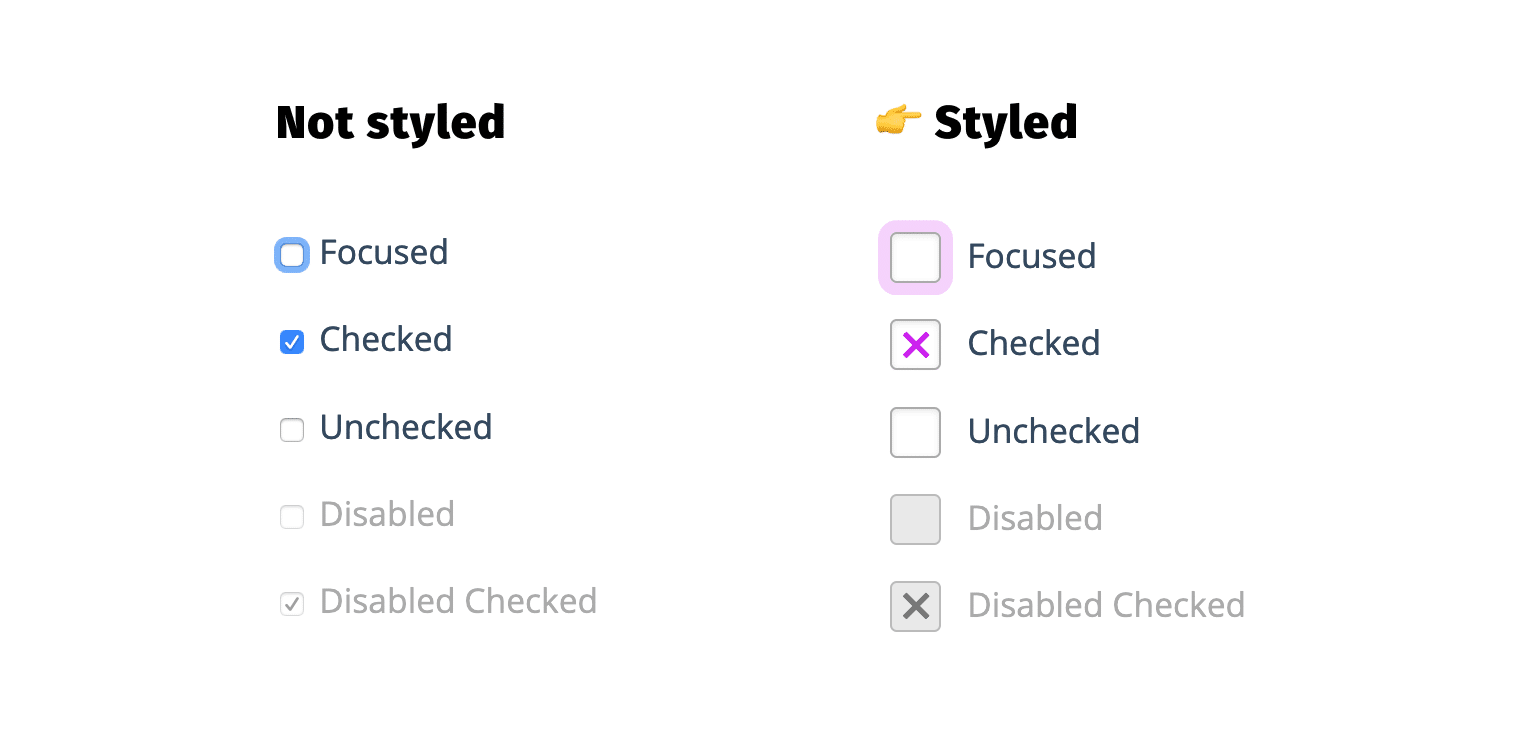
As you can see, these are simple checkboxes, without complex layout: a colored border, a check icon and even some focus styles I’m going to detail in the code.
HTML – Checkbox code base
Let’s start with the HTML code. A simply composed code with one label and one input in each p.
You have now in the order 4 checkboxes: 1 empty, 1 checked and 1 disabled and 1 disabled checked. For the focus styles, you’ll need to use the tab key will testing the page, but let’s style it before that.
Please be careful with the ID and FOR attributes. You have to “link” label and checkbox together thanks to these attributes, by giving them the same value. It’s mandatory for accessibility reason, and for the trick to work. The bonus effect is that on clicking the label, the switch will work too.
Note that the code doesn’t use span elements. However, span could be useful for more complex checkbox design solutions. We don’t use checkbox image neither, that’s for other kind of concepts.
CSS – Customize checkboxes
The input:checkbox element is not style-able, not that much, not enough. We will play with the styles of the label element and its two pseudo-elements as we voluntarily didn’t used spanelements.
It’s precisely in those selectors that you will find the magic: It’ll display custom checkbox with my recent browser, and classical ones with my old browser. If you don’t need to support old browser (below IE11), you can use a easier to write code.
As you can see, the selectors are simpler, I removed all the :not(:checked) and :checked part I used to make sure Internet Explorer doesn’t understand the whole selector. Otherwise it tooks only part of the style and it makes it unusable for IE users.
A bit of explanation in the code itself: The first declaration allows you to place the checkbox under the upcoming custom checkbox to hide it visually without using display:none; or opacity: 0; and to preserve readability for screen readers. The second one makes the label element more attractive. The space is done to fit the future checkbox size.
The relative position is useful here to precisely place the checkbox (the label becoming the reference).
Targetting only recent browsers
All our custom styles will use this type of selector: [type="checkbox"]:checked or [type="checkbox"]:not(:checked) in there declaration. Which means if the web browser doesn’t recognize the selector, these styles will not be applied. It’s a kind of feature detection thanks to the selector.
If you don’t have to support IE below version 11, use the second syntax I provided just above.
Create the custom CSS checkboxes
Now, we will visually create the checkboxes thanks to ::after (the check symbol) and ::before (to make the box) pseudo-elements.
The first two declarations are for the box and the check symbol aspects (size, color, etc). The two next define the states: not-checked or checked. An animation is played because of the transition property.
We need the checkbox label to make use of our pseudo – elements because input elements like checkbox element usually don’t support pseudo – elements, because inputs are “widgets” for our browsers.
Styling different checkbox states
Basics done, now we will set the other status: disabled, disabled checked, focused). Find below some styling ideas, but feel free to edit them.
That’s all for these custom styles.
Don’t forget to use vendor prefix with some of the CSS3 properties if you still need to support those.
As you can see, I didn’t use icon fonts here, but if yo already use one on your site, use the decorative icon that correspond to your style.
Same for the focus styles, you can adjust the interaction effect using a different focus outline, or dotted borders or any style that would match your identity. If the border is too complex to style, you can use the outline property (which will soon respect the border radius, good for your radio fields too).
And with this CSS and HTML code, we made the checkbox accessible. Pretty neat for a fake checkbox isn’t it? It’s even compatible with touch devices and assistive technology.
With CSS Design Checkbox that are more advanced
I will not explain everything about this demonstration, the idea is exactly the same. You can now compose a more complex HTML code using span for instance, and the same logic, pseudo-classes and pseudo-elements.
Here another idea of what you can do with this code, with this accessible switch demonstration.

These two demonstrations are using respectively em and pixel unit (px) to make examples more understandable for this last one. You should try with em, % or rem to create a more flexible and maintainable code for these toggle switches, depending on your experience and web project.
We didn’t use background images for obvious quality and accessibility reasons, but you could replace this idea of background images with SVG icon, like this demo that uses an smooth ease animation.
Styling Radio Buttons
Hey! Now you got the idea and this example of code with checkboxes, I’m sure you can handle it with radio buttons or toggle switches. I won’t go into the code, but if you need any advice, jump into the comments section or reach me on Twitter. I’ll help you 😊
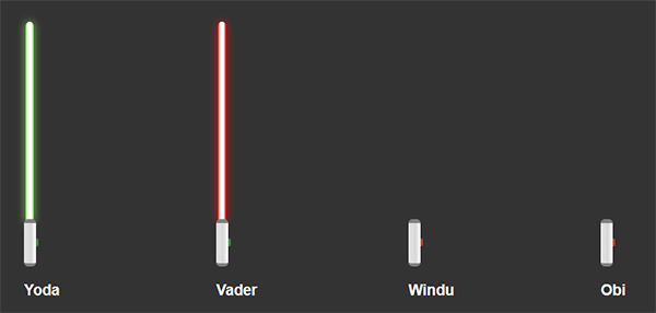
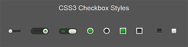
Looking for ideas?
Now you can do what you want with checkboxes (or radio), find below so inspiration to go further.

And yes, really, you can do the same with radio buttons. Did you try?
If you want to learn more on readable, usable and accessible forms, read this article about forms by Geri Reid.
Share the post "How to code customized checkbox and radio buttons with CSS"

Post a comment for this article?
Follow comments and trackbacks