Also available in:
When you need to work on interfaces, color contrast is a real thing you have to take into account to make it accessible. You have the right to be afraid of losing part of the aesthetics of your beautifully well designed interface, and you are right if you are used to poor contrast ratio. Accessibility comes with its constraint, but not much more than UX (User Experience) Design.
Definitions
I would like to start with my definitions of Accessibility and User Experience. I know the definition of both is quite complex and not always shared by the experts, so sorry not sorry, I’ll give it a try.
User Experience
The User Experience is the feeling, the attempts, the hope, the actions, the failure and success, the frustration, the memory, etc. a person has with a product or a service. Depending on the goal you want to reach, this experience can be bad or good. Even with the idea of reaching a bad experience, it could totally be on purpose by the designer of this experience. Oftentime as a designer you tend to provide a memorable experience in a good way to make your users understand, use and love the product/interface. Making interfaces usable comes with the need to understand a specific group of people so that you can help them achieve a precise task with efficiency, effectiveness and satisfaction.
Accessibility
In our domain, Accessibility is the practice of making websites or application usable by as many people as possible. We often think it’s applicable to only people with disabilities, which is by definition the case, but it definitely benefits other groups of people in some specific cases or context.
Where user experience tend to satisfy a precise group of people, accessibility tends to include as many people as possible in a common good experience, but both are not mutually exclusive.
The Myths of Color Contrast Accessibility
This blog post is an answer to this eponymous article.
I would like to thank Anthony for pointing out some of the things that seem to be myths around the designer community. I personally discovered some of them by reading the article.
The issue is perhaps not so much what Anthony says but the way in which he says it – it makes you think that you shouldn’t trust one of the most known Accessibility Guidelines (WCAG), because it is not what users need.
The article guide readers through several visual examples with one solution that is supposed to be accessible, and one that is supposed to be inaccessible, arguing that the inaccessible solution is preferred by people with disabilities. That leads you to a false risky conclusion: could the inaccessible solution be a better (the best?) solution?
I want to work and guide you on a better path: analyze the issue and find a better solution for each example demonstrated by Anthony. This guide should help you better understand some principles around color, available solutions, and tips to really test your hypothesis.
Myth 1: The WCAG requirements are always optimal
Indeed they are not. As the name said, WCAG are only guidelines to help designer and developers build better interfaces. When you start building your design with colors, both people’s tastes and user needs will bother your sense of beauty and your feelings about what is delightful or not.
Anyway, designing is neither about your preferences nor about your taste. It’s about usability and matching the user needs. Most of the time, color is not essential in terms of usability. Start with fifty shades of gray compositions.
Some people I know are going way further than me: they design with black and white. (wink wink Inclusive-Components.design by Heydon)
The colors tested
But let’s back to our colored stuffs.
When you need to design accessible interfaces with colors, 2 things are not important:
- your ego, even if we will need a bit of your taste and expertise to compose the interface and find harmony,
- the brand color definition: if those are not accessible, change them. I don’t mean you should change the original brand color, but pick one close but more contrasted for your interface. Here we could use your taste to pick the good one 😀
I know that’s not always possible though. Another Idea could be alternative stylesheet, but to me it’s the last solution to keep both users and branding folks happy.
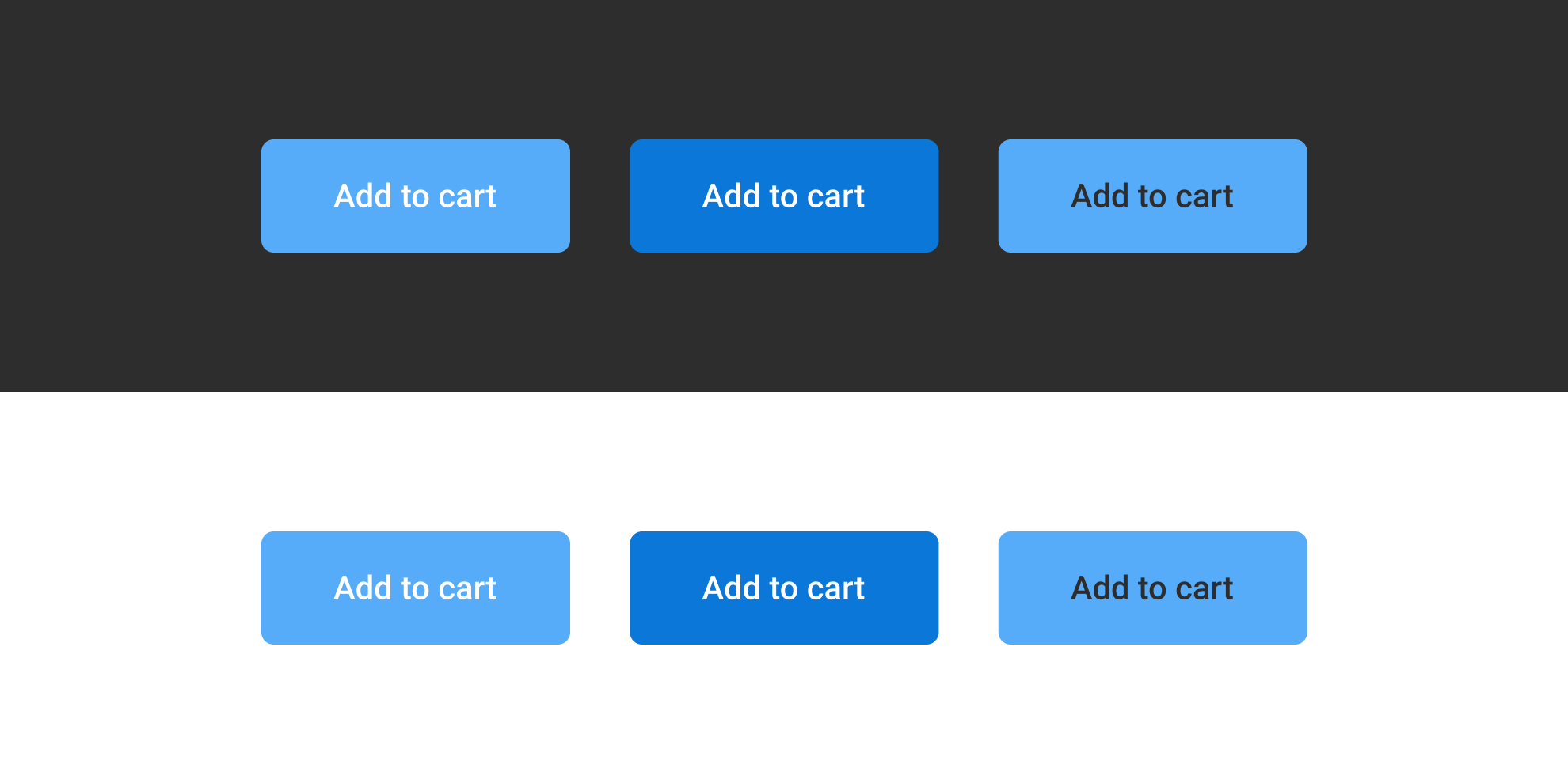
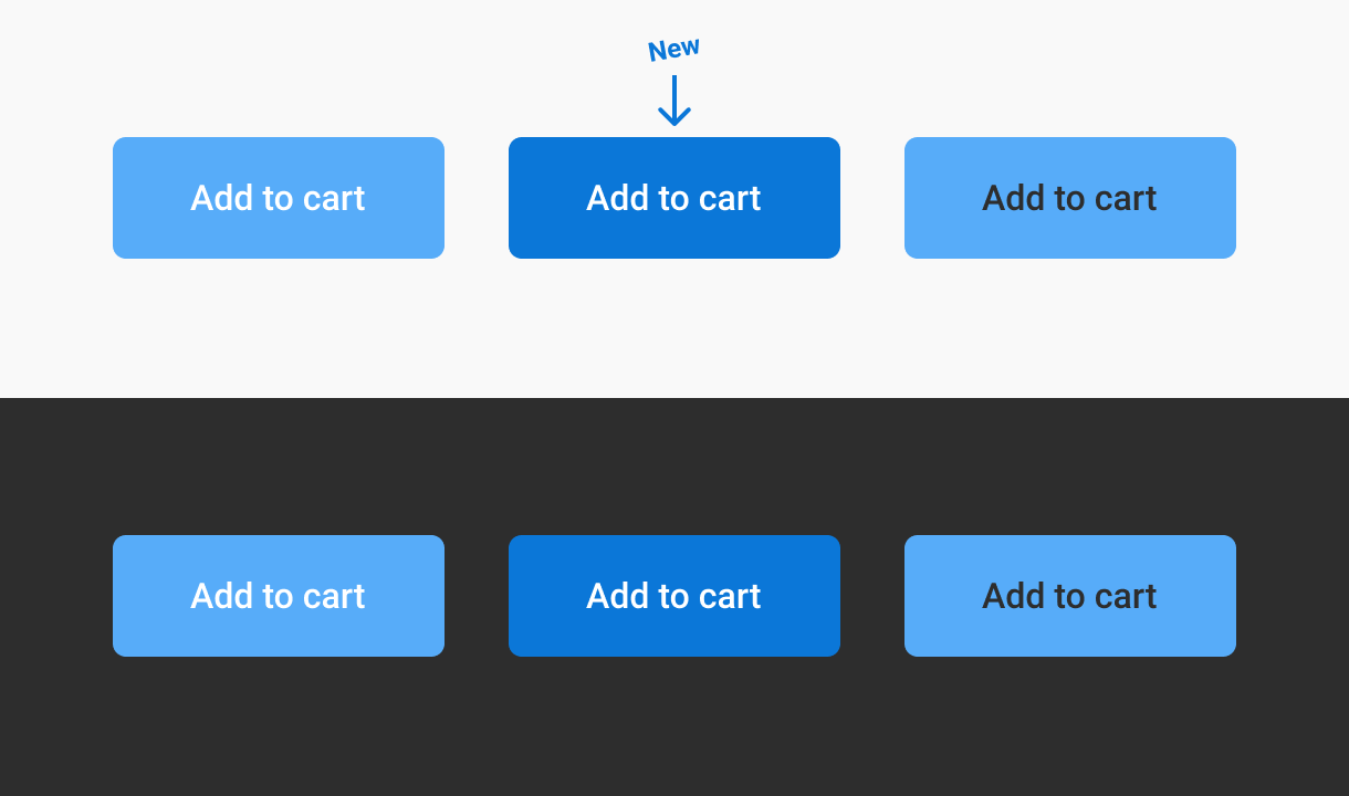
Let’s take the same example as Anthony.
I used white and dark background on this illustration because Anthony had the idea of making a poll using the dark image, but then argumenting on color contrast on his blog post with a white background.
Just for you to know: context changes the way you feel and read colored things. But that’s another topic (I take a quick shot at it later in this blog post). For the rest of the blog post, I’ll study those buttons with a light background. I won’t play with all the background colors, I’m pretty sure you get the idea with one example.
Here’s the data about the contrasts. Tests are made with a font size of 16px and a font weight of medium, because both of those text styles matter in the analysis:
- white on blue
White: #FFF, Blue: #57ACF9
Font-size: 16px – Font-Weight: medium.
Contrast ratio: 2.5:1 (minimum 4.5:1) - dark on blue
Dark: #2D2D2D, Blue: #57ACF9
Contrast ratio: 5.6:1 – (expected 4.5:1)
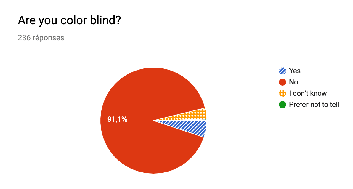
Looking to the “source” of a survey, the white text is preferred by the people who answered.
Well! I’ve got an issue with that. Considering the simple fact that almost 5% of the worldwide people are colorblind (consider a way bigger number if you include other visual impairment), and that 29% of the people who answered the poll prefer the accessible version… I don’t want to transpose or compare the numbers, but potentially the people who answered are colorblind, and even if they are not, some of them prefer the accessible version… a lot of them.
Another thing is that you can’t find the right solution by asking “do you prefer A or B”. You should ask: “How many people easily read A?” then on another separate question “How many people easily read B?”. And ideally, instead of a binary “easily read” question, you should probably even use a rating scale.
In Anthony’s case, I would say both of the solutions are not ok here, but why?
Maybe because the WCAG are using Maths for calculating things that are all about perception, and it’s a real issue. It has even been recorded as an issue on the WCAG Repository.
To go further, Anthony totally forgot the Brightness and Color differences, which is very important in color “contrast” analysis. It covers another aspect of color perception, also known as Irlen Syndrome: this syndrome is about high contrast sensitivity. I’d say that WCAG is talking about “color contrast”, but it’s not really about contrast and more about luminance difference between 2 colors. Anyway.
Brightness is not related to the contrast, it’s related to the perception of light. That’s why analyzing contrast where brightness act is kind of a non-sense.
Let’s go back to our set of colors.
- white on blue
Brightness difference: 107 (minimum 125)
Color difference: 277 (minimum 500) - dark on blue
Brightness difference: 103 (minimum 125)
Color difference: 353 (minimum 500)
Both have a lack of differences. That’s why dark on blue is still not enough to create a real difference when you ask people. They will be more likely to answer with taste preferences.
So yes, WCAG uses the wrong measure, but the proposed solutions are not correct at all. Let’s find out together how to improve a little bit the readability of our buttons.
How to fix color contrast?
If the preferred color seems to be white on blue, you would rather keep the white as text color and change for a better blue background to improve your contrast and color differentiation.
I love to play with Color.review, a useful tool that gives you indicators to help you pick the right accessible set of colors, with a projection of the rendering.
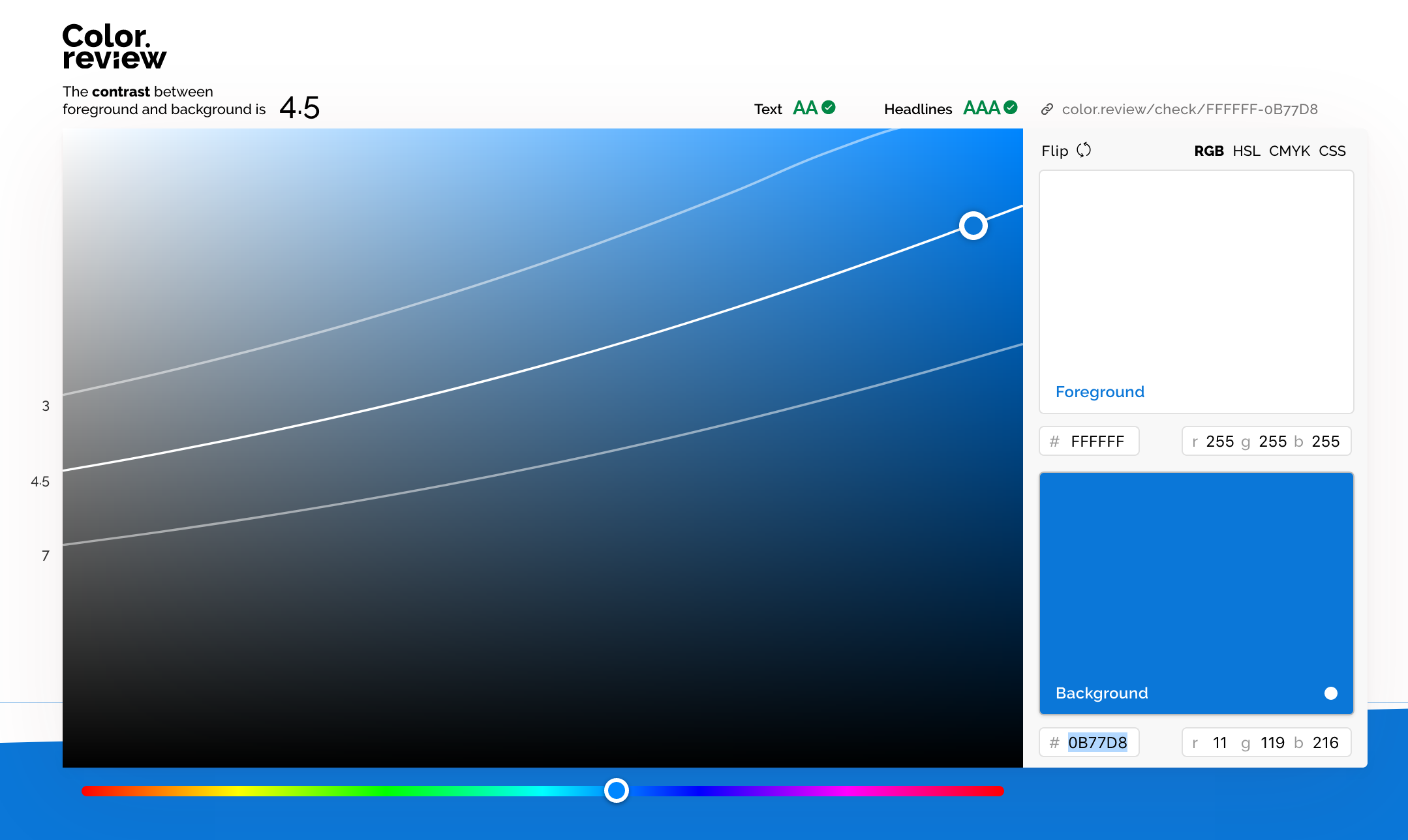
By playing a little bit with the blue, I finally find something respecting the AA requirements (intermediate level of accessibility requirements), and way better color and brightness differences.
With this new blue background, we get some new data that are way close to the expected WCAG requirements:
- NOT accessible white on blue
White: #FFF, Blue: #57ACF9
Contrast ratio: 2.5:1 (minimum 4.5:1)
Brightness difference: 107 (minimum 125)
Color difference: 277 (minimum 500) - Accessible white on blue
White: #FFF, Blue: #0B77D8
Contrast ratio: 4.5:1 (minimum 4.5:1)
Brightness difference: 158 (minimum 125)
Color difference: 419 (minimum 500)
And to confirm this is a real solution and not a matter of taste, I asked on a questionnaire about people’s preferences on readability, and I also asked I also asked the respondents if they were colorblind. See the next section for more detail on the numbers.
Comparative metrics
No surprise here: when you ask separately what is the more readable, people will be more likely to give you the “readability” answer and not only their taste in term of color. Anyway, here is some extracted data.
For each visual proposition of a button, I asked the same question: “Can you easily read the text on this button?”. For each, the same answer where available as a rating between 1 and 5, where 1 is “Not easily [readable]“, and 5 is “Yes I read it easily”
On the next graphs, you will see numbers between 1 and 5 on the horizontal axis, those are the rating of the visual proposition. On the vertical axis you will find the number of responses.
Proposal 1: Button with white text and blue light background
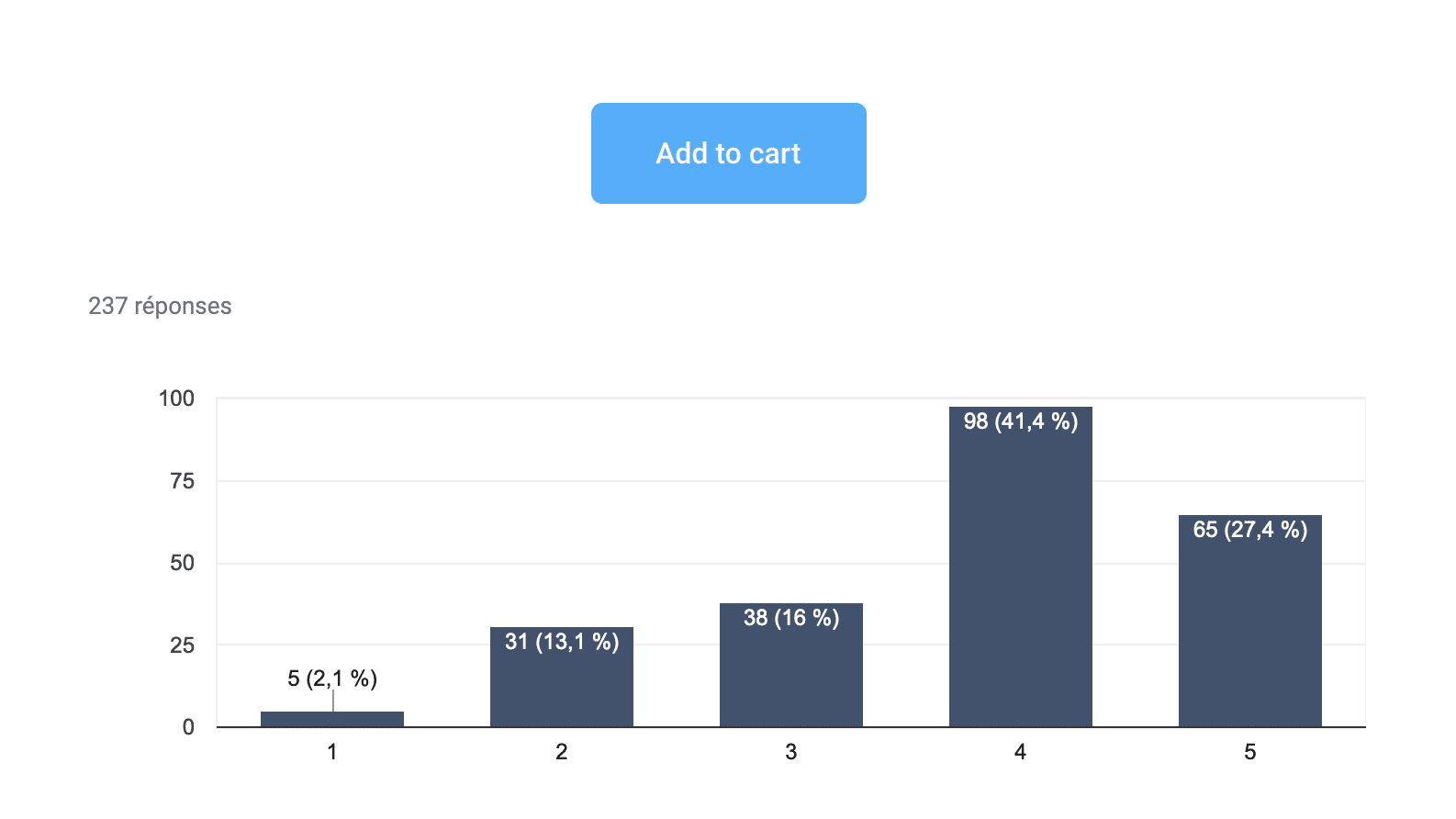
People are pretty at ease with this contrast, even if a lot are still rating less than 4/5 this visual.
Proposal 2: Button with dark text and blue light background
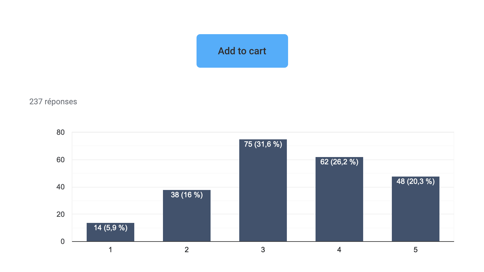
A big amount of mixed feelings here. This solution is not good at all if we want to reach our goal.
Proposal 3: Button with white text and blue accessible background
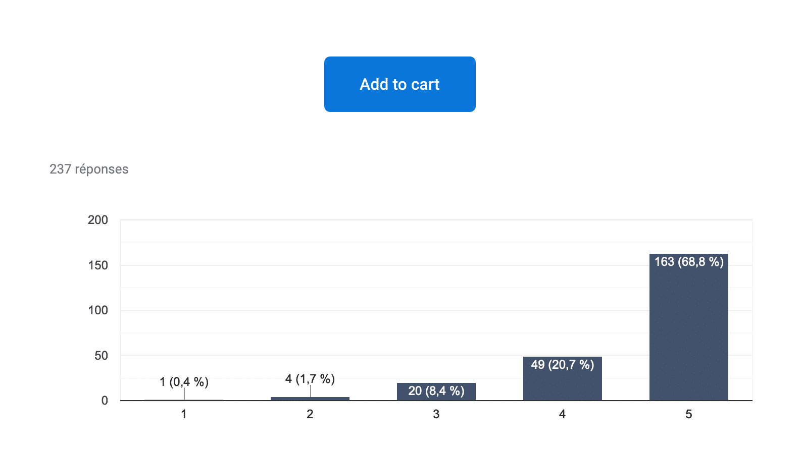
There is almost no debate on this solution. I think we did good.
Proposal 4: Button with white shadowed text and blue light background
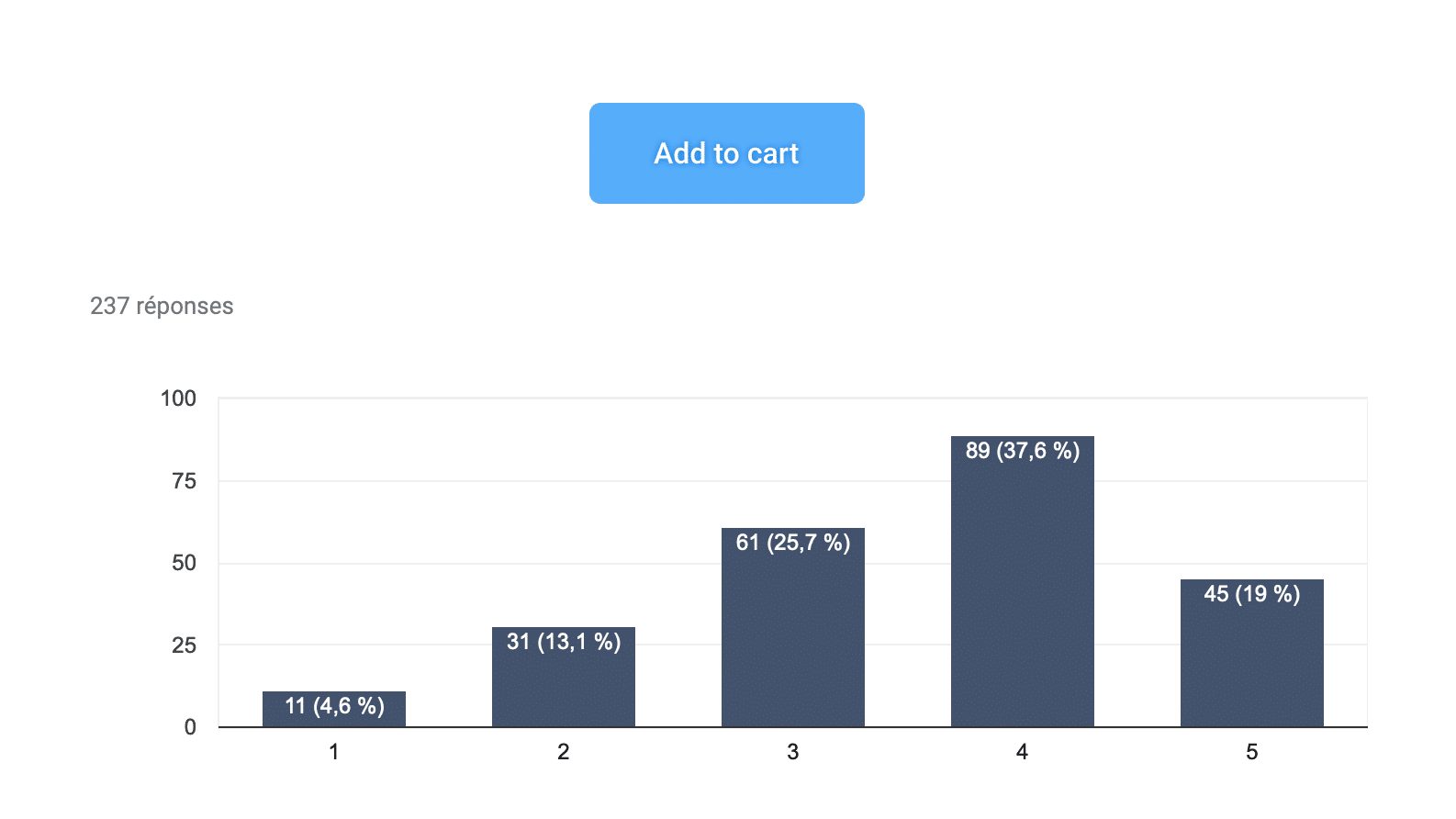
This last test wanted to solve the contrast problem by using a drop shadow under the text while keeping the set of non-accessible colors. This did not have the desired effect.
Arbitrarily, I’ll take for “readable enough” the percentage of people included in the upper range (4 and 5 points) to be able to compare our solutions.
- The more readable button
- Proposal 3 – Proposed more contrasted button.
Rating: 89.5% - Proposal 1 – Anthony’s inaccessible light blue with white text.
Rating: 68.8% - Proposal 4 – The text shadowed version.
Rating: 56,6% - Proposal 2 – Anthony’s accessible version with dark text.
Rating: 46,5%
- Proposal 3 – Proposed more contrasted button.
- Colorblind Preferences
- Proposal 3 – The proposition I made in term for contrast with the white text.
Rating: 45 – 90% - Proposal 1 – Anthony’s inaccessible light blue with white text.
Rating: 40 – 80% - Proposal 4 – The text shadowed version.
Rating: 35 – 50% - Proposal 2 – Anthony’s accessible version with dark text.
Rating: 35 – 50%
- Proposal 3 – The proposition I made in term for contrast with the white text.
The result is all about accessibility here: we succeed at proposing a solution which makes the button readable by 89.5% of the population if we keep only the 4 and 5 ratings, and 90% of the people with colorblindness. (the ratings would probably have been closer with more voters.)
While you’ll likely never find a solution that works for 100%, your job as a designer is to include as many people as you can – and if you’re not sure, give them control over your interface.
Going Further with Color Contrast
When people think about color accessibility, they usually come with the idea that their design will end up ugly. I don’t really know where does this idea come from, but I’m really curious about that.
As a designer, you already know that design is always about working within some kinds of constraints
- a more or less precise budget
- a certain type of material
- a limited space (smartphone, tablette, small areas if you are into home staging for example)
- etc.
Accessibility should only by another constraint, and like the others, should be seen as a focus for creativity and not a blocker.
Daryl Koopersmith and Wilson Miner wrote a pretty good blog post on Designing Accessible Color Systems. It’s a good example of how you can work on your color system to make it accessible and build efficient components with it.
PS. I heard some stuff about Stripe not being accessible for Screen Readers. That’s another topic, baby steps are better than nothing.
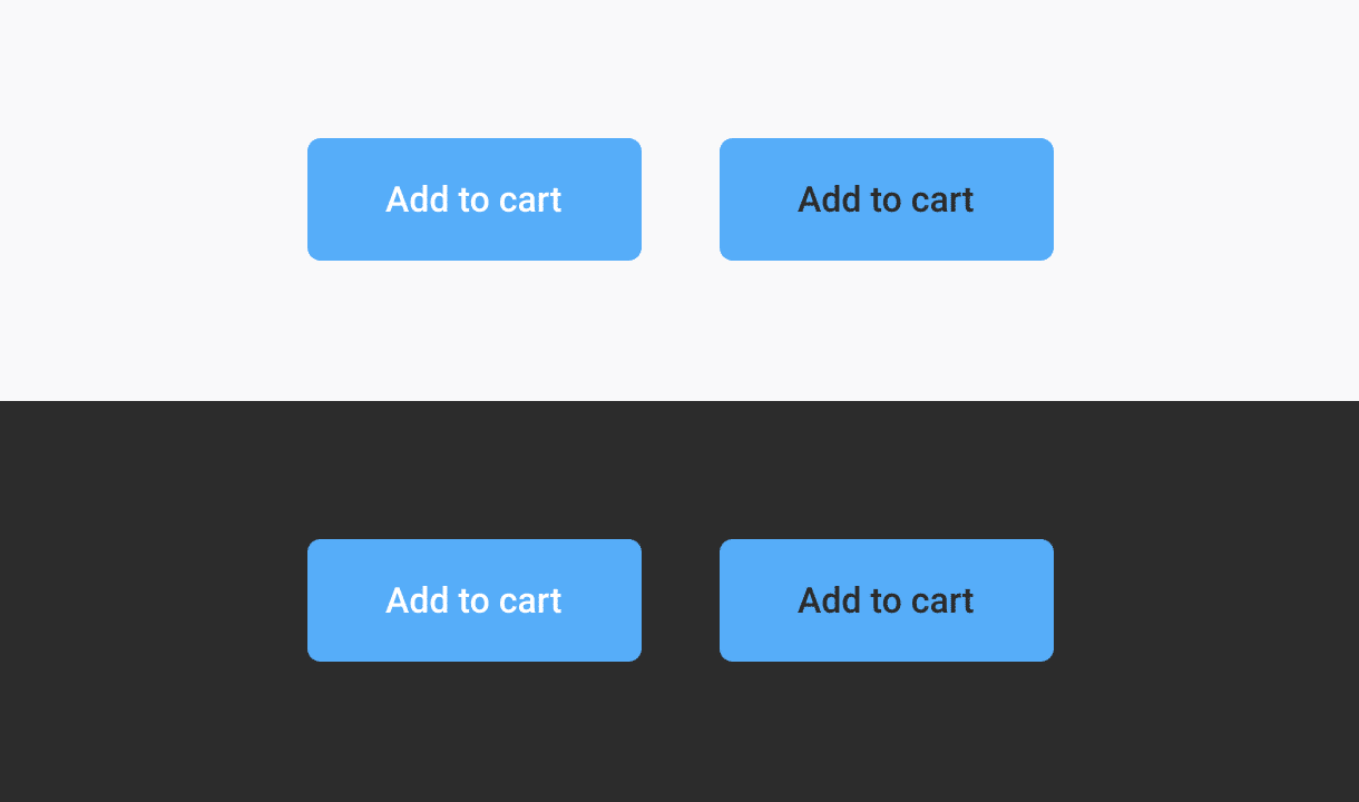
About context: Dark interface VS Light interface
I told you earlier that the buttons tested were on white background but I have shown you 2 different backgrounds on purpose.
The context can demonstrate the perceptive aspect of the color and its interpretation by your eyes and you brain. Color perception is a complex thing referencing under the abbreviation of HVS (Human Visual System model).
To quickly explain my point here, when you have a light interface, a blue button and a white text, your eye doesn’t really need to adjust. At the opposite, working with dark text on the button will ask your eye to adjust a little bit more and will be perceived harder to read. Supposedly.
It’s a bit like when you’re in a bright room and you pass by a dark room, it takes a while for your eyes to adjust to the lack of light to start drawing the contours of objects.
As I said the perception and the brain are complex things.
Myth 2: Text needs to meet the AAA requirement, or it’s inaccessible
Despite the fact that I never heard of that myth before, the minimum required for most of the European Administration website is AA.
[…] in the EU Member States are obliged by law to ensure that the information they publish is subject to accessibility standards, in particular the Web Content Accessibility Guidelines (WCAG) AA standards.
—Source
Patrick H. Lauke, himself described as WCAG trash panda, Web Standards and Accessibility expert, explained it to me in overly simplified terms:
“The core point of A/AA/AAA is that they are separate levels of compliance. and they cover things based on population affected and how critical a failure of a criterion is. A affects a lot of people and will be a very detrimental/critical problem. AAA will affect a relatively smaller percentage of the population, is is likely less of a show-stopper and more of a surmountable but annoying issue that will disproportionally affects that particular user population. Also, AAA are generally criteria that require more fundamental changes (in design/layout/etc) to address. So the myth is right only in that “you need to meet AAA requirements if you want to claim AAA compliance and be accessible to the widest audience”. AA is generally accepted as the baseline. AAA goes above and beyond, to help people with more severe visual conditions.”
Again, the goal with the minimum is to encourage people doing some effort for people in needs with better readability. If WCAG has 3 levels of requirements it’s to encourage you to go further and learn the benefits of being accessible. If you cover all the simple A requirements, it’s already a good job. Next step AA 😊
If you are told that AAA requirements is only for aged people (because they are “mostly” the only ones with a vision loss of 20/80) and people who don’t use screen-reader, just to give you an excuse not to meet those requirements, then you are not making things inclusive.
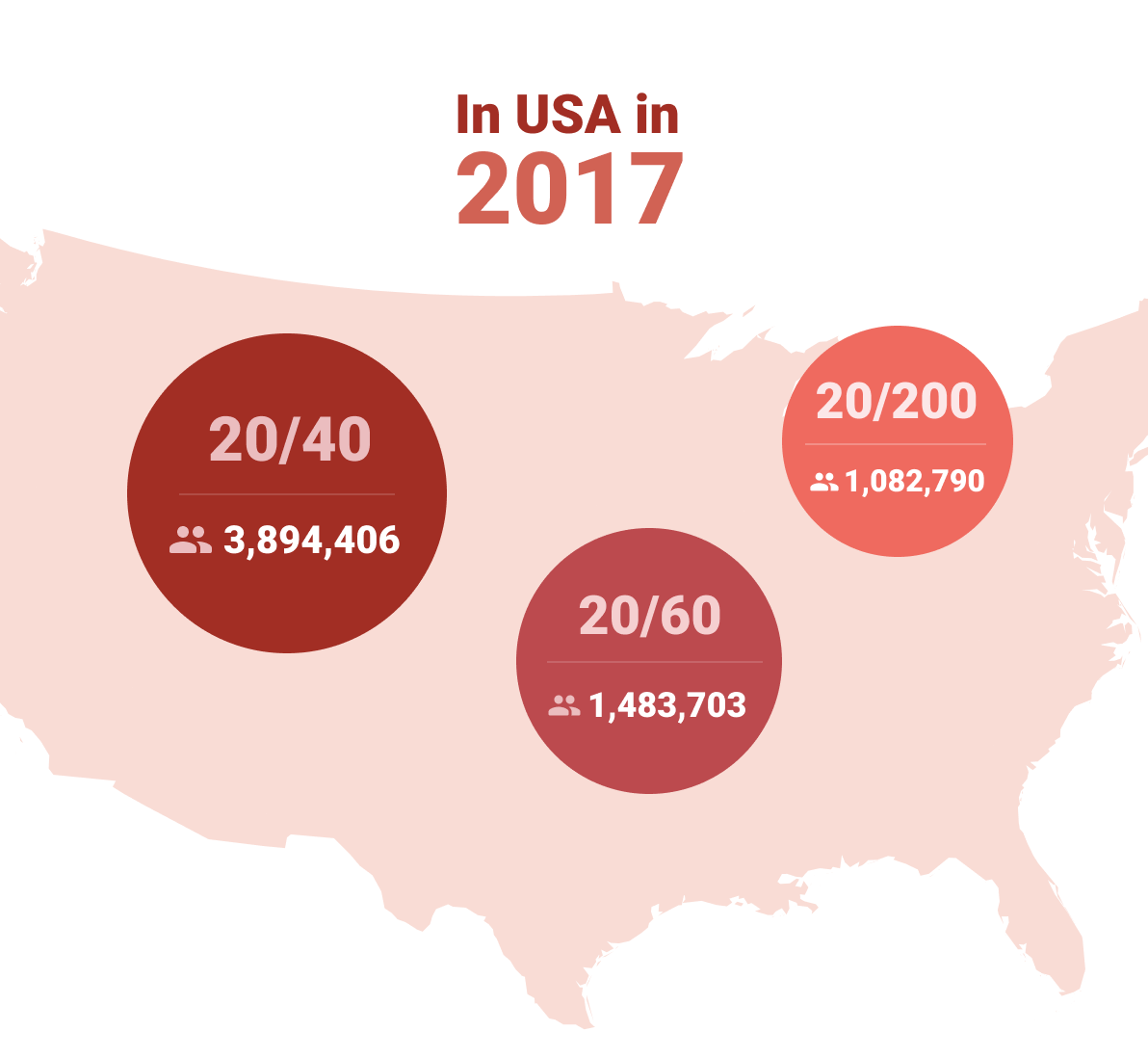
Furthermore my source seems to say that the number of people with impaired vision is about several million in the US. In 2017, 3 894 406 persons with visual impairment less than 20/40, 1 483 703 persons with less than 20/60, and 1 082 790 with 20/200 or less. And those impairments take into account people above 45 years old.
There are 2 good reasons for making things match the AA or AAA requirements:
- Your user research told you so.
- You want to be accessible and inclusive by default.
Use global studies to give you a tendency, but don’t get stuck at it: do your own research for your population/users.
Myth 3: Gray text and buttons are inaccessible and look disabled.
Depends.
In our recent user tests I conducted at Foyer, the first Insurance Company in Luxembourg, we had 100% of our testers ending up with the same behavior: thinking that gray buttons were disabled despite the effective contrast.
Sadly I can’t provide you the recordings or statistics here, but I can certainly give you the same advice: affordance comes with a lot of contextual parameters.
Oftentimes, gray buttons are used for secondary action or cancelling actions, action that are willfully less eye-catching to help user focus on what we expected them to do.
To do so, you can use another set of stylistic combination:
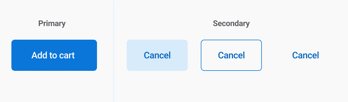
Your boundaries (border for example) don’t have to match a good contrast ratio since the text does.
If a button with text also has a colored border, since the border does not provide the only indication there is no contrast requirement beyond the text contrast.
—WCAG 1.4.3 – Contrast (Minimum)
Again, do your own research and don’t forget that you will make mistakes, and that’s totally fine! Learn from those mistakes.
Myth 4: Using a color cue alone isn’t sufficient in conveying information
This isn’t a myth, this is accessibility basics, and at some points it’s even a usability basic knowledge. This section take Use of Colors as reference, but also logical and cognitive disabilities into account.
You can’t take the topic of colors separately among the other various topics of accessibility and usability. Accessibility of your colors is only a small part of the field and have to be combined with other types of topics like cognitive impairment, mobility impairment or auditory impairment.
The accessibility requirement states that:
“color should not be used as the only visual means to convey information, indicate an action, or distinguish an element.”
However, this standard only applies to cases where different colors assign specific meanings to inform the user. In other words, if you’re using color differences to convey information you need an extra cue. This is made for visual impairment but also for cognitive impairment.
Anthony says “But if you’re using lightness and darkness to convey information, you don’t need an extra cue as long as the contrast difference is high enough.”. What does that mean?
I tried to rework the phrasing but I can’t get it right: using color differentiation to bring meanings is not enough, period. You can use lightness and darkness if you want, it’s still playing with things with no meaning at all.
So yes, technically Anthony’s right, in the strict reading of WCAG. But technically is not enough: it still results in potential confusion for users.

Keeping the toggle tokens example, the issue is that if you don’t have enough items you don’t know what the initial state of the tokens is – whether they are activated or not. Same if by default all the items are gray, you don’t know what is checked and what isn’t.

With one more item your brain can guide you by defining a pattern. Similar-looking items have the same state and you can start guessing the state for each item. But howabout we stop guessing and start using visual cues people are used to, and that are actually made for saying “this one is selected”. Another part of accessibility gathers cognitive disabilities, and make people guess what you want to say end up badly sometimes, it’s even more true with people with cognitive disabilities.

And voilà ! I mean, what does it cost?
Color is for decoration, ambiance, theming. It should support your message, not be the only way to convey it. Colors don’t have real meaning despite the numerous purely cultural interpretations you can easily find on the web. Of course you will use red color for errors, but the real meaning is the words you put on your messages, and the visual indicator next to them. (icons, images, for examples)
But even there, the icons are easily interpretable, but that’s another accessibility/usability topic.
Color (Contrast) Takeaways
I know I gave you a lot of information, sometimes in contradiction to what other experts can shout loud and clear. Here are some takeaways:
- Always do your own tests with your users.
- Don’t let your ego kill users feedback.
- WCAG are not always 100% correct, they are working on improving their admittedly basic contrast calculation methods.
- If you think about accessibility, you already do more than a lot of designers, now try to practice and stay open for feedback.
- If you feel lost, ask experts, there is a community to help you.
- There is always something more to do better, know when to stop.
I’m available: comments and Twitter are here for that 🙂
A thanks to Patrick H. Lauke for his kind advice.
Resources and External links
I learned from these, as well as other resources provided in the blog post.
- Accessibility Definition (Wikipedia)
- Color Vision Deficiency Simulator
- Scaling Accessibility with a Design System by Geri Reid

Post a comment for this article?
Follow comments and trackbacks