
Also available in:
On May 8th, Figma unveiled several new features, including Figma Sites, a tool that promises to revolutionize website creation directly within their design interface. Alongside it, Figma Make (AI & Code), Figma Buzz (a community component feature similar to Canva), and Figma Draw (vector drawing) add new strings to the platform’s bow.
Yet, as a designer attentive to digital accessibility, one thing becomes obvious within minutes of testing: while the intent is promising, the foundation of accessibility remains shaky, if not completely overlooked. Sure, Figma Sites already lets you use some semantic tags like <header>, <footer>, <section>, and heading levels (h1, h2, h3). But many other essential elements are conspicuously absent:
- No list tags (
ul,ol,li), - No table support (
table,thead,th,td), - No custom attributes like
hreflang,lang,dir, etc., - And most critically: no forms (
form,input,label,button, etc.).
ARIA attributes? Nowhere to be found.
To conduct my test, I opened one of the examples provided by Figma Sites and used every tool available to try and make the output at least slightly less inaccessible.
This article isn’t meant to harshly criticize a tool still in beta, but rather to point out essential priorities. Because while time is being invested in spinning effects and cosmetic animations, access to information, the very foundation of the web, is being neglected. And that’s a shame. It would be unfortunate for such a promising tool to start off on the wrong foot by leaving accessibility behind.
So here’s a critical yet constructive take on Figma Sites, with one clear goal in mind: helping the platform evolve in the right direction: the inclusive one.
The Importance of Accessibility in Web Design
But before diving deeper into Figma Sites, let’s take a step back and revisit some foundational principles of modern design, and accessibility.
Why Accessibility Is Not Optional
Accessibility isn’t a “feature” you enable later. It’s a core principle of the web, just like mobile compatibility, performance, or security. Ignoring it means denying a portion of the population access to information or services, in other words, stripping away individual autonomy. Whether intentional or not, it contributes to deepening inequality.
From a legal perspective, many countries, including those in the European Union, now require digital accessibility standards for public services and businesses. The RGAA, RAWeb, WCAG, and the European Accessibility Act are no longer just recommendations. As of 2025, failing to comply with these requirements could even expose organizations to legal risk.
But more importantly, accessibility is a matter of respect, respect for diverse needs, bodies, and minds. It is a tool for inclusion and opportunity. It’s a moral obligation, not a technical burden.
What Designers Expect from a “Modern” Tool
A website creation tool in 2025 can no longer afford to overlook accessibility. What designers expect from a so-called modern tool isn’t just a smooth interface or sleek onboarding with polished micro-interactions. It’s the ability to build on solid foundations: semantic markup, accessible forms, coherent keyboard navigation, and visible, understandable labels.
In short, a modern tool should encourage best practices, not cosmetic effects at the expense of usability.
As designers, we create interfaces to allow human beings to access content, services, or products, not just to satisfy our artistic egos. And it’s the tools we use that should lead by example.
The Benefits for Users
When a website is accessible, everyone benefits:
- People who are blind or visually impaired can navigate using a screen reader;
- People with motor disabilities can tab through interfaces with ease;
- Neurodivergent users access a clearer, more predictable experience;
- Older adults or less tech-savvy individuals find the site easier to read and navigate;
- And so on.
More broadly, accessibility improves the experience for all users: well-considered contrast, clear structure, properly labeled forms, these are also major advantages for users who are in a rush, distracted, on mobile, or in noisy or unstable environments.
And don’t forget: it benefits you as well. As you age, you may lose some of your abilities. Thinking about accessibility now is an investment in your own future.
The Benefits for Businesses
Investing in accessibility isn’t a waste of time, it’s a performance booster:
- You reach a broader audience (an aging population, people with temporary disabilities, mobile users);
- You improve your SEO. Semantic tags and text alternatives are just as valuable to Google—and to the AI systems that surface your content and services;
- You reduce maintenance costs by structuring your code and components more effectively;
- You strengthen your brand image by committing to a meaningful societal issue.
In short: an accessible site is a more inclusive, clearer, more efficient, and more sustainable site.
Why miss out, when it’s a guaranteed edge over the competition?
What Figma Sites Offers Today
Let’s take a look at what Figma Sites currently offers in terms of accessibility, and the ground it still has to cover.
A Semantic Foundation in Progress
The launch of Figma Sites introduces a long-awaited feature for designers: the ability to generate websites with an integrated HTML structure, without ever leaving the Figma ecosystem. In its current beta version, the tool allows the addition of certain semantic elements directly through the interface:
- Structural tags such as
<article>,<header>,<footer>,<section>,<aside>,<main>,<nav>, and<section>again; - Heading levels from
h1toh6; - An
altattribute that is sometimes interpreted.
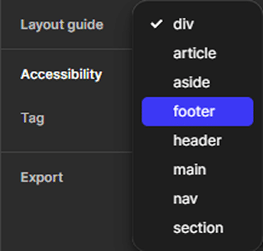
This initiative is worth applauding, as it provides a first layer of content comprehension for assistive technologies, offering a slightly more responsible approach than a div soup (more on those missing pieces further down).
What’s unfortunate, though, is seeing this feature tucked away under Accessibility, when in fact it’s the foundation of semantic web structure, which serves far more than just accessibility.
HTML and CSS are so straightforward that many front-end developers today no longer learn the basics properly, leading to endless layers of <div> and missed opportunities for clarity and structure.
What This Already Enables
With these initial tools, a designer can:
- Visually and semantically structure a page;
- Define the main areas of the site (navigation, content, footer);
- Establish a clear content hierarchy using heading tags;
- Lay the groundwork for better indexing and accessibility on the web.
In other words, Figma Sites goes beyond simple prototyping: it initiates the creation of websites that can be explored by real users, both human and machine. But that’s still not enough.
What does this suggest for the future? That Figma Sites is fertile ground, but still largely untilled when it comes to accessibility. The promise is there, but the implementation has yet to meet even the basic requirements of a web for all.
The Most Obvious Gaps in Figma Sites (So Far)
Once the initial excitement wears off, a clear truth surfaces: accessibility is still far from being fully addressed. Many essential elements for navigation, interaction (not in Figma’s animated sense), and content comprehension are still missing.
While Figma Sites takes a welcome step toward HTML structuring, it’s still far from sufficient when it comes to building truly accessible websites. Here’s an overview of the main technical and functional shortcomings observed in this beta version.
No Semantic Lists
IAt the moment, there is no way to structure a group of elements as a proper list (<ul>, <ol>, <li>) in a custom way. This prevents you from:
- Conveying repetitive content clearly (services, steps, key points, etc.);
- Providing screen readers with information on the number of items or their order;
- Supporting smooth navigation for users relying on assistive technologies.
This is a fundamental gap when it comes to readability, navigability, and content understanding.
Sure, you can use Figma’s basic text feature to auto-generate ordered or unordered lists. But you can’t define that a group of logos is a list of logos, or that a group of navigation links is a list of links.
No Tables for Data
There is currently no way to create structured tables (<table>, <thead>, <th>, <td>, etc.). As a result, it’s impossible to:
- Properly present numeric data, schedules, or comparisons;
- Provide the correct associations between header and data cells;
- Make this information understandable for assistive technologies.
The information may appear visually structured, but it completely lacks semantic logic.
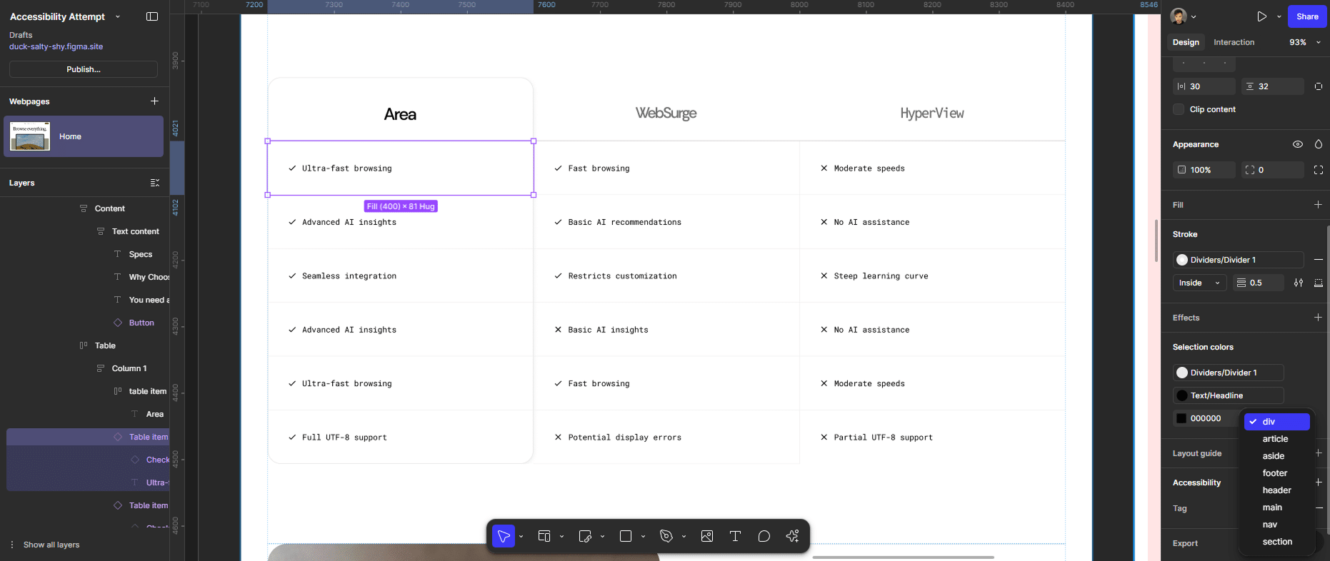
Creating tables in Figma has always been somewhat of a challenge depending on the era (who remembers the pre–auto-layout days? 😄). We’re still in that same boat, but now with a technical and semantic problem.
Perhaps the recently introduced Grid Layout could offer a solution in the near future.
Forms: The Big Missing Piece
The total absence of form components (<search>, <form>, <label>, <input>, <textarea>, <button>, <fieldset>, <legend>, etc.) is a major obstacle to meaningful interaction:
- There’s no way to create an accessible contact form;
- No structure to associate fields with their labels;
- No handling of focus, error states, or user feedback.
You simply cannot build a functional website without accessible forms.
Even though introducing forms raises other important questions—like “Where is the submitted data stored?” or “Which service handles the data?”. Figma will have to address these challenges to remain competitive.
By the way, if you’re looking to build better forms, I’ve created a checklist and a book on web forms just for that.
No Support for ARIA Attributes
ARIA attributes (roles, states, properties) are essential for enriching semantic meaning, especially when native HTML doesn’t go far enough.
As of now, Figma Sites offers:
- No way to assign
roleor ARIA attributes to custom elements; - No dynamic landmarks for screen readers;
- No way to hide decorative or redundant content from assistive technologies.
These are fundamental tools for making complex or custom interfaces usable for all.
This is a critical omission for complex components like menus, tabs, accordions, or modals.
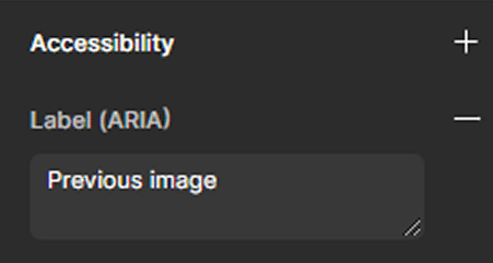
That said, I did notice an ARIA label on one of the demo components, though I have no idea how it got there, or how to add more like it.
No Keyboard Focus Management
Keyboard focus is one of the most fundamental aspects of accessibility when navigating without a mouse. Users with motor or visual impairments often rely entirely on keyboard-like navigation tools and never use a mouse.
The keyboard equivalent is pressing the Tab key to move focus to the next element on the page, or Shift + Tab to go backward.
To know where you are, it’s essential to visually highlight the focused element, typically with a focus ring or similar indicator.
Without this, users are essentially navigating blind, and that’s a major usability issue.
However, as of today:
- There is no way to manage tab order (which is necessary, since Figma places
position: fixedelements at the end of the HTML code); - There’s no visible focus state (focus ring or equivalent);
- There’s no guarantee that components are navigable without a mouse, as many so-called “links” are actually
<div>elements with arole="link"and anhref, combined with anonclickevent.
(For non-technical readers: these are non-semantic elements, not focusable, and not keyboard-activatable.)
This makes keyboard use highly unreliable, or even impossible for many users relying on assistive technologies.
Duplicate Page Titles and Heading Issues
Another issue is the lack of control over heading tags, which can appear in illogical order (e.g., an h1 followed by an h3 without an h2), as well as page titles (the tab title), which should always be unique for clarity and navigation.
These problems impact:
- Content hierarchy;
- Overall page comprehension;
- Navigation by headings, which is heavily used by screen reader users;
- And the ability to understand the page’s purpose at a glance.
This aspect may go beyond the usual list of missing features, but it’s something Webflow handles well in its pre-publish audit, which Figma seems to be drawing inspiration from.
Limited Visibility of HTML Structure
As it stands, the Figma Sites interface doesn’t allow for an easy overview of which HTML tags are being used. You have to click on each individual element to see its semantic nature—there’s no global view.
This makes it difficult to:
- Quickly verify structural hierarchy;
- Conduct an accessibility audit;
- Ensure consistency across components.
Worse still, it increases the risk of losing accessibility efforts in a sea of non-semantic elements.
Here’s an idea strongly inspired by how WordPress displays content structure:
Highlight semantic elements visually within the layer tree or canvas.
That way, accessibility-related data could also be surfaced directly through the visual layer interface, making it easier to build responsibly.
When Aesthetics Take Priority Over Essentials
Tell me you ignored your accessibility experts without telling me you ignored your accessibility experts.
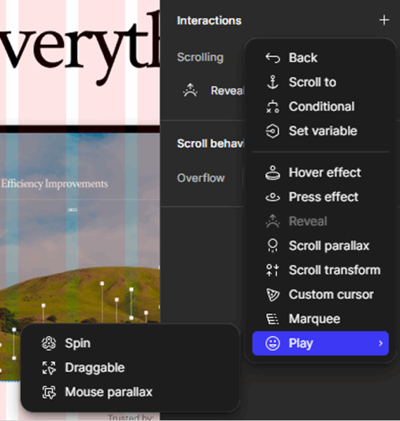
Polished Visual Effects… But Purely Cosmetic
From the very first moments using Figma Sites, one thing becomes clear: the attention given to visual effects is inversely proportional to the attention paid to essential accessibility.
Silky transitions, spinning components during loading, micro-animations, you can tell that a great deal of effort went into crafting visual flair.
But let’s ask a simple question: what’s the point of all these animations if the content isn’t accessible?
These animations, let’s be honest, they aren’t “interactions”, aim to convey a sense of energy or “modernity,” but they don’t meet any real functional or universal need.
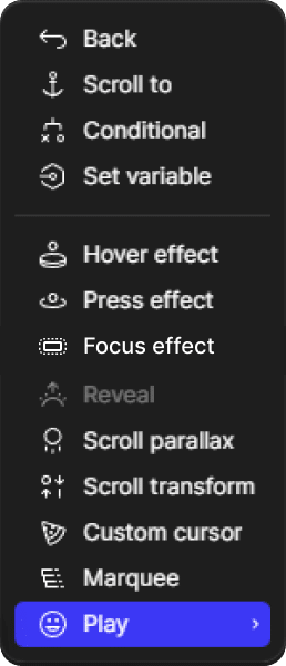
True interaction patterns like “hover effects” and “press effects”, those triggered by the user, are a good starting point.
What’s missing? Just a proper “focus effect” to round out the set of interactions that actually support usability.
“Interactions” That Aren’t Actual Interactions
Another concerning trend is the use of the term “interaction” to describe what are, in reality… entrance animations, scroll effects, or spinning elements.
These features may be visually appealing at first, but they come with several problems:
- They slow down or temporarily hide content, which is particularly disruptive for people with cognitive impairments or attention disorders
- They don’t serve any functional purpose (they trigger no real action)
- They interfere with navigation if poorly implemented — and too often, they are
It’s worth repeating: accessibility is also about removing unnecessary distractions.
An effective interface does not hide information behind choreography.
Another idea while we are on this: modern browsers offer APIs that allow websites to detect if users prefer reduced motion.
Figma should absolutely use this capability to limit animations when users have expressed that preference.
You can find more insights on this in my accessibility checklist and book for designers.
Priorities That Raise Questions
The real issue isn’t the presence of animations, it’s what their prioritization says about the product strategy.
Time and effort have gone into refining visual effects meant for a small percentage of users who are highly comfortable with visual interfaces, in calm, ideal, connected environments.
Meanwhile, very little has been done for the 20% of the global population living with disabilities, who are waiting for the basics: readable content, keyboard navigation, semantic tags, ARIA roles.
You might say it’s just marketing logic, it’s easier to sell animations than to sell human-centered benefits. But if that’s truly the case, perhaps what’s really missing is a broader education on inclusion and how accessibility benefits everyone, not just people with disabilities. 😉
Maybe some believe it’s harder to sell accessibility to funders? But let’s not insult their intelligence, suggesting that animations are more useful than access to information feels like a slap in the face. Accessibility is not a luxury to be bolted on later. It is the foundation of the web, the very layer we should all be building on.
The problem here isn’t the presence of animations. The problem is that the fundamentals were skipped. Accessibility is not a plugin or a “pro feature.” It’s the base of a responsible, sustainable, and truly useful product.
Figma, You’re On to Something: Concrete Suggestions
It’s time to start thinking about a more serious roadmap for accessibility. The foundation is already there it just needs to be extended and reinforced.
A Base Exists, But Key Building Blocks Are Missing
Figma Sites has laid down a semantic foundation, but it’s still incomplete.
Here’s a list of essential elements to include in the short to medium term to unlock real accessibility potential:
Structural HTML Tags to Add
- Lists:
<ul>,<ol>,<li> - Tables:
<table>,<thead>,<tbody>,<tr>,<th>,<td> - Forms:
<form>,<label>,<input>,<textarea>,<select>,<button>,<fieldset>,<legend> - Internal Anchors:
<a href="">currently, in-page anchors are rendered as links withouthref, making them inaccessible by keyboard.
Attributes (ARIA) and Enriched Semantics
- The
altattribute is available in Figma, but is not included in the output code, especially for SVGs (which should not usealtbut instead an accessible name or text alternative) role(e.g.,role="navigation"by default for<nav>,role="dialog", etc.)aria-label(to name different navigation sections),aria-labelledby,aria-describedbyaria-hidden,aria-expanded,aria-controls,aria-livetabindex,aria-current(to mark the current page in a site),aria-disabled
Implementing these would go beyond raw HTML tags and allow for real dialogue between the interface and assistive technologies, making Figma Sites a much more inclusive and future-ready tool.
A Simple and Gradual Accessibility Roadmap
Figma doesn’t need to do everything all at once. But it urgently needs to establish a clear and credible roadmap, and share it with the community.
If a design tool that aims to bridge designers and developers can’t do this, it would be quite the irony.
Step 1 – Semantic Completion
- Add the missing HTML tags (lists, tables, forms)
- Enable automatic or guided heading structure (from
h1toh6) - Show warnings for disordered or duplicate headings
Step 2 – Accessible Interactions
- Ensure consistent keyboard navigation (tab order, focus, visibility)
- Provide a way to test interaction behavior directly inside Figma Sites
Step 3 – ARIA Enrichment
- Add basic ARIA roles and an interface to manage them
- Explicitly associate labels with inputs
- Provide accessible interactive components (modals, accordions, etc.)
Step 4 – Advanced Accessibility (Long-Term)
- Integrate automated accessibility tests (like an a11y linter or axe-core)
- Simulate screen reader output (a virtual screen reader view)
Redefining What MVP Means in 2025
It may be time for Figma to redefine its concept of an MVP, a “Minimum Viable Product.”
Because today, a viable product can no longer rely on aesthetics alone. It also needs to be:
- Readable, navigable, understandable
- Designed for everyone, not just the most privileged users
A beta that doesn’t include basic accessibility is not a neutral starting point, it’s already technical debt, and frankly, a disservice to disabled people.
And accessibility debt, as we know, is always more expensive to fix later.
It’s far better to build an inclusive roadmap from the beta stage, with clear steps, proper documentation, and open collaboration.hase bêta, avec des étapes claires, documentées, et ouvertes à la contribution.
In Conclusion: A Beta, Yes, But Not an Excuse
Figma Sites feels like a potential revolution in the design ecosystem. Creating actual websites without leaving your design tool, with HTML and CSS output included, that’s exciting. But this revolution must not be half-inclusive.
Yes, this is a beta.
But a beta is not an excuse to skip the fundamentals. In fact, it’s the perfect time to lay down strong foundations. Skipping accessibility from the outset is how you build technical and human debt, the kind that’s hard to pay back later.
What Figma Sites has shown so far is a desire to do things right… with misaligned priorities. Time has been spent polishing visuals where users needed solid ground. Energy went into “spinning effects” while millions still can’t navigate or fill out a basic form.
This article isn’t a complaint, it’s an open hand. For Figma to become a truly modern tool, it must also become an accessible one. And that starts today, with the help of a whole community ready to test, contribute, and guide the way.
There’s still a lot of work to do. But there’s still time to rethink the roadmap, and build a web that everyone can use, not just admire.
We’re not artists chasing pretty concepts.
We’re designers who want to go further, toward purpose, toward people, and toward progress.
More articles on this topic
- Do not publish your designs on the web with Figma Sites – by Adrian Roselli
- Figma Sites: When Accessibility Is An Afterthought – by Kristina Gushcheva-Keippilä

Post a comment for this article?
Follow comments and trackbacks