Also available in:
In my eternal quest for a better web, a question was recently asked to me on LinkedIn. The question was: do you know a WordPress plugin that allows you to create an accessible form? I’ve never asked myself this question because I use Contact Form 7 which allows you to do a bit of everything. But let’s dig in.
This quest for accessibility in WordPress is not new. You can read Julie’s feedback on the accessibility of the WordPress back office (2017, french). Alas, there are many things that have not changed, and fortunately, many others have evolved in the right direction.
An accessible form with WorPress? My method
Here’s my environment at the time of testing, and more importantly the few things I tested before deciding if the WordPress form plugin was worth it.
Tests environment
For these tests, I updated my installation under Local with the latest version of WordPress:
- Nginx + PHP 8
- WordPress 6.1.1
- Removal of all the plugins
- I used TwentyTwenty Three
- Keep in mind the date for each test 😉
Then I installed the form plugins when they were free. For some of them, I could test on an environment provided by the plugin editor.
Testing Methodology
In my analysis, I want to test two aspects: the ease of use in the back-office to create forms, and the accessibility aspect in the front-end for end-users. I have not tested the back-office accessibility for time-saving reasons at the moment, but I may do so later.
In every test, I target some specific points:
- Back-end (5 points rating) :
- The ease of use,
- Usage guidance, support and assistance
- The structure of the administration,
- The use of technical language,
- The global usability.
- Front-end (5 points rating) :
- The source code quality (technical accessibility)
- The form fields design quality (visual accessibility)
- The interaction design quality (technical and visual accessibility)
I did not go as far as the screen reader test (VoiceOver on the Mac), except for rare exceptions, once again for reasons of time saving, and especially because there is often no need to go that far to disqualify a plugin. Unfortunately.
How to read by notes, ratings, and technical language?
To put it simply, a 3/5 in accessibility is not enough, you can start thinking about using the plugin from 4/5. In terms of usability, I recommend 3/5 for a person with little technical knowledge, points above 3 are more for control and adjustment.
In the following lines, I will inevitably have to talk about some technical aspects. HTML is a development language (code) that allows you to structure the pages you browse. When the code is poorly done, the visual display of the page may be good, but the structure may be poor. A bad structure will add difficulty for tools used by people with disabilities, especially to transcribe the content of the page, and therefore use your form.
ARIA, is a “technology” that theoretically can improve HTML. But like any tool, if misused, it may well do more harm than good.
What is an accessible form?
Without going into too much detail, this is a form that meets the WCAG compliance criteria. The Web Content Accessibility Guidelines (WCAG) can be found in their version 2.1 here.
In my tests, I go through a few criteria without going into details, but which for me are essential before I can go further in the tests. If they are not valid, I stop.
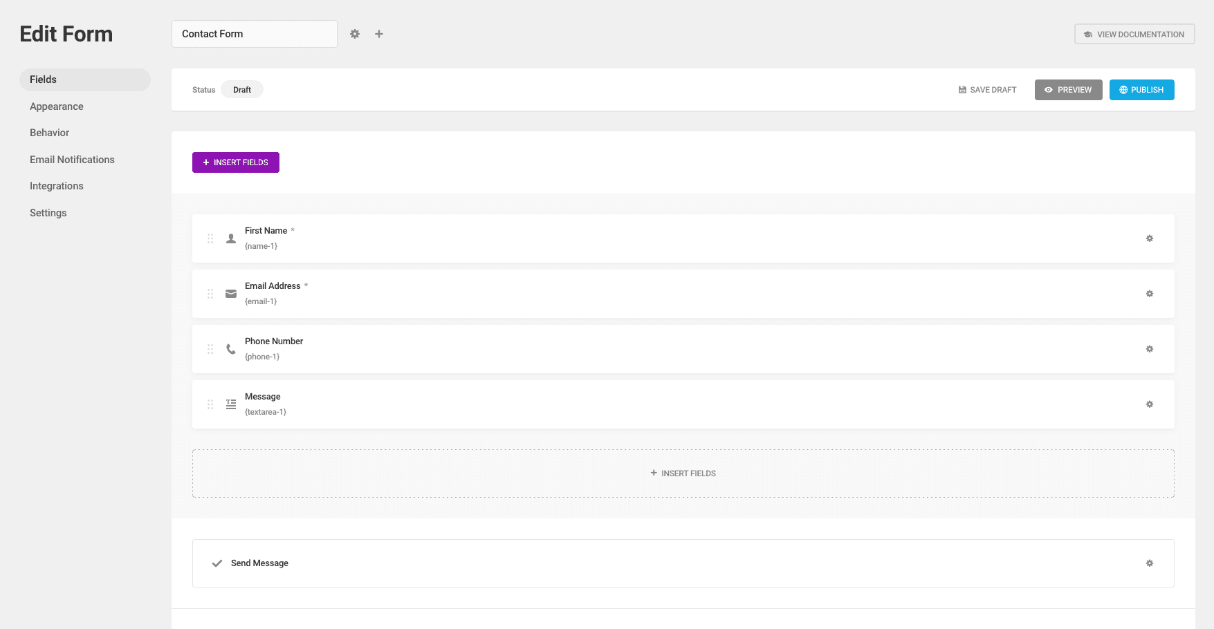
The form builder plugins I’ve tested for WordPress
Let’s move on to the various form creation plugins I’ve been able to test so far, and see where it all goes wrong and if we come across a form that is accessible in WordPress.
Accessibility of Fluent Forms
Last test update : Dec. 24, 2022
Fluent Forms is a form creation plugin that I didn’t know about until I was told about it recently. So I’m discovering it, maybe at the same time as you.
I’ll start with the admin interface, since I had to install it. This one takes the WordPress codes by smoothing the styles a bit. Personally I find them rather pleasant, but that’s my personal opinion.
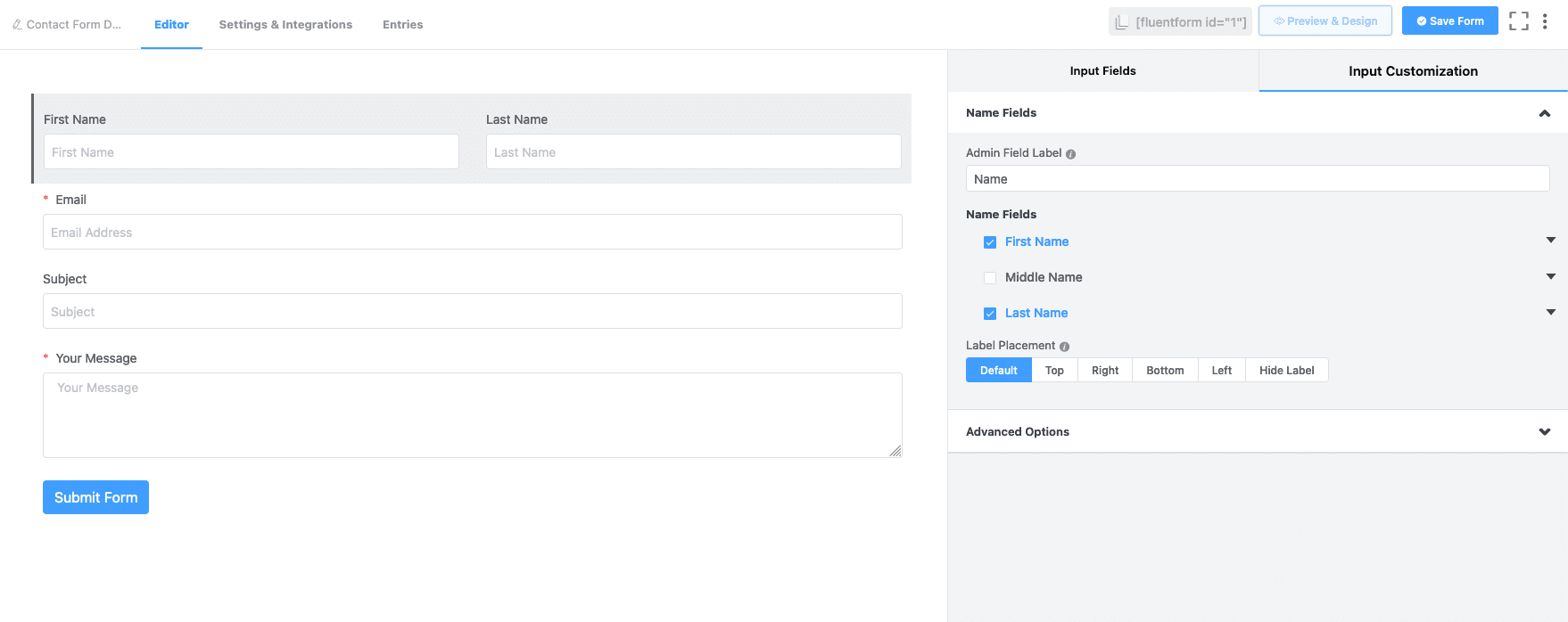
The structure of the form editing page is close to that of Gravity Forms which is the next one I’m evaluating, maybe a little simpler. Maybe too simple for me for example, who saw the default “placeholders” (those texts in the fields that are removed when you write) that it doesn’t seem possible to remove. This will be one less point for ease of use/control, but also for front-end accessibility as it is not recommended to use them.
On the front end, we have labels and fields that are well connected for the classic cases (select, input, checkbox, radio, etc.) and keyboard navigation is easy thanks to advanced styles for keyboard focus. Even the more advanced widgets seem easy enough to use with the keyboard.
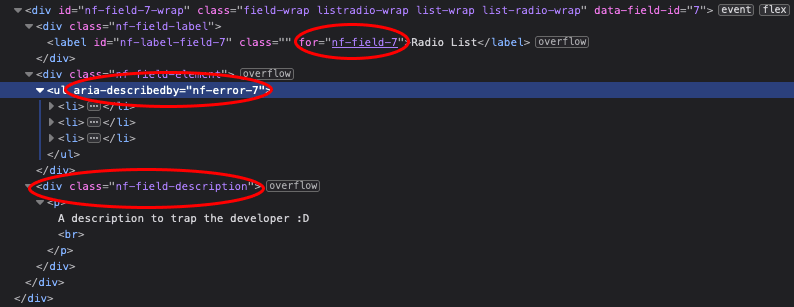
On the other hand, the positive points stop there for this plugin. Error messages are not announced (aria-describedby), required fields are not technically announced either (aria-required), no use of fieldset and some very bad uses of labels. So I’ll stop the test here.
Ease of use
3/5
Accessibility
2/5
Accessibility of Gravity Forms
Last test update: Nov. 19, 2025
Gravity Forms is now one of the oldest and best known plugins on WordPress. It is also fully paid and no longer offers a free version as it did in the beginning (I have a doubt as I write this sentence).
It does, however, offer a free online testing area that allows you to check the appearance of forms with a multitude of examples, but also to test the administration of a form.

On the ergonomic side, Gravity Forms has decided to get closer to Gutenberg’s, probably in order not to disturb the use. It is not easy to offer a lot of customisation and control possibilities, and at the same time remain easy to use on the proposed interface. But they did a good job in my opinion.
You will progress on understanding the interface at your own pace as some decisions are made for you by default, and you can tweak options if you like. A few accompanying tooltips are present to help you get up to speed.
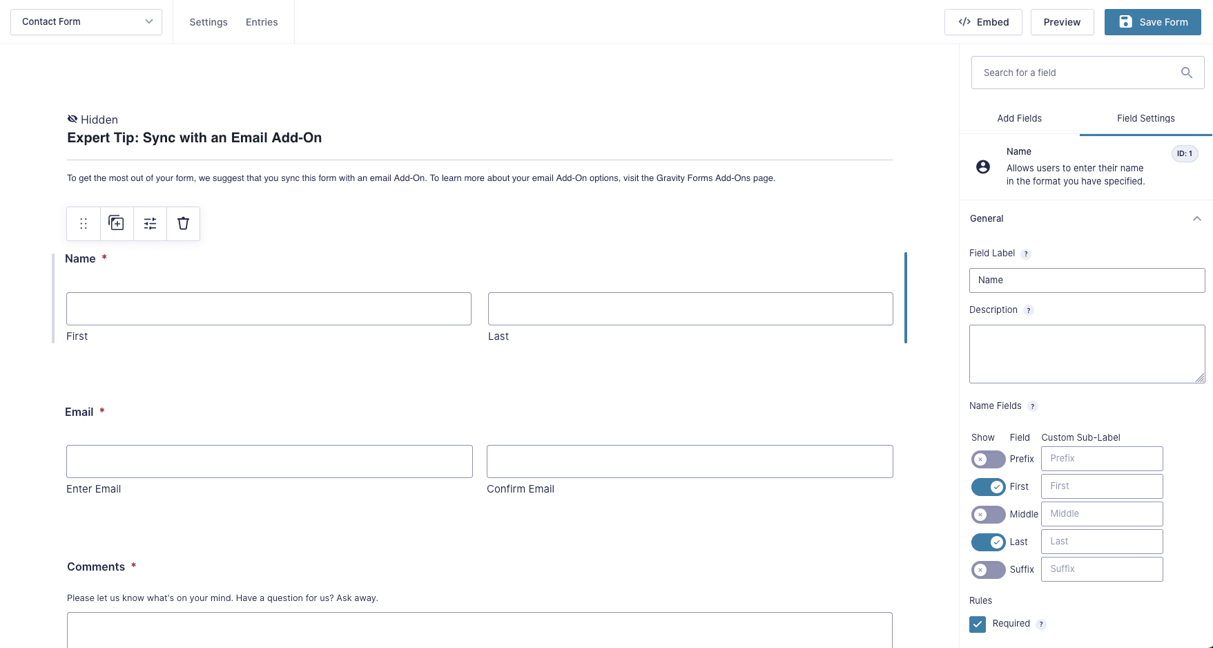
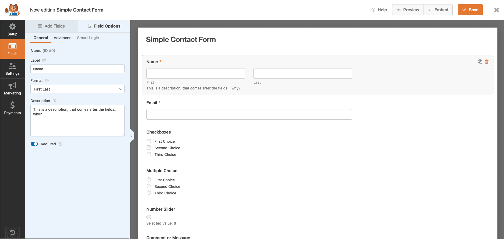
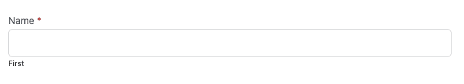
On some fields, Gravity Forms has decided to adopt a strange label division (see the screenshot above) proposing a main label as “Name” then sub-labels “First” and “Last”. It’s a very English (or even American) principle that doesn’t seem very ergonomic to me for many multicultural reasons.
I went through the classic shortcomings of this type of form from a code point of view: it’s all there, the information about the required fields, the proper use of labels, fieldsets and legends, the notion of aria-live for messages that update, the rich field descriptions linked to their respective fields.
In short, a good job on the code side, which seems to have been validated by Level Level, a company specialised in WordPress and accessibility. Read the article on the subject.
I reviewed the color-contrast tests again in 2025, since this criterion wasn’t valid in 2022 during my first test. It’s nice to see that my feedback was taken into account and that the default design promoted by the team has been updated.
The plugin also used to have issues with focus management, its visibility, and sometimes its complete absence on certain types of fields (select, radio, etc.), but this has now been fixed.
The only flaws I noticed, which would be the last remaining points to correct as of late 2025, are:
-
The chained selects don’t have a logic that semantically links the elements together. They would benefit from a hidden
<label>, a<fieldset>+<legend>, or appropriate ARIA attributes. -
The “Product” field is oddly marked up, with labels that aren’t associated with any field (not invalidating) and a focusable, non-editable element that, when activated with the Enter key, submits the form.
I also didn’t find the historically non-compliant fields, such as the progress type or the ones offering drag & drop.
Another aspect to be discussed would be the proposal of reCaptcha as an anti-spam control method. As far as I remember this solution is inaccessible, even if it is not directly developed by Gravity Forms.
Ease of use
4/5
Accessibility
4.5/5
Accessibility of Ninja Forms
Last test update: Dec. 24, 2022
Ninja Forms is much more streamlined than its competitors and offers a developer mode that I discovered while using it. It combines the need for simplicity for the less expert, and a more advanced mode for those who feel the need to tinker.
Ninja Forms was one of my favourites some years ago, but I remember being disappointed by the quality of the code and the many errors in the HTML validator. I guess they have improved a bit on this aspect because the code base is really more qualitative.
The basis is there: labels are connected to their fields, error messages are announced as such, as well as required and erroneous fields.
The descriptions associated with the fields are not taken into account at all and declared as such. There is even a strange thing with these descriptions: they appear before the field but are declared in the code after the field, which is a counter-indication. (the order of reading the code must be close to the order of the elements on the screen)
Labels are very badly used on checkbox and radio groups, and there is even an aria-describedby that leads to an error message that does not exist when the field is not yet wrong.
The overabundance of very poorly used elements makes this plugin a low quality resource for creating forms.
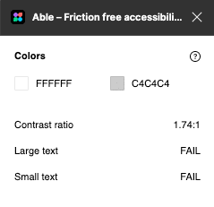
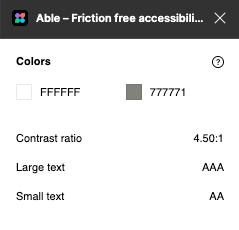
In terms of interaction and visual aspect, the contrast proposed by the default border style is not good for a contrast on a white background. It is 1.74:1 against a recommendation of 3:1.
On the keyboard interaction side, the focus style is well designed (better contrast), but totally invisible on checkboxes and radio buttons.
A plugin that I can’t really recommend then.
Ease of use
4/5
Accessibility
2/5
Accessibility of WPForms
Last test update: Dec. 24, 2022
As for the usability of WPForms, one is quickly drowned in information when installing this plugin: a large dedicated page worthy of the Aliexpress shop solicitations, and one wonders how one will be able to start their first form. Once you have found the right button or menu page, you still have to understand the difference between creating it with or without a template. A bit laborious for so little, but let’s move on.
The design interface is very similar to the competitors, but there is a 3 level tabbed navigation. Very surprising and confusing at first. The interface remains simple when you dive into the creation of the fields, and a some aids are available for each control field, which are a little too discreet (low contrast again).
On the code side, required fields are not correctly announced by a sentence like “required fields are labelled with an asterisk” or something similar. The asterisks are fine in the labels and the fields declared as required. An aria-required is missing though.
There is a strange use of 2 labels with the same for attribute for fields based on main label and sub-labels (which I don’t justify from an usability point of view either). Not knowing the effect I won’t comment on it.
The label still has a funny use on checkboxes and radios with a label whose for attribute links it to an HTML list. The Firefox console seems to understand the link, but I’m not sure it’s valid. The use of fieldset and legend is missing in these cases. (doc)
Field descriptions are added after the fields and are never linked to the fields they describe thanks to aria-describedby.
In the oddities, WP Forms offers a range-slider using the right HTML element. However the update of the value just below is never explicitly announced either by the aria-valuetext attribute or by an update of the description and an aria-live attribute.
On the interaction side, an error in the form allows me to focus on the first erroneous field, which is a good practice. A strange thing happens though: the first wrong field ends up with 3 labels, one for the main one, one for the sub-label, and one for the error message.
It is also again impossible to know where I am at the keyboard navigation on radio or checkbox elements, or the famous range-slider.
On the visual side, the contrast is again insufficient, but this is starting to be a constant with these audits.
So I wouldn’t recommend this plugin either. The welcome on the plugin is laborious and the help is not very visible. The code is a mess of badly used HTML elements and attributes. Next!
Ease of use
2/5
Accessibility
1/5
Accessibility of Formidable
Last test update: Dec. 24, 2022
I discovered Formidable a bit by chance while looking for some alternatives to accessible form builder extensions. I thought I’d give it a try as it is advertised by its creators as “The most powerful and versatile form builder for WordPress”.
In one of their articles, they also claim to have no errors according to WAVE, and to be WCAG compliant (read this article for more info). So let’s see if it meets accessibility needs, and let’s go over the arguments offered by their own announcement.
On the discovery side, upon installation, a page proposing coherent actions is displayed, much better than WPForms for example. So I go to the templates not to build the form from scratch.
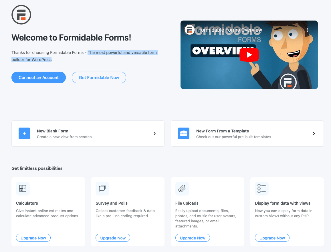
The button reveals a modal that offers some classic templates, but also a huge list of templates arranged by category. Ok, not bad. I’m going to keep it simple and make a contact form. Ha ! well no, to make a contact form I have to give my email to get 10 free templates… 😂 Come on, one point on the ease of use that I need to remove.
Let’s go back to a blank form then. Here we go.
Drag & drop is easy and I notice that you can create columns on the fly, which is not too bad for complex forms.
The organization of the tabs and options looks chaotic to me though, unlike the competition, there aren’t a lot of extra options, but it looks very busy and unorganized. There are actually things that don’t belong in the basic options and should be in the advanced options, IMHO.
On the code side, it’s rather like the good family jokes told at Christmas dinners: if you like bad taste, you’re in for it.
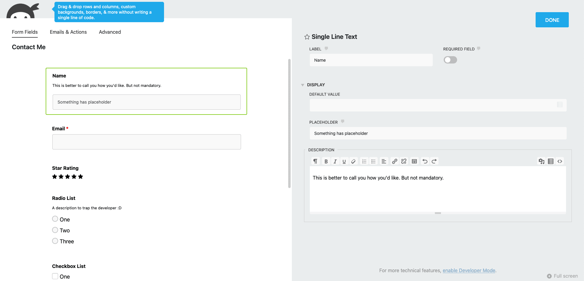
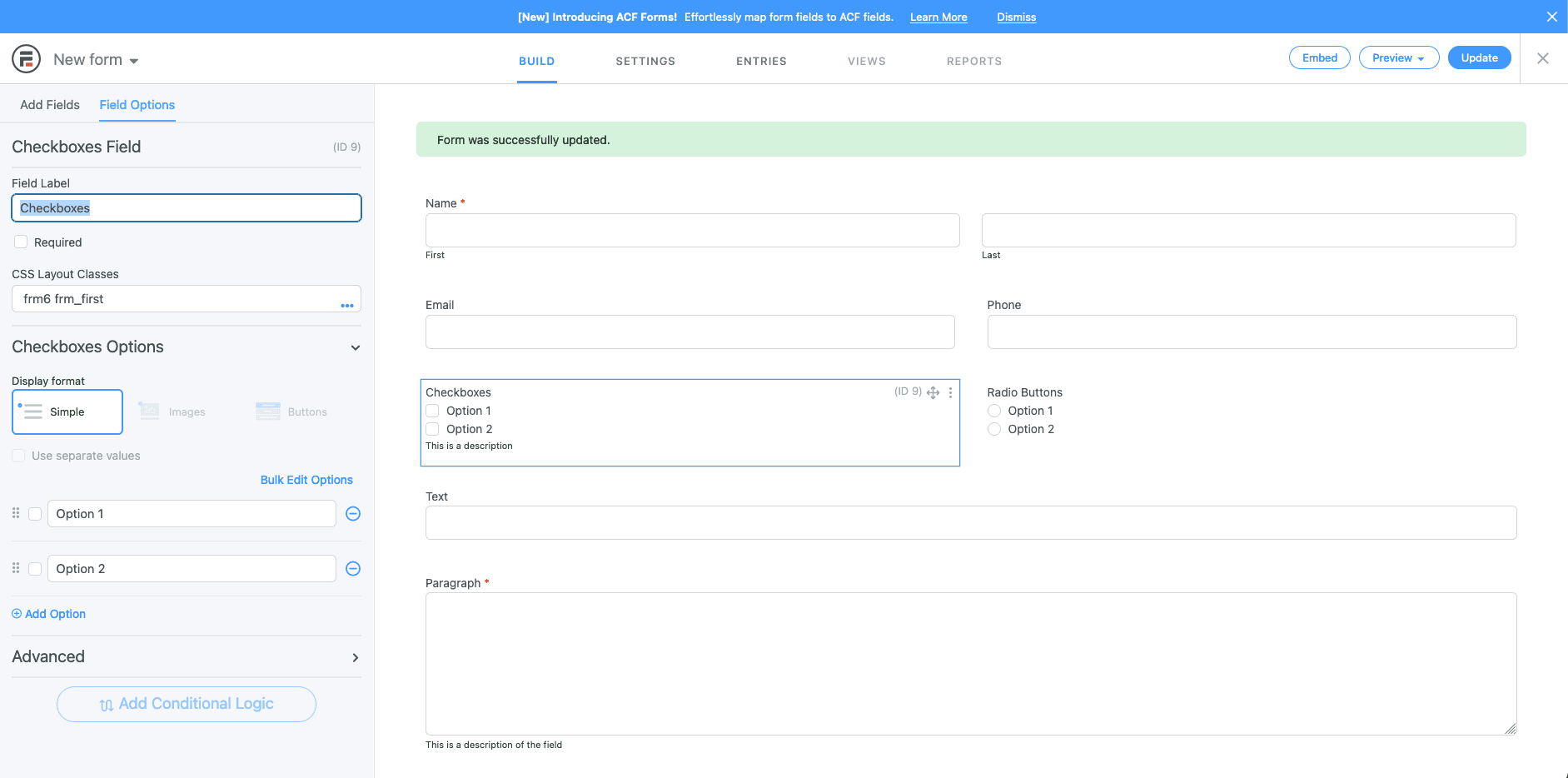
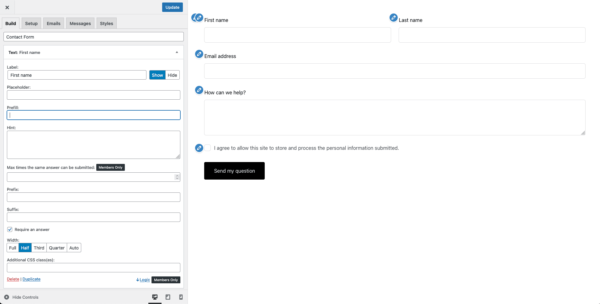
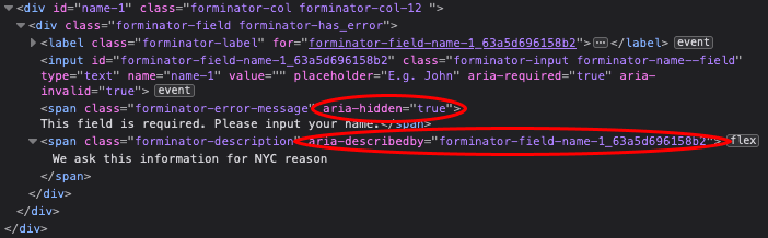
The screenshot above shows you a very “interesting” mishmash. This code visually represents the following:
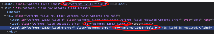
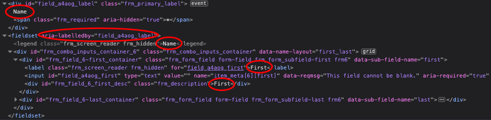
Here I’ll say that it’s their fault: like all the other form builders, they decided that when a first and last names were requested, the label would be split into “Name”, “First”, “Second”, three labels, 2 fields. So we’ll have to pass on the usability, again.
Code-wise, it could have been good, but it’s a horror: The first “Name” will be read by a screen reader unless the person jumps to the field directly, only “First” will be read (the one in the label) as the legend of the fieldset above it is in display: none; which has the effect of not being read by a screen reader (seems to be retranscribed by VoiceOver though). Once the field is filled in, the second “First” should be ignored in case of sequential navigation by form field. Otherwise it will be read just after the first “First” has been filled in, which is totally unnecessary.
And here we are on the cases of “simple” fields…
On the other fields, the field description is well announced with an aria-describedby. The checkbox and radio group labels are ignored as they do not use any means of connection with the field groups, the previously misused fieldset could have been used here.
In the event of an error, a global message is proposed, as well as a contextual message per field. Both error types use a role="alert". The problem with this technique is that the implicit value of aria-live for an alert role is “assertive” which means that one alert will cancel another (to put it simply). The global error message will never be read, and it is quite possible that only the last contextual message will be read in case of multiple errors…
The fields are announced in error, however, which will make a positive point of little use in all this muck. So their WAVE analysis doesn’t announce any code errors, but the expert analysis here leaves me very, very puzzled.
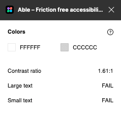
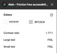
As usual in this audit, the contrast of the border on the white background is not sufficient, at 1.77:1 against the recommendation of 3:1. Which WAVE doesn’t detect (for some mysterious reasons)
As for the keyboard interactions, the border changes colour when the focus is on and offers a rather bright halo. A small bonus for the focus on the radios and checkboxes and also the select.
But still, I wonder what happened to compliance with the WCAG.
Ease of use
2/5
Accessibility
2/5
Accessibility of Happy Forms
Last test update: Dec. 24, 2022
We don’t know each other yet, but Happy Forms immediately asks me for my e-mail address upon activation. Intrusive and aggressive.
For the rest of the interface, Happy Forms wants to reuse most of the styles that are specific to the WordPress administration, so that website editors don’t get lost. That’s pretty good practice.
The options for each field are however very rich and not very well explained. But you will certainly enjoy being able to propose rich forms with condition chaining, for example, once you become more skilled.
On the code side, we find the classic errors: the form has no name, a hidden field serving as a trap for robots is not properly announced/hidden, required fields are not announced, neither textually nor in the source code (aria-required), field descriptions are not connected to the fields they describe, and radio button groupings and checkboxes are not announced correctly. Error messages are also not connected to erroneous fields and fields are not advertised as erroneous either.
No specific effort for accessibility seems to be made, other than connecting the labels to their field. Which is kind of a basic.
On the interaction side, especially the keyboard navigation, all the basic fields have a visible focus, except for the main button of the form. However, after searching in the form options, you can set the background colour of the focus button yourself. An accessibility option that implies “get on with it”. This is somewhat in line with their responses when their users ask for more inclusiveness.
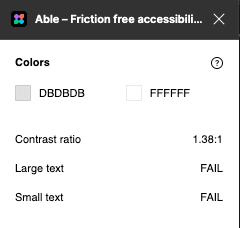
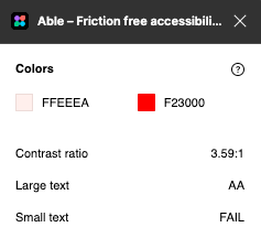
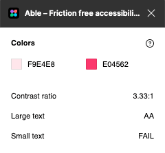
In terms of colour and contrast, apart from the labels, nothing goes right: the borders are not sufficiently contrasted on a white background (1.38:1) and the error messages propose a text:background contrast that is also not high enough with a score of 3.59:1.
Ease of use
3/5
Accessibility
1/5
Accessibility of Piotnet Forms
Last test update: Dec. 24, 2022
When the plugin is activated, Piotnet automatically redirects to the Forms list. Which is empty. Normal. So I add a form for which the interface is really… basic. A title, and my default fields for Custom Fields (WordPress fields, not form fields).
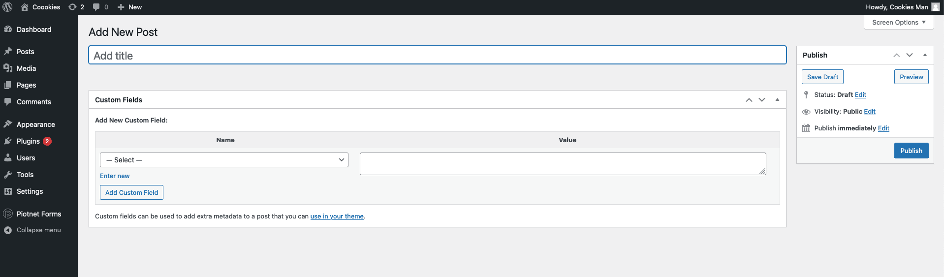
Strange, nothing happens when I save/publish the “post”, I go back to the home page of the list, and I see nothing new.
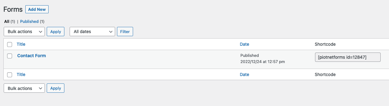
I go into the settings, everything seems to be “premium” if I want to complete the functionality of the plugin. I was about to finish this review here and put a 0 rating everywhere, when I saw an “Edit with Piotnet Forms” feature, in the list of features by hovering over the Contact Form item I just created.
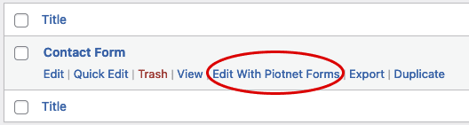
I clicked on it and… magic happens.
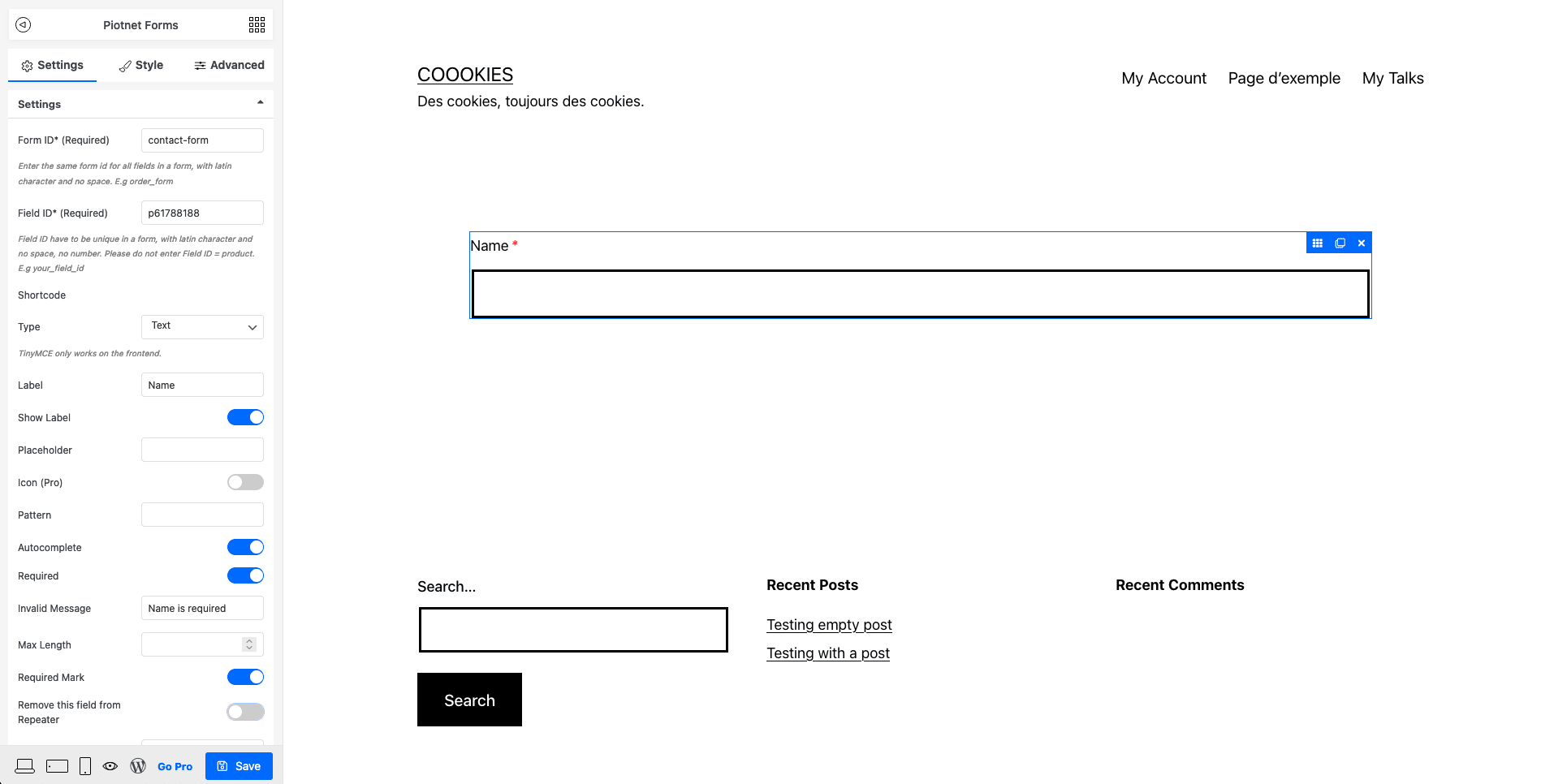
Why this decision to hide the form editing, which is literally the main function, in a barely visible link, instead of immediately loading the form interface? This decision will be worth -2 points on the usability score because I almost gave up and it’s far from obvious. You need to fix this Piotnet!
On the interface of the options, this plugin has taken the decision not to expose all the fields on its main panel, but to make it an option within the “Field” content type. This doesn’t necessarily make it easier to discover, but it’s a design choice.
I tried to create some rich layouts with columns, and I had a lot of trouble understanding that you have to use the “Section” item type and duplicate it on the spot to make a division. But be careful, you must not use the Duplicate function which is on the controller at the top of the block, but on the left of the block. Same icon, but 2 different functions. Very bad design pattern which makes it a plugin with a very long and slow learning curve
I also clicked on a paid item in the list to see what it offers. This made me leave the page without saving and lost my changes. Well done.
By the way, speaking of saving, when I save the form, I don’t get any validation of the save, just a button that blinks oddly.
So much effort was put in the wrong place (customizing an interface) when in fact the plugin developer would have done better to rely on WordPress design codes here.
Let’s move to the code side. Well, if I can figure out how to leave this mode… Ah, you have to click on the WordPress icon at the bottom left. This plugin is definitely a treasure hunt. (without the benefit of a treasure)
The labels are connected to their fields. We find the classic error of the label being connected to nothing in the radio buttons and checkboxes. The mandatory fields are announced in the code, but there is no global message announcing the mandatory ones as having an asterisk.
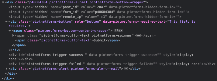
Small novelty in the “creative minds of developers”‘s list: the submit button is not a button, but a div with JavaScript on it. The keyboard navigation stops at the filling, the form is impossible to send. This simple fact will make its score fall drastically.
On the interaction side, Piotnet doesn’t get involved since the field styles are dependent on the activated theme, or on the style options that users can choose by themselves. This represents a potential inaccessibility though.
When the form was validated, or rather sent, nothing happened, until I filled in the Form ID field in the admin, which is required. It allows to connect the fields to be validated of the same form together. A technical aspect that is very disabling for a non-technician.
At validation, the fields in error have an error message that disappears at the slightest interaction, and the field is not noted as invalid in the source code. A problem that goes far beyond accessibility, here we are on the basis of ergonomics.
Ease of use
1/5
Accessibility
0/5
Accessibility of Contact Form 7
Last test update: Dec. 24, 2022
Contact Form 7 is a well-known plugin installed on many websites. However, while it can be very powerful on many levels, it is very, if not too technical for the average person.
The raw form you get just after installing the plugin is pretty much ok in its structure, but the slightest addition of a field puts you in a tricky and inaccessible situation if you don’t have any technical knowledge: the fields are not identified (technically) by their labels, and the structure is far too poor.
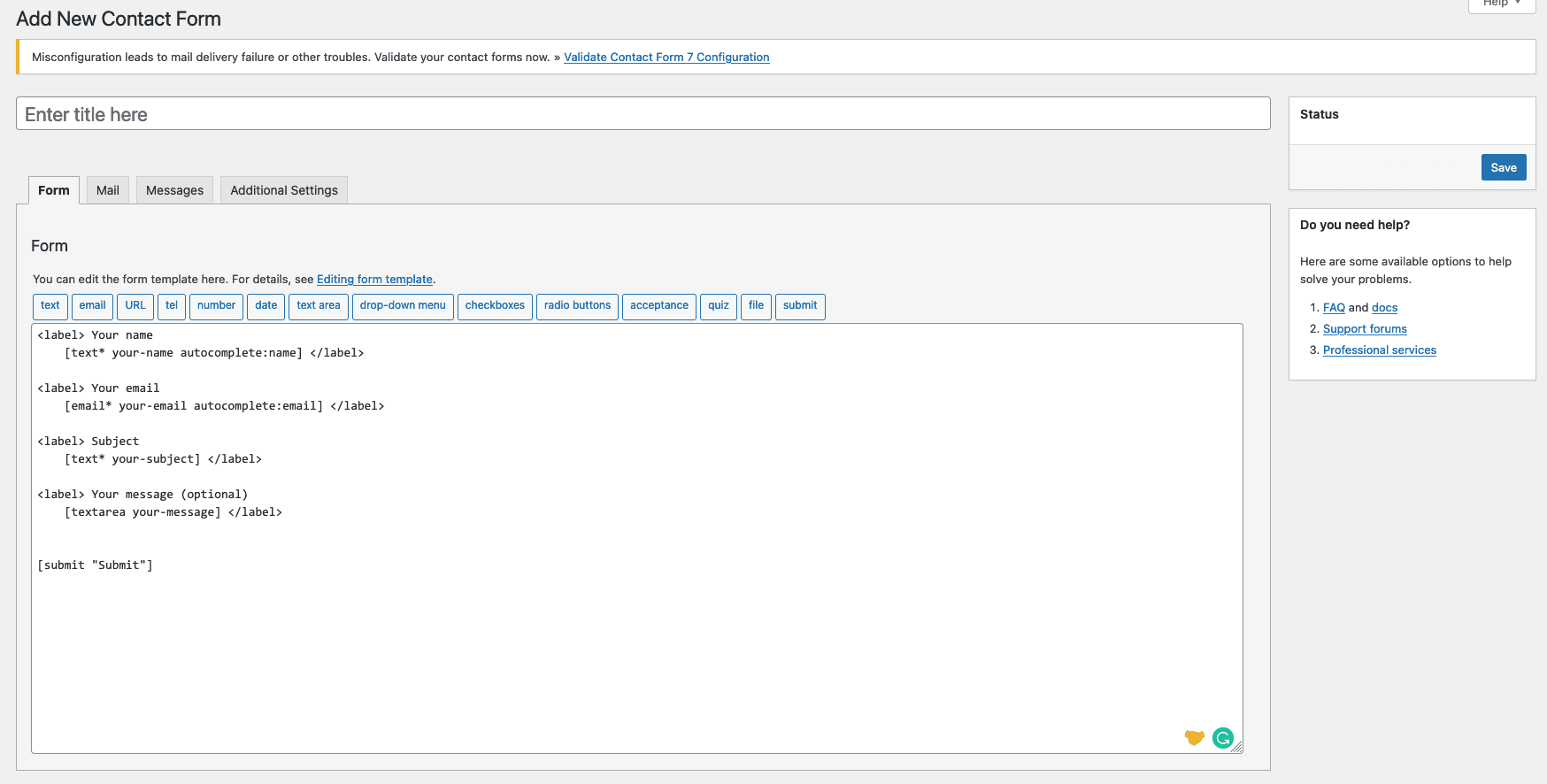
If I stopped there, the plugin would certainly be one of the lowest ranked on the list. And I’m going to stop there, simply because making the form accessible requires technical knowledge in the field, and I’m looking to provide a ranking for non-technical people. I’m looking for a plugin that is easy to use and accessible “by default”, in the sense that users don’t have to worry about their technical knowledge or their need to upgrade.
Ease of use
1/5
Accessibility
1/5
Accessibility of Simple Accessible Form
Last test update: Dec. 24, 2022
The home page of Simple Accessible Form proposes a very strange form where I have to fill in technical information that I don’t necessarily know what it will be used for or the impact on my users.
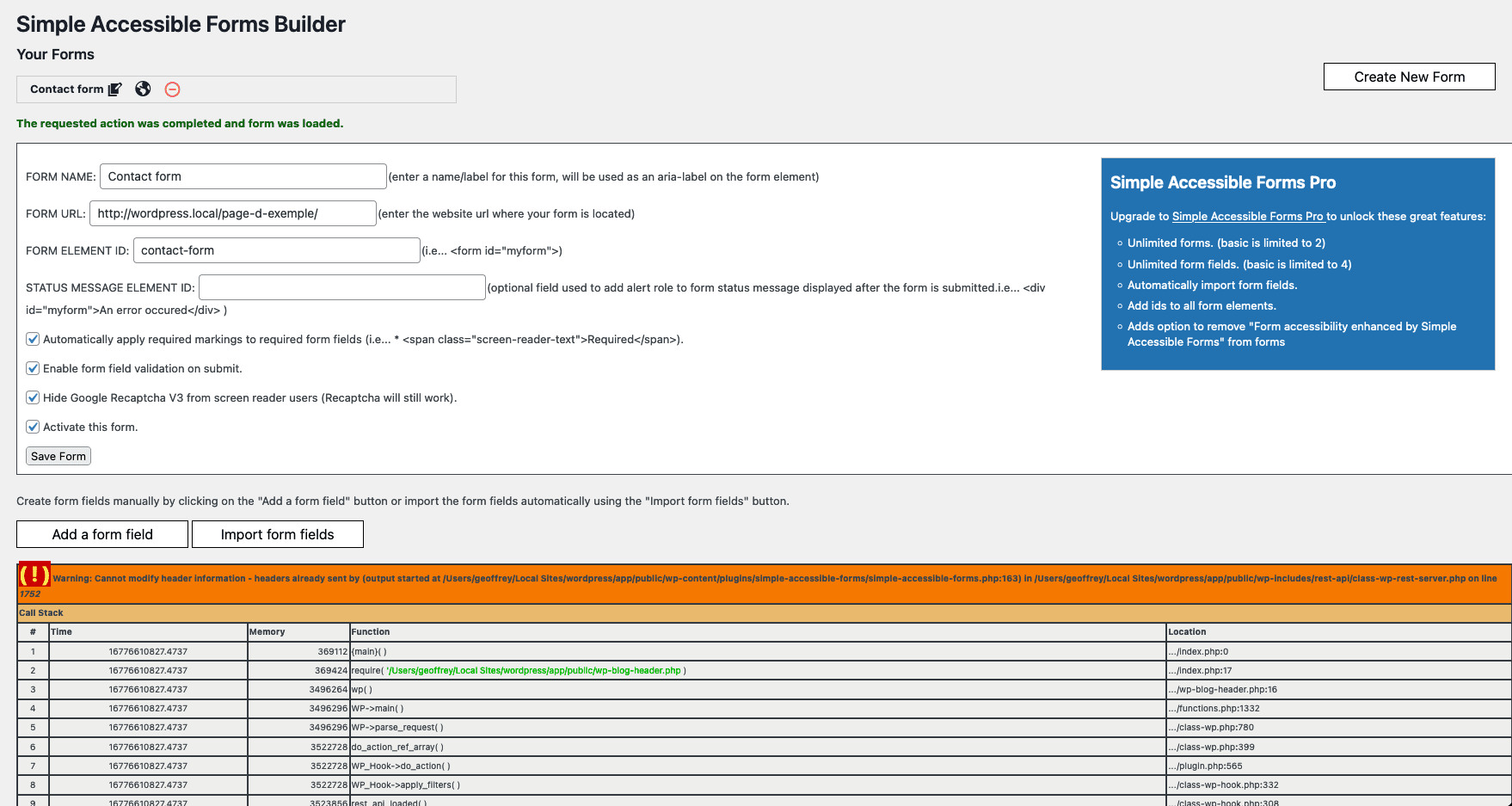
Moreover, when validating the form, I have a PHP error that appears, enough to make me uninstall a plugin for fear of other errors in public…
Once the form is created, I have to see that I can edit it: action is only visible via an icon. Laughable design decision for a plugin that wants to be accessible. The “view form” link (planet icon) sends me to a page where the form is not present.
When I click on the edit icon, I am still on the same page with the PHP error. Nothing allows me to edit a form. Ok I think I don’t understand anything about this plugin, and will have to stop testing here. Go on, move on.
Ease of use
0/5
Accessibility
0/5
Accessibility of Forminator
Last test update: Dec. 24, 2022
The onboarding of the Forminator plugin is non-existent but displays a direct menu in the administration. The creation of a first form can be done on the basis of an existing template, which makes it easier to get started.
The layout is not very confusing compared to the competitors, and the settings for each field are done in modal windows. Their changing height at each tab particularly stresses me, but this is a personal preference.
I quickly discover in drag & drop that I can make columns since I even have trouble placing a new field on a different row.
The different types of fields are rather explicit and the options are quite rich. Apart from the “modal” aspect, the options offer a lot of customization possibilities.
On the code side, there are quite a few omissions. We note that the labels are well connected to their fields, but that the labels of the groups of checkboxes or radio buttons are not announced correctly. (lack of use of fieldset and legend)
The errors all have an aria-hidden="true" which makes them invisible to a screen reader, and the field descriptions do not use the aria-describedby attribute correctly by reversing the position of the ID and this attribute.
In terms of interactions, the border of the fields changes color when the focus is taken, but not on the radio buttons, checkboxes and selects.
From a visual point of view, the contrasts are sufficient as long as we do not enter the error display. The errors offer a poor contrast between text and background (expected: 4.5:1)
Ease of use
3/5
Accessibility
2/5
Building an accessible form on WordPress : report
Well, it seems that we won’t be able to enjoy accessible forms on WordPress anytime soon.
The plugin that seems to be doing well is Gravity Forms. However, after an audit by the company Level Level, there are still some little flaws that must have been forgotten during the audit, or added with the plugin evolutions.
If you have to choose from the tested plugins here, Gravity Forms is the only plugin that offers a sufficient level of accessibility for basic forms, even if we would have appreciated a little more control on some ergonomic aspects.
Another aspect I don’t understand, and which I explain by the plagiarism disease: why are the name fields of these plugins split into “Name > First, > Last”. It’s a typical American behaviour that doesn’t export very well, and it’s also unnecessarily complex to make good from a code and usability point of view.
It’s as if these developers decided to shoot themselves in the foot.
Finally, we notice that the errors are basically always the same:
fieldset/legendare under-used, or very poorly used,- The notion of additional messages to be associated with the field is not understood,
- Border contrast on page background is never correct or left to an untrained user,
- Keyboard navigation is very rarely taken into consideration,
- Interactions in case of errors are almost always absent.
If you ever want to create a WordPress plugin that addresses these usability and accessibility issues, there is clearly an opportunity in Europe, since a European Directive with the sweet name of the “European Accessibility Act” is going to be effective in 2025.
There is a niche to take for the well-being of your users, but also for a business on WordPress. If you are motivated, count me in your quality team with great pleasure.
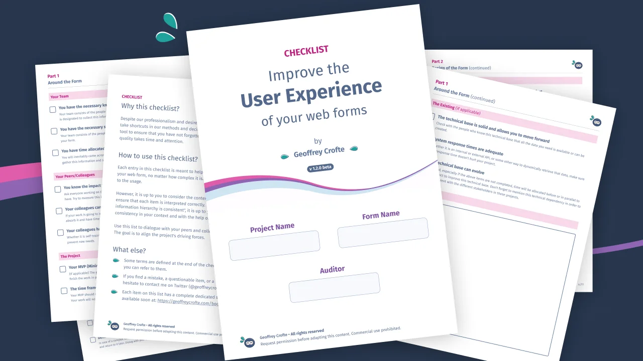
In the meantime, I’m making available again my checklist to improve the user experience of your web forms, which is quite timely considering the topic of this article 😀
Thanks to Rémi who will recognize himself for having asked the question on LinkedIn, and who found me some names of plugins that I did not know.


Nice article! Maybe take a look at WS Form (https://wsform.com)
Hello,
I’ve tried this one just now, and I confirm that this solution isn’t accessible neither. (radio button not ok, rating not ok, error management not ok, etc.)
Some rookie mistake, as usual 🙂
Maybe include wsform.com too
Hello,
I’ve tried this one just now, and I confirm that this solution isn’t accessible neither. (radio button not ok, rating not ok, error management not ok, etc.)
Some rookie mistake, as usual 🙂