Also available in:
A lot of people seem to want to play with the Pantone colors of the year. Maybe these colors inspire more creative people. Or maybe it’s because it’s rare to get two of them. Note however that their use in the web, or digital assets, can have an impact on the accessibility of your creations. Small note on this topic.
In my article on Myths about color accessibility I tried to define accessibility as follows:
In our domain, Accessibility is the practice of making websites or application usable by as many people as possible. We often think it’s applicable to only people with disabilities, which is by definition the case, but it definitely benefits other groups of people in some specific cases or context.
Where user experience tend to satisfy a precise group of people, accessibility tends to include as many people as possible in a common good experience, but both are not mutually exclusive.
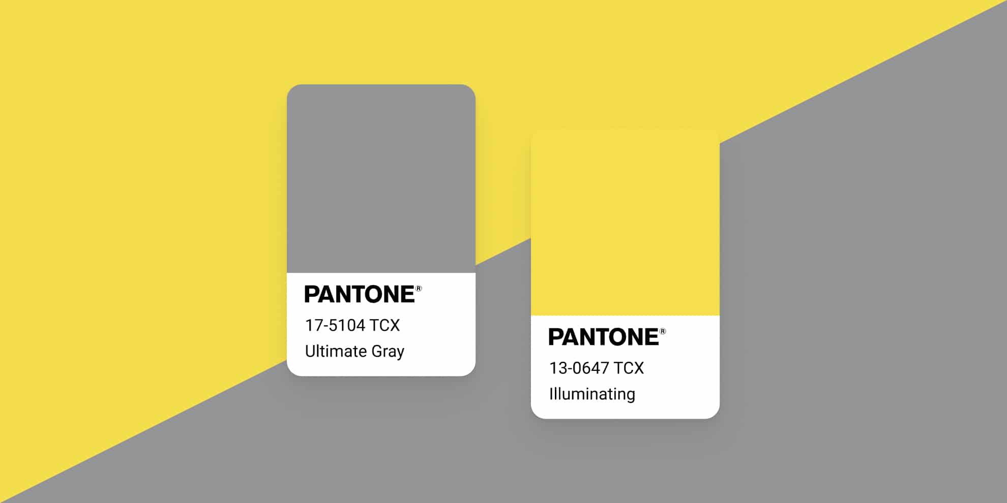
Pantone 2021: The Colors
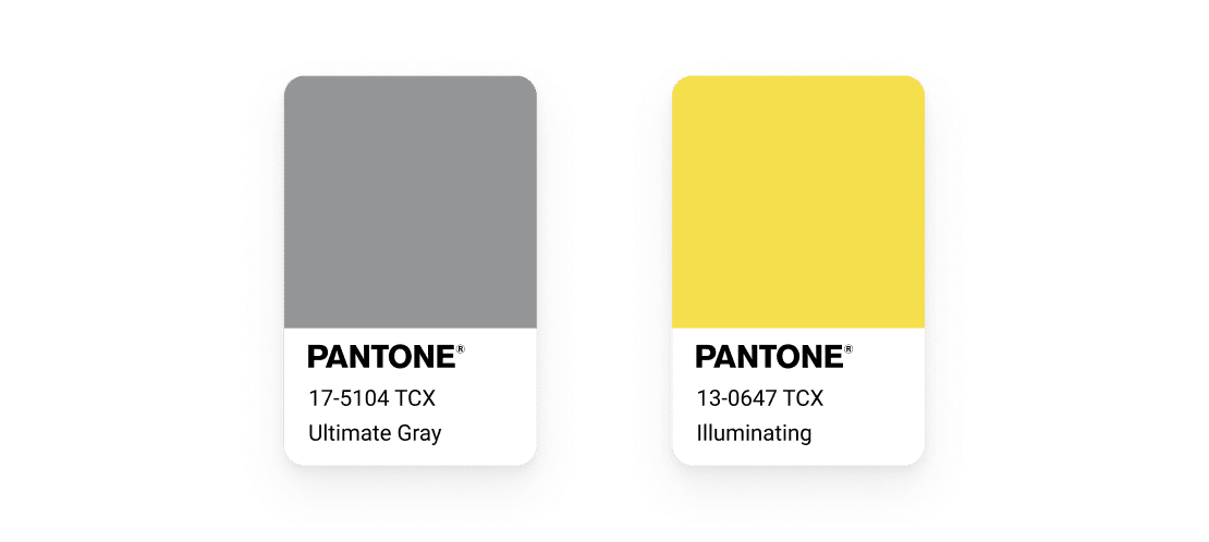
For those who have not followed the 2021 trends, here are the colors that Pantone has decided to highlight for this year.
These 2 colors, for their technical definitions and their naming, are more simply grey (Ultimate Grey) and yellow (Illuminating), with, as parameters, the following equivalences:
- Grey:
- sRBG: 147, 149, 151
- Lab: 62, 0, -1
- Hex.: #939597
- Yellow:
- sRGB: 245, 223, 77
- Lab: 89, -3, 70
- Hex.: #F5DF4D
I talk about equivalence because the screen rendering and the original Pantone rendering have neither the same mode of creation, nor the same synthesis. (Additive for the screen, Subtractive for the print).
Now that the presentations are made, I would like to show you how to compose an accessible color palette from these Pantones, with two main objectives: to offer you tools and a process, and to show you that designers are not painters even when they play with colors.
Contrast Analysis
One of the many means, but certainly the most effective nowaday, to determine if colors are perceptible and if the content is readable, is the measurement of the contrast between 2 colors: the background color and the foreground color.
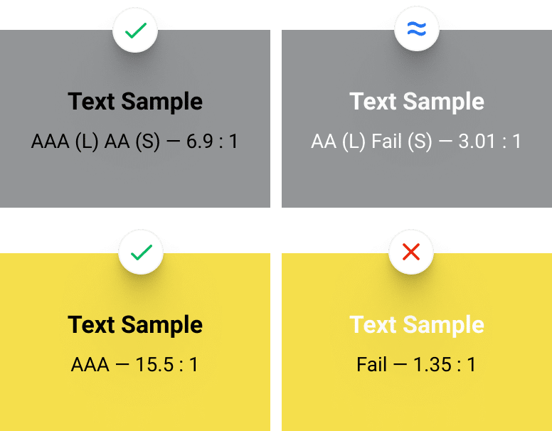
Pantone offers us a set of two colors, so I decided to start by combining them with the classic black and white to technically check their compatibility for optimal contrast.
The indications on this image are to be read as follows:
- AAA (L): AAA compliant for large texts,
- AA (S): AA compliant for small texts,
- Fail (N): Compliance failure for given size “N”.
One generally tries to obtain an AA for the target size (on the WCAG 2.1 standard as a reminder)
We can see that black is a great success since it allows a level AAA on all text sizes with a contrast of 15.5 to 1 on yellow, and AA (S) for a contrast of 6.9 to 1 on gray.
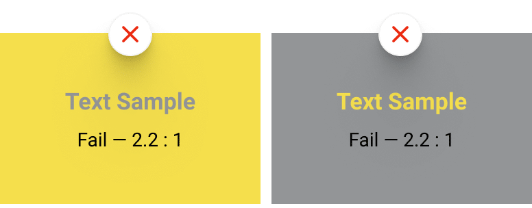
Out of curiosity, I tried to combine these two colors to see if they could be combined in a digital composition.
Yellow on gray or gray on yellow gives of course the same score, that is to say an insufficient contrast to be used as is on your composition. We will therefore not be able to use these colors in combination if there is text involved.
We will of course not stick to these colors, and see how we can compose a usable palette for the web.
Creation of a palette based on Pantone 2021
When we, as designers, create color palettes, we introduce contrast, accent, or neighboring colors to the dominant colors. Here we will take as dominant colors the 2 Pantone of the year 2021.
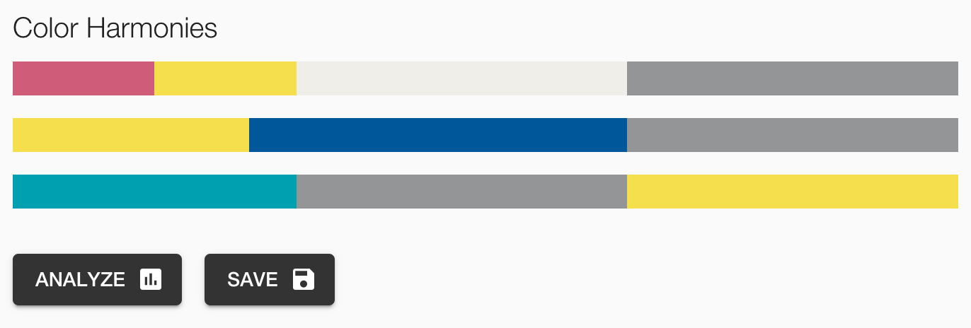
The good thing about Pantone is that they specialize in color. Their site offers a dedicated page that analyzes colors and palettes playing with the selected colors. This is the example of the Aviary palette.
For the rest of the article, I will simply use and decompose this palette into a web palette that can be used in most projects (website, application, digital file, etc.).
When you don’t have a ready-made palette, or when you are not inspired by the ones you find on the web, you can:
- Generate random ones with Coolors. (I prepared the first 2 colors, block them)
- Use Colormind‘s artificial intelligence to help project yourself.
- Use Adobe color-combining algoes to refine your selection.
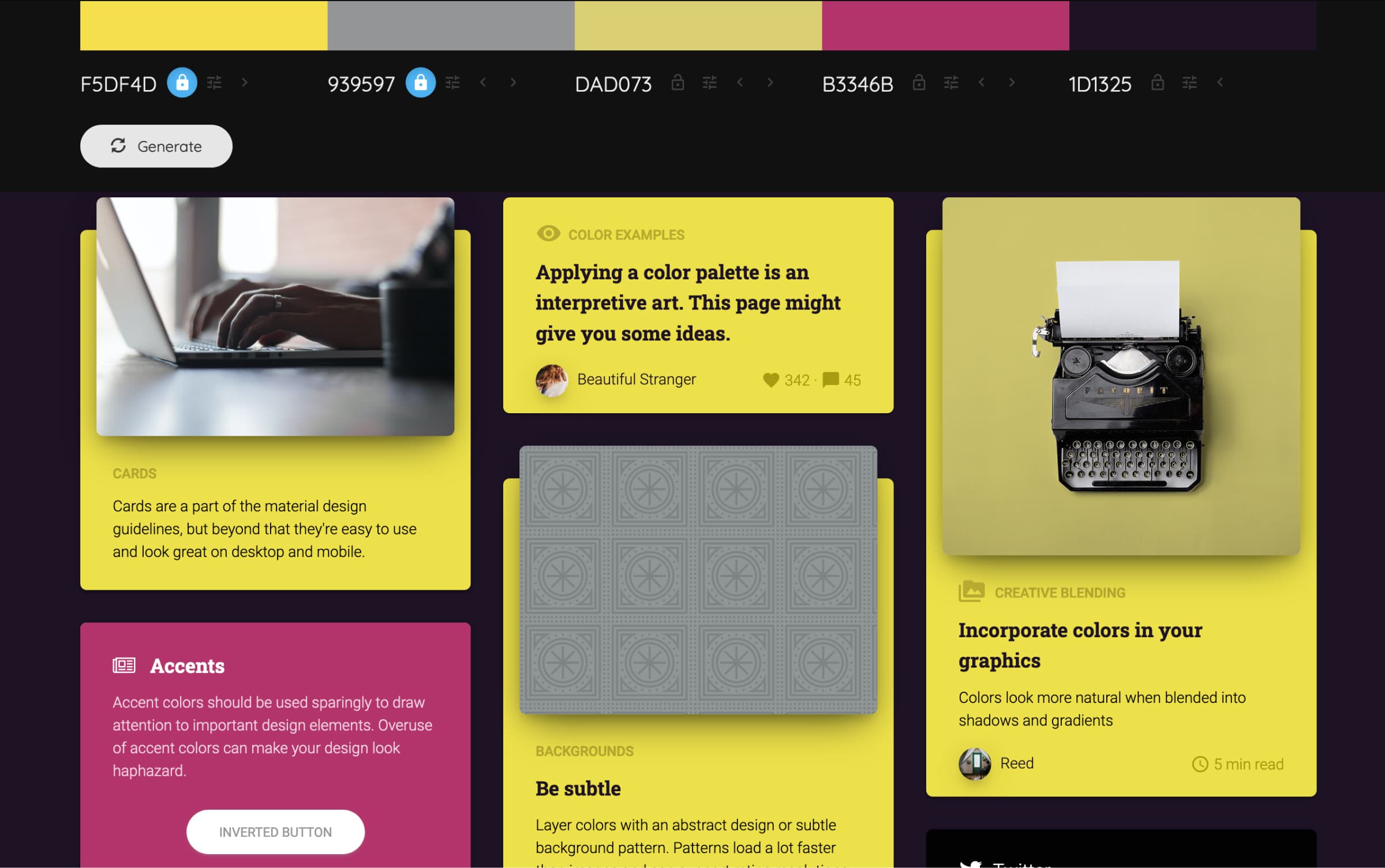
To come back to our palette proposed by Pantone, the brand even offers you some tools for a more in-depth analysis of your palette, including tools to visualize the impact of your choices and the combination of colors between them. This is useful for a beginning of the notion of accessibility, even if it is not complete.
The Analyze button takes you to a list of tools that can inspire you or help you better adapt your colors.
The luminance map is rather handy to show you the nature of each color, without the color itself. But I will personally use other tools to compose my palette.
A “web” palette based on Pantone 2021
Now that we have our palette, it is interesting to check the contrast of each color against white. Why white? For reference, it is a base for the paper, it is often the basis of composition of our website. And more especially it is a base on the Leonardo Color tool.

Why these numbers? First, they allow me to realize that only the blue is naturally contrasted enough against the white, the others are around 3.0 so it’s not too bad, apart from the yellow and the color “Cloud Dancer” (cream-gray).
On top of that, they will be used to adjust my palette in my Leonardo composition.
I then added one by one these 6 colors in Leonardo in order to get the basic palette. To save you the work, here is a direct link to the palette. In the “Contrast Ratios” field, you will notice that there is a list of 10 values separated by commas. This is what allows me to automatically generate 10 colors passing through 10 different contrast ratios, usually around : 1.05, 1.1, 1.3, 2, 3.1, 3.75, 4.8, 6, 7.25, 9
Why these contrast values?
Leonardo by default starts with 3.0 and 4.5, the two values of the WCAG standard for AA compliance. The list that I propose to you covers a rather large range of luminances from the lightest to the darkest of the same color. In general above 9 the contrast is already very high and the differences almost not perceptible anymore.
For each color, I will slightly adapt this list to place my contrast values I obtained previously. The goal is to find my original color in the list of variants generated by the tool. You can totally not do that, but be aware that you will then lose the reference of your palette base colors.
For example, for the blue color in my color list, I will have this contrast list :
1.05, 1.1, 1.3, 2, 3.1, 3.75, 4.8, 6, 7.32, 9
I have bolded the changing value in the list.
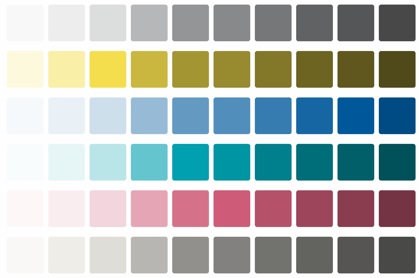
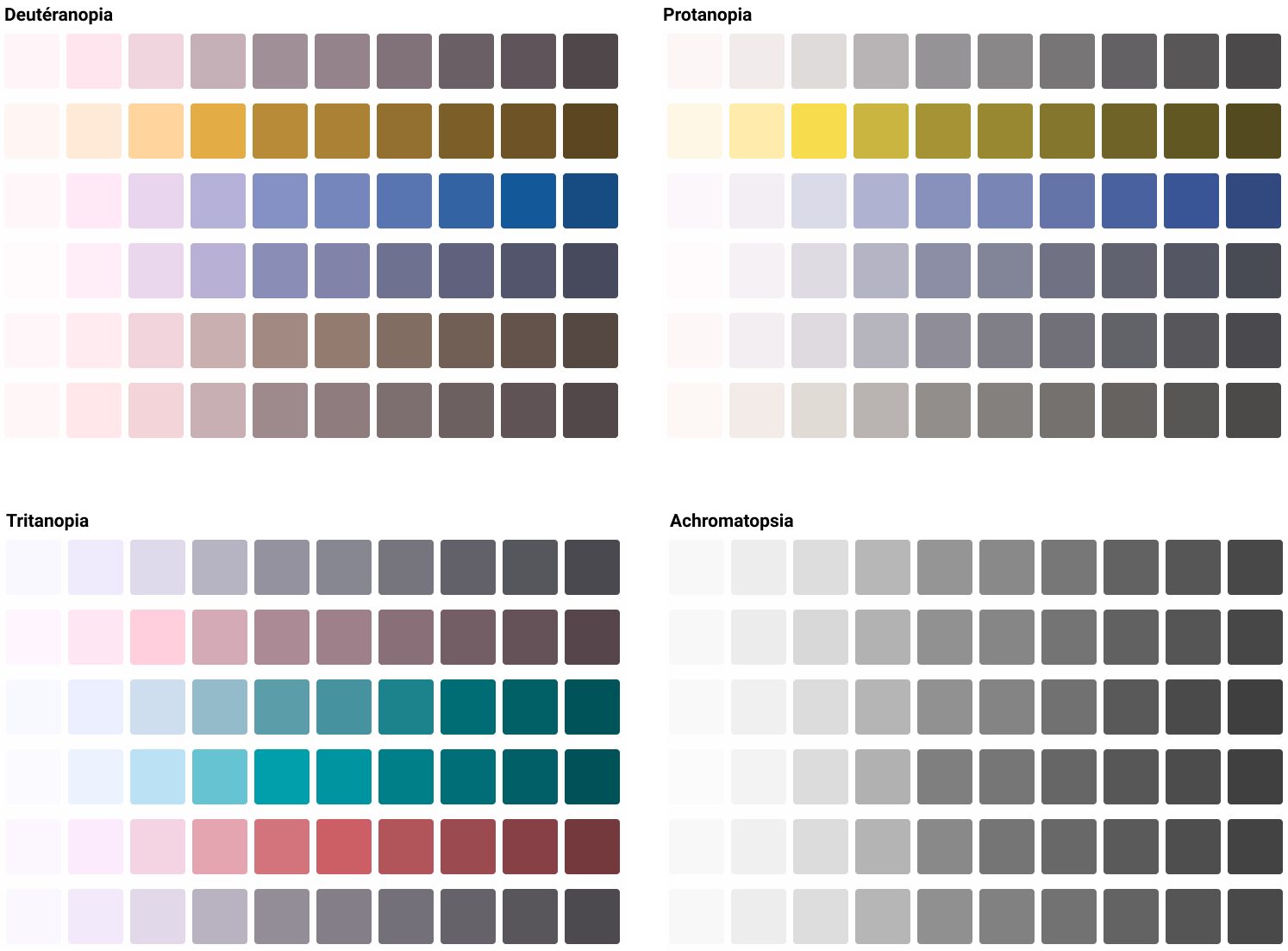
Once this list of colors has been established, it is important to check the proximity of each color line to its neighbors. This can be done with Leonardo’s “Swatches” mode, by passing the CVD (Color Vision Deficiency) Simulation fields on each of the simulation options.
Below are excerpts from my different palettes simulated in an “extreme” version (case of color blindness with a complete missing part of the color spectrum) to show you what it looks like.
The point of doing this is to realize that if you want to juxtapose colors in your interface to differentiate elements, they may be too close to each other for a color blind person. Point of attention to have when creating your interface therefore.
You will notice that the use of close contrast values for each color makes the colors indistinguishable in the palette in the Achromatic version: each line seems to be exactly the same.
Use this accessible color palette
I never said this palette will be accessible because you composed it into Leonardo Tool, only the colors above 3.0 are accessible against the white. Some colors can be used together as well, as a combination of text and background colors, and others cannot.
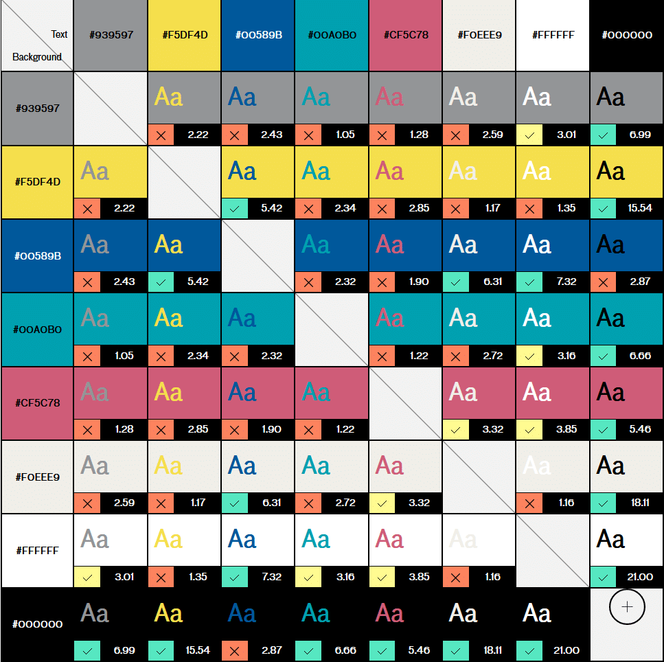
A good tool to generate a compatibility table to save you time is Accessible Brand Colors from UseAllFive. On this link I have put an example of our 6 colors as well as black and white to show you what is generated by the tool.
All combinations with a cross on an orange background are to be avoided. A check mark on a yellow background for big texts, and a green one is all right.
This allows you to get an idea of the combos that can be made with these colors. Of course you can test all the colors of our (your) palette, but it would take a long time.
From a purely naming point of view, it is common to take each color and name it with a numeric suffix. Example with yellow: illuminating-050, illuminating-100, illuminating-200, etc.
Jack from Amplitude proposes a similar approach but modifies the naming for something close to the luminance level of the color. I let you read the article because the principle of numerical scales based on relative and absolute luminance is interesting.
Compose your screens
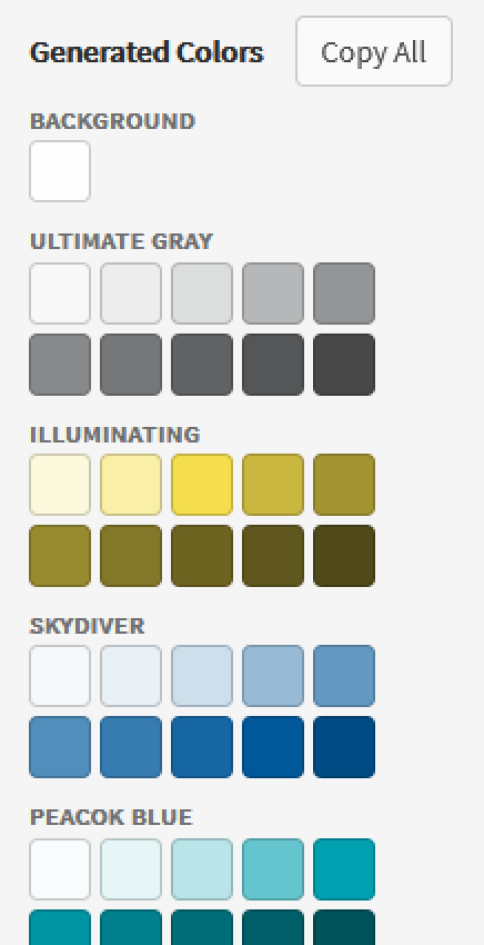
This is a simple list of hexadecimal values that will be copied to your clipboard. So you’ll have to do something with it. If I recall well, Adobe software uses an ACO format for color palettes, but I haven’t found a tool to convert a list to ACO unfortunately.
On my end, I use Figma, and I used to copy these colors in text format, then make small squares in the tool to visualize my color chart before saving it in the Styles panel of the tool. A bit time consuming though, but the Color Import plugin came to the rescue and tackled this problem by creating all this in a simple copy/paste list and one clickable button.
What happens next depends on the state of your project and your skills, but a moodboard with your first ideas of composition according to your needs and materials to explore will allow you to start refining in terms of use and composition with these colors.
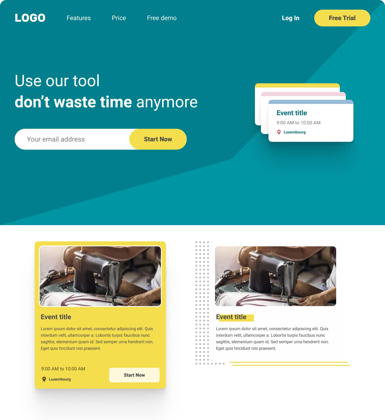
Now it’s up to you to play and find out how to manipulate these colors, this picture is only a first draft far from being complete.
Accessibility and usability
If you’re still here: congratulations for following our adventures so far in composing a color palette from these PANTONE 2021s.
The objective of this article was to present you a personal approach for building a color palette usable for the web from random colors, here Pantones 2021 yellow and grey.
There are many other methods, and I sometimes use the Colorbox.io tool to optimize certain scales and make sure I have colors that are compatible with pure white or black, a bit like Lyft’s approach on their Color System.
Our job as a designer is not only to find colors that make us happy, but to know how to compose from very precise constraints or specificities, sometimes with colors of a brand that are not accessible from the ground up, and to learn how to make something acceptable all people. Accessibility and inclusiveness is (or should be) part of our daily lives as designers.
Beware however, not everything is so strict all the time, we generally also have our personal affinities that can take over. Changes in the color palette may occur along the way to adjust “as you see fit” certain color shades. It is by manipulating them that we can see more clearly afterwards.
Sometimes 4 or 5 precise color combinations (background + text) will be enough to make designers and users happy.
At first, if you think it takes too much effort, try aiming for AA for big texts, it will be better than nothing at all. The important thing is to do better than yesterday.
We can continue on this topic on Twitter 😊
Color Accessibility Tools and Resources
The few tools I’ve used so far:
- Leonardo – to compose my web palette.
- Colorbox.io – to compose a scale with perfect contrasts.
- Color Import – Figma plugin to import styles.
- Accessible Brand Colors – to compare colors between them.
- Coolors – to help create color schemes.
- Colormind to help you project yourself (color schemes).
- Adobe Colors to compose color charts thanks to algoes.
- Color.review a tool I often use to adjust my colors.
Some online resources:
That’s it! Great reading and have fun!





Post a comment for this article?
Follow comments and trackbacks