

In my eternal quest for a better web, a question was recently asked to me on LinkedIn. The question was: do you know a WordPress plugin that allows you to create an accessible form? I’ve never asked myself this question because I use Contact Form 7 which allows you to do a bit of everything. But let’s dig in.
Posts for ‘accessibility’ keywords
Pantone 2021: Working on an Accessible Color Palette
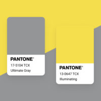
A lot of people seem to want to play with the Pantone colors of the year. Maybe these colors inspire more creative people. Or maybe it’s because it’s rare to get two of them. Note however that their use in the web, or digital assets, can have an impact on the accessibility of your creations. Small note on this topic.
There is no “Myths of Color Contrast Accessibility”
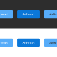
Color contrast is not a detail you can skip. If you design interfaces, it is part of the job. And if you are used to low contrast ratios, yes, you are probably afraid of losing some of the beauty of the interface you just crafted. That fear is legitimate. But accessibility is a constraint like any other, no heavier than the ones UX design already puts on you.
Web Resources #44

UX / UI, CSS, HTML, JavaScript, Accessibility and a lot of pixels and animations on this selection. Learn Grid Layout while having fun, discover more on CSS Variables or Font Variable. I also have a selection of digital artist to make this selection not only technical. Have fun!
Did You Know – HTML start, reversed and type attributes for OL element
When it comes the time to write rich copyrighting, you would love to know more about HTML5 attributes and rules to write accessible and efficient contents. Did you know that Ordered List (ol element) allows you to tweak some default values thanks to HTML attributes? Let’s find out how.