
Also available in:
You already know that a Design System is not only a shared CSS file or a Figma/Sketch bunch of libraries. A Design System is made up of 80% human (relationships, sharing, daily work), and 20% documentation, tools and libraries. I want to help you with the small part.
To help you with those 20%, I made a little list of tools that helped me and keep helping me in a daily basis, and also some tools that could be interesting for you even if I don’t use those tools. It’s a pretty good addition to the UX/UI Designer Tools list I made for you earlier.
I’ll detail a bit the usage I have of each tool I use, and for the ones I tried once but don’t use in a daily basis I’ll be briefer, even if they caught my attention at some point.
I’ll try to separate Visual Library tools from Coded Component tools, even if, you’ll see, the separation is quite difficult sometimes.
Design System Visual Library
During my first experience of building a Design System, I started with Sketch App but after a while, the library was too big for this poor little Sketch and it started to be too laggy to be able to work.
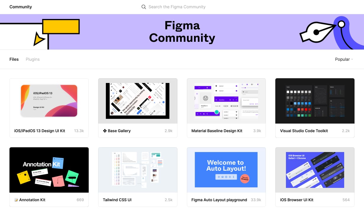
That’s why after some tests by a colleague of mine, we joined the Figma Community.
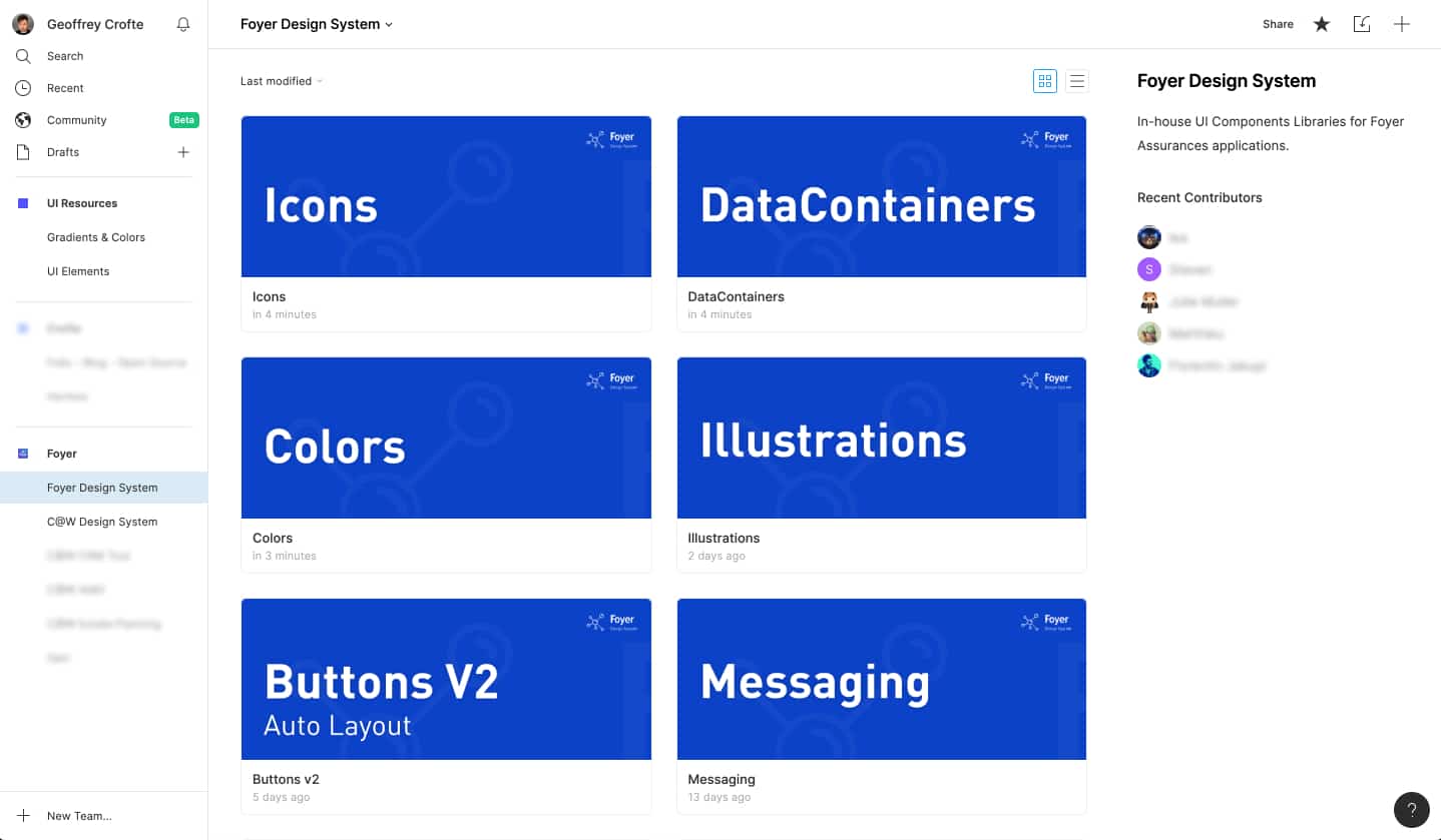
Figma – Scalable Design System
Figma is well known by the design community, and it allows you to build efficient Design System and share visual libraries. I did test other solutions like Adobe XD or Sketch, but the cross-OS compatibility and the way it works matches my way of working on a Design System.
The Team features are really useful for onboarding people in a team of designers. There are Shared Libraries that can be activate on the overall team to kind of force people to used Master Components (Symbols in Sketch) in their design composition.
Those different libraries can be activate on the overall Team, but are all optional. It means that when you create your file to work on an interface using your Design System, you can deactivate the libraries you don’t need. I don’t know why you would need to do that, but you can do it 😀
Our existing System is quite big, but I never notices any lag using it or searching through the big amount of Master Components.
There is also Live Collaboration where you can work on the exact same object in the exact same file. That’s a life saver when you need to rush on a design for any reason.
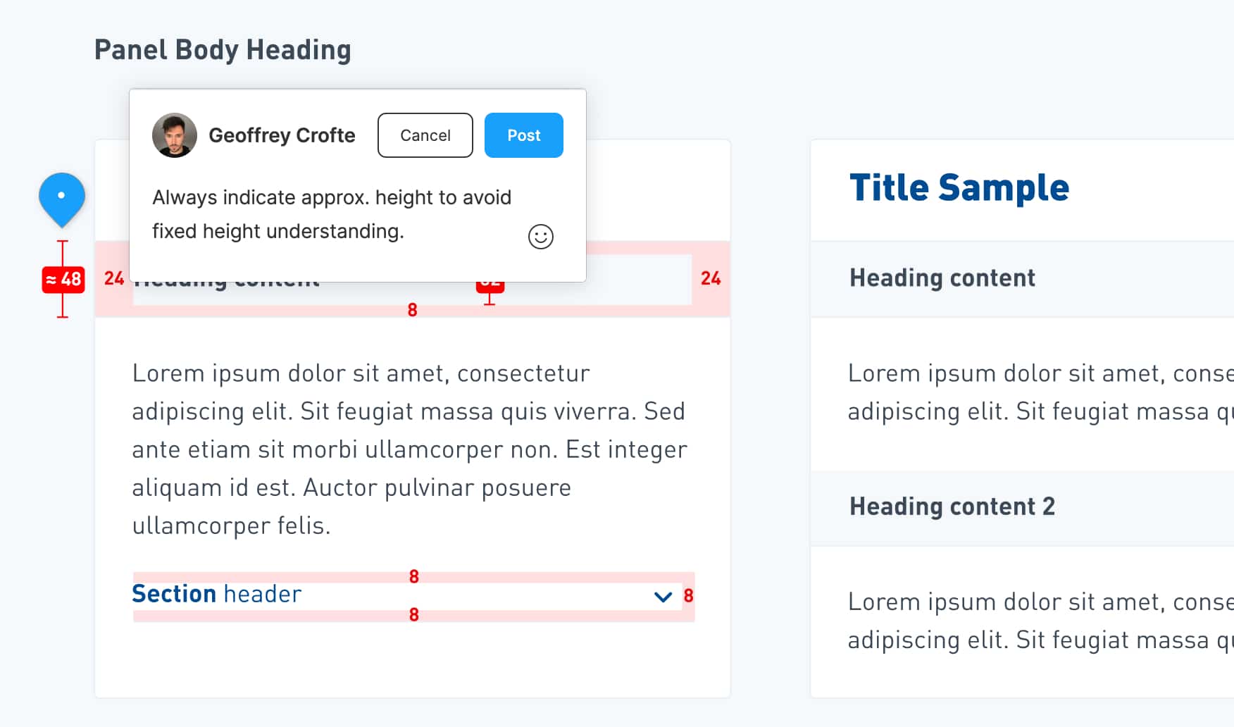
Visitors and contributors can leave comments on the workspace directly, adding several layers of contribution.
The fact that all the files are in the Cloud, you don’t even think about backup or cloud service where you have to save your work regularly and think of a versioning tool. Everything is included into Figma: version control, blame tool, files saved in the cloud. And yes, you can work offline as soon as you already loaded your work, the tool will save locally your work and push it online when your connection is retablished.
For Organizations, if you need to have an enhanced security, Figma allows SAML SSO.
Figma is also all about the community around it: Plugins and Shared files made by the community for free are available and can easily be activated for all your team members. The onboarding for building a plugin is so simple that I’ve made one to prepare your exports for PWA Icons.
Figma is free for up to 2 editors and 3 projects, which is really enough for students or small design teams. But as long as you need to build shared libraries, you will have to pay $12/month/editor.
ZeroHeight – Design and code documentation
Zeroheight is a CMS to manage a documentation, a website that is available for you and your collaborators. The advantage of this tool is that you can synchronize your design file to keep the documentation up to date. It works like a charm with Figma which offers a powerful API.
When I built the Foyer Design System website, I did it with simple HTML files, it took me a bit of time just for the template and the responsive aspect of the website. The structure was based on the existing internal Design System we have at Foyer for our complete documentation. (yeah the public website is not even 5% of the complete documentation)
When I started to work on the CapitalatWork Design System for our internal needs (in-house applications) I needed something efficient with a fast setup. Zeroheight allowed me to build several pages of documentation in a morning.
The tool allows you to build visual documentation as well as technical documentation. It synchronizes your design file ; in my case Figma with the imported Frames, Components or Styles I decided to import and document. There is some pre-made blocks of contents that can easily cover 90% of your needs for a great Design System structure and content.
When designers or developers will join me on completing the documentation, we’ll be able to write it collaboratively at the same time.
Zeroheight is free for one editor, enough to get started, and starts at $15/month/editor. It’s also :
- Design Tokens up-to-date
- Synchronized files and Design Assets
- Inspection of the details of your components
- Version History (Company offer)
- Custom Domain Name (Company offer)
- Private System protected by a password (Company offer)
- SAML SSO + User Permissions (Enterprise offer)
Superposition – Design Tokens
Superposition is an app that allows you to literally browse your existing design tokens. Just enter the URL of you website or a page and get:
- The Colors,
- The Typography,
- The Spacing,
- The Border Radii
- The Shadows
- The Motions
- And the assets.
This list can be exported in several format for CSS, Sass, JS, android, and Swift should arrive soon.
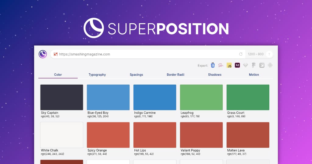
Superposition is a great tool for starting a Design System in an existing environment. Whether you’ve got only one project or several ones using (kind of) the same codes, it’s a good starting point to list all your tokens to better estimate the work to do at merging or simplying this list.
This tool has compatible plugins for Adobe XS and Figma, I can’t enough advice you to use it if you play with existing projects. This tool is free.
Learn more about Superposition
UI Kit and Code Tools
Here are some of the dev-oriented tools I found or use(d) with my team on our Design Systems. Again it’s not easy to separate design and dev on this topic, but those tools will talk way more to developers.
Storybook – UI Components Library for front-end devs
Storybook is made for documenting and create a playground for front-end developers. The tool allows you to build a library of components with infinite variation. The goal is to allow developers to build variations that matches the real use cases of the project(s) they build be used for.
It’s a good tool to keep consistency and to make component evolve with the project needs, without breaking the previous versions.
The component pages are well built and allows you to add as much as tabs and information you will find useful for your team, like: technical documentation, notes, accessibility advices, event documentation, story around the component, etc. You can easily get snapshot of your components to see visual changes or code editions.
The goal of this tool is to create a collaborative technical tool that can also be turned into a complete styleguide. The important part of this sentence is “collaborative”. It helps people work together, but still, it’s just a tool 😉
I’m telling you so because I knew a team that worked with Storybook, but it was a one-man made book, the link was shared by email to the collaborators, and nobody never heard anymore of this Storybook after that. Use the tool you want, but don’t forget to speak to human beings around you.
Anyways, Storybook works well with raw HTML, React, React Native, Vue, Angular, Mithril, Marko, Ember, Riot, Svelte. All the documentation for those frameworks are well documented.
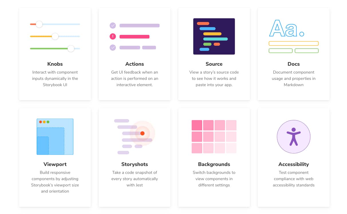
This tool is Open Source and free, and there is a lot of Addons that will make you system really powerful.
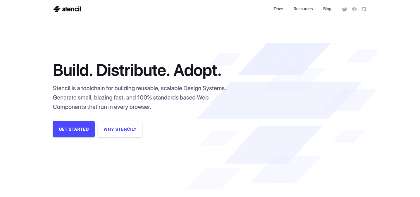
StencilJS – Reusable Components
StencilJS is a powerful tool to build reusable components compatible with a lot of frameworks. It’s ideal when you work in an environment where React and Angular are part of your projects, and not only those. It’s a cross-framework tool.
Stencil is a toolchain for building reusable, scalable Design Systems. Generate small, blazing fast, and 100% standards based Web Components that run in every browser.
StencilJS has JSX support and is built in a way that it’s future-proof: native Web Components with polyfill, that brings support for all types of environment.
It also brings simplicity into:
- Visual comparison: UI diff with screenshot,
- Documentation: with auto-generated component doc and CSS variables,
- Dev environment: Built-in dev-server for hot module reloading.
We decided at the start of building our Design System that we shall never write JavaScript as long as we are surrounded by different environment (PHP, WordPress, and Angular). “We are writing only HTML and CSS”.
While building our in-house Design System, a need emerged: unify interaction within some more complex components, to keep user experience consistency. A teammate within our Design System Core Team decided to give a try to StencilJS, and it worked quite well.
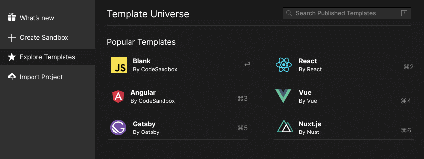
CodeSandBox – Experiment Combinations
I never had the opportunity to use it but this tool seems perfect to test things in a pre-built environment. CodeSandBox allows you to:
- Use predefined templates of code (blank JS, React, Angular, Vue, Nuxt, Gasby, etc.)
- Create your own predefined templates,
- Use community templates to get started,
- Sync it with Github,
- See changes in live thanks to the Hot Module Reloading,
- NPM Support directly within the tool.
You can even embed your Sandboxes, which could be pretty handy if you are building an in-house system with rich examples. You can also test third-party compatibility with your existing system before diving into a solution.
React Styleguidist – Playground styleguide for React.
If your team is working with React, React Styleguidist is a great tool for building Storybook-like tool and play with live documentation of your components.
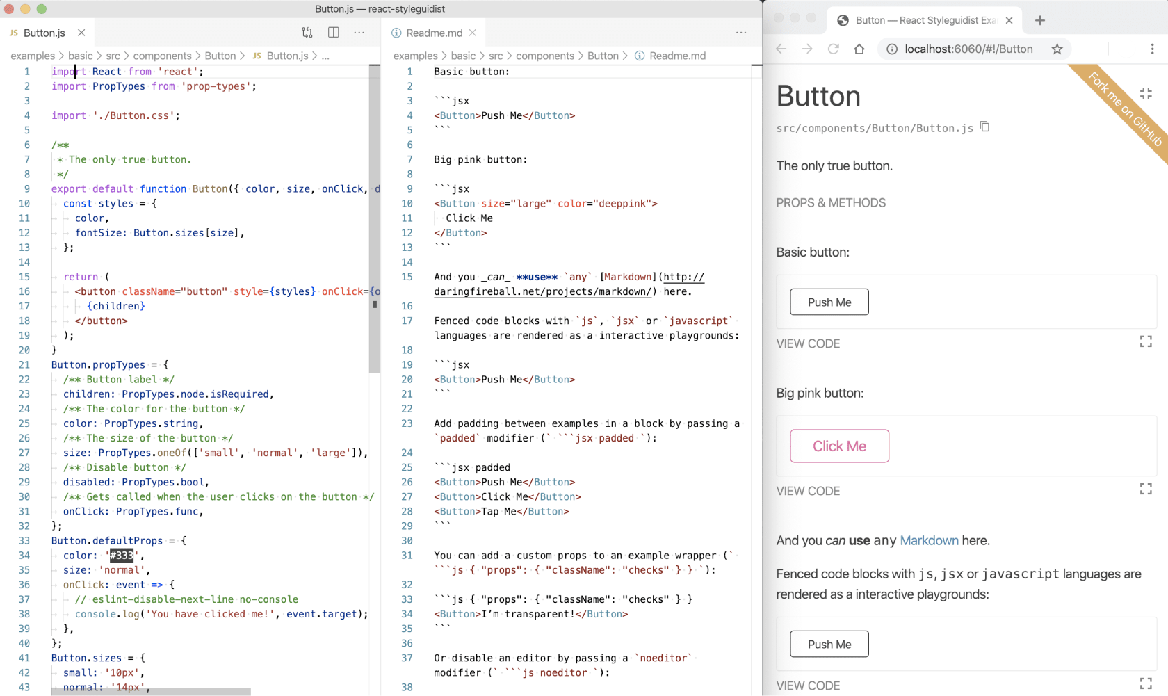
The tool generate a styleguide and allows you to build consistent systems with component variations.
I never used this tool but to me it’s close to what you can do with Storybook, but here it’s React-friendly and only built for that purpose.
Learn more about React Styleguidist
HTML & CSS Knowledge
Yeah I know, it’s kind of weird to consider HTML and CSS as tools, but they really are. You won’t be able to build accessible and strong patterns without those knowledge.
Nowadays, I see more and more “Front-End Developers” being only JS Framework users (yeah users), like children playing with pieces of LEGO they don’t even understand the true nature. To build a Design System, you need someone working on raw HTML, with a strong understanding of Role-ARIA and able to test the components on a lot of browsers and assistive technologies.
You need someone able to improvise custom CSS lines of code to adjust components and build variations of those, keeping the same HTML (article by @shadeed9) to avoid re-work on the implementation side.
You need someone whose expertise is HTML and CSS only because being able to handle all kind of complex layout situation is a full time job, sometimes way more difficult than playing with pieces of LEGO.
If you want to learn a bit more on Inclusive Components, I advise you this great reading: Incluse Components by Heydon Pickering.
Building a Design System is about humans…
Don’t forget that building a Design System is not about gathering the right tools but gathering the right persons around the table, communication and needs understanding.

The tools are here to help you build a strong relationship between at least developers and designers. They are supposed to help them speak the same language, filling the gap between those two fields, and serve a common goal: bring a consistency within interfaces for a better user experience.
Choosing the right tool is not always easy, you will have to listen to each other to understand designers and developers needs. To improve you Design System, you have to do exactly the same thing as other products: listen to users, collect their needs and pain points, and build solutions.
That’s the other 80% part. 😊
Share the post "Design System: Great Tools for building your System"


Post a comment for this article?
Follow comments and trackbacks